 kage
kage
lleverage.ai
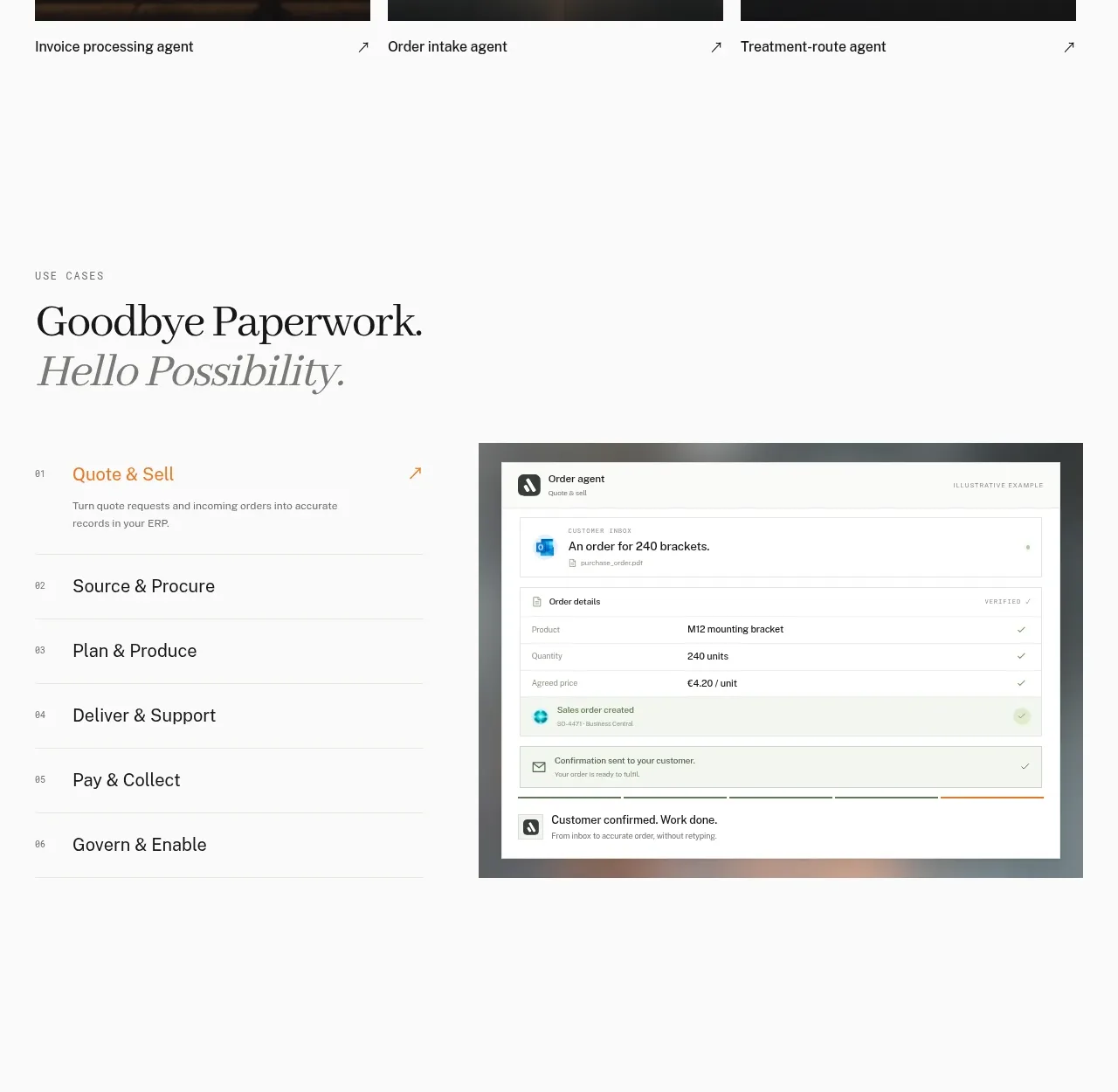
Design analysis
An editorial section pairs a numbered vertical workflow list with a large product-interface preview, making a complex platform feel sequential and understandable.
Prompt preview
## Reference images

Study these alongside the description below: hierarchy, rhythm, spacing, colour. Build for the product you are asked about, using this design language.

- Component: https://kage-design-assets.t3.tigrisfiles.io/components/lleverage/862048bd-3dd3-4c2e-9d3c-aadeb65c3eec-1792130578-4.webp
- Full page it was cut from: https://kage-design-assets.t3.tigrisfiles.io/screenshots/lleverage/862048bd-3dd3-4c2e-9d3c-aadeb65c3eec-1792130486253-full.webp
- Component on Kage: https://kage.design/component/lleverage-tabs

## Before you start
Ask what stages make up the user's customer's journey and what interface or artifact best demonstrates the value. Then build an original version.

Build a two-column workflow showcase on an off-white background. Place an eyebrow and two-line serif heading above a left-side numbered list of 5–7 stages. Each row should have a small index, a concise title, a thin divider, and an active state in a warm accent such as #C98B4C; inactive rows remain charcoal and muted. Include a short active-state description and arrow link. On the right, show a framed product screenshot or UI mockup with a subtle dark border/background, 1–2px radius, and enough whitespace around it. Clicking a stage should swap the preview and description with a gentle fade or slide; keyboard focus must be visible. Stack the columns on mobile.

Never: use the reference's logos, product names, copy, illustrations, imagery, or exact interface screenshot.
More components
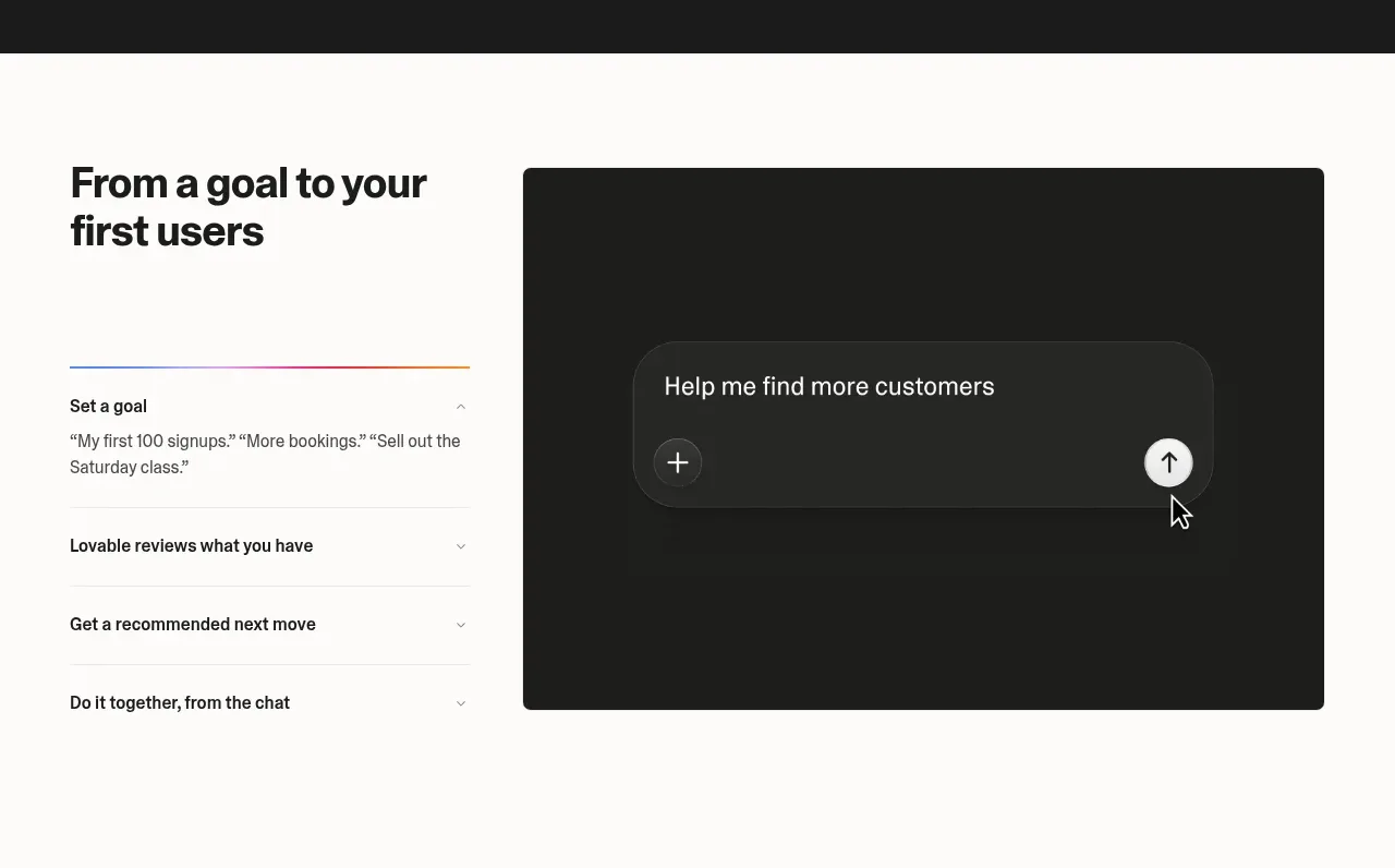
 Goal-to-first-users assistant
Lovable Growth Tools · Tabs & steps
Goal-to-first-users assistant
Lovable Growth Tools · Tabs & steps
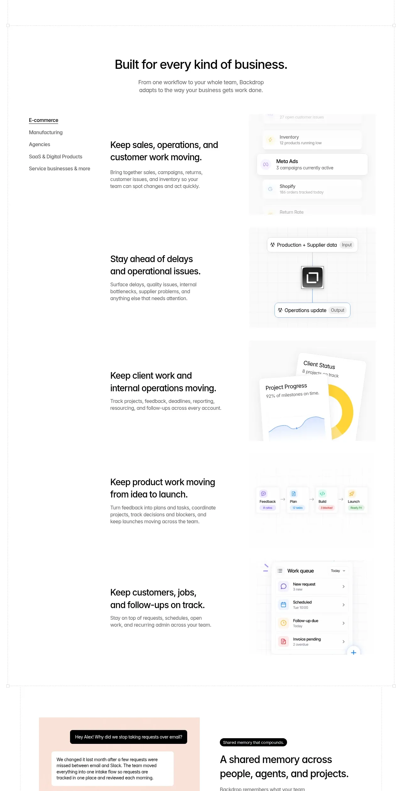
 Business use cases tabs
Backdrop · Tabs & steps
Business use cases tabs
Backdrop · Tabs & steps
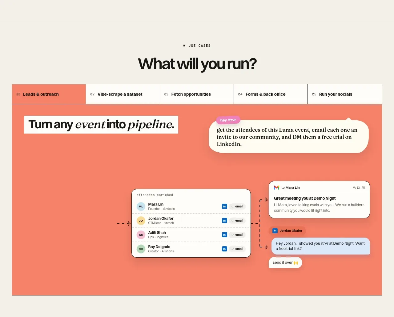
 Use-case selector and interactive showcase
Retriever AI · Tabs & steps
Use-case selector and interactive showcase
Retriever AI · Tabs & steps
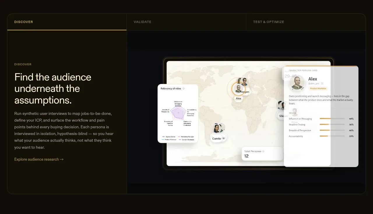
 Tabbed research workflow showcase
Articos MCP · Tabs & steps
Tabbed research workflow showcase
Articos MCP · Tabs & steps
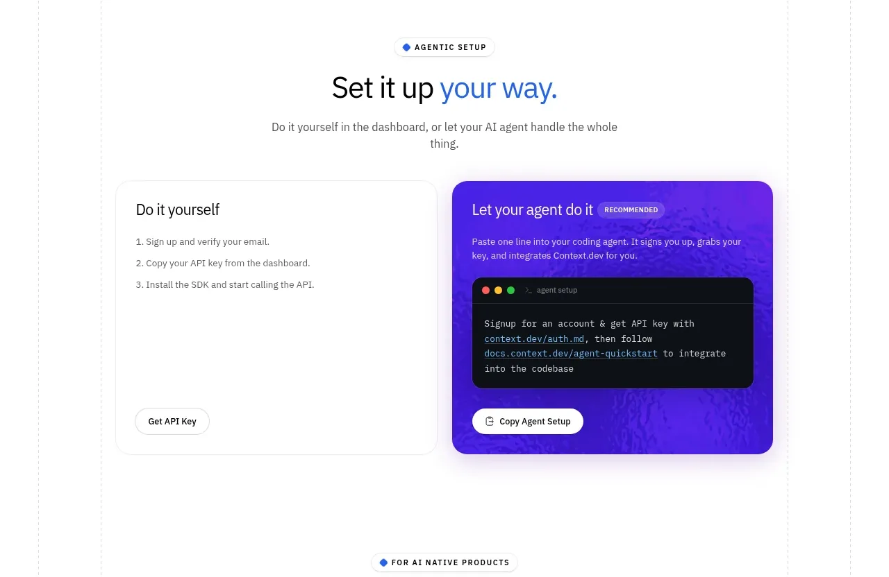
 Self-serve versus assisted setup
Scrape Anything by Context.dev · Tabs & steps
Self-serve versus assisted setup
Scrape Anything by Context.dev · Tabs & steps
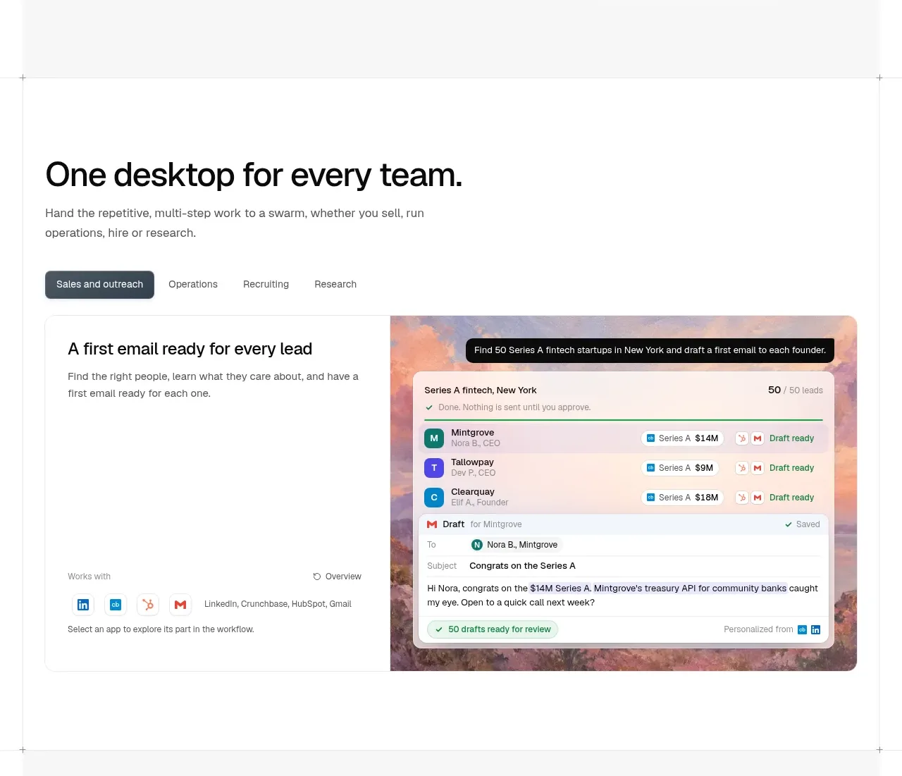
 Team workflow tabs
OpenSwarm · Tabs & steps
Team workflow tabs
OpenSwarm · Tabs & steps