 kage
kage
lovable.dev
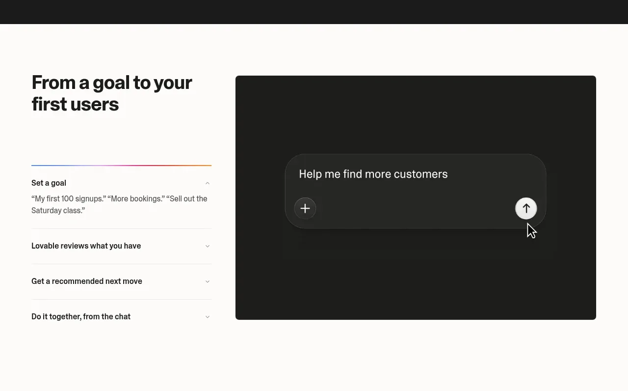
Design analysis
This section pairs a left-side list of growth questions with a large dark conversational preview, making the product's guided workflow immediately understandable.
Prompt preview
## Reference images

Study these alongside the description below: hierarchy, rhythm, spacing, colour. Build for the product you are asked about, using this design language.

- Component: https://kage-design-assets.t3.tigrisfiles.io/components/lovable-growth-tools/9452fb95-0338-4269-a5da-8889e8804cc9-1792216983-3.webp
- Full page it was cut from: https://kage-design-assets.t3.tigrisfiles.io/screenshots/lovable-growth-tools/9452fb95-0338-4269-a5da-8889e8804cc9-1792216920277-full.webp
- Component on Kage: https://kage.design/component/lovable-growth-tools-tabs

## Before you start
Ask what the user's product and brand are, then apply these principles to that product rather than reproducing the reference.

Design a two-column interactive assistant section. On the left, show a compact section title and an accordion or tab list of four growth tasks, with the active row indicated by a fine accent rule. On the right, show a large dark rounded preview panel containing a chat composer, add control, and submit arrow. Use an off-white background, 24–32px gaps, thin separators, 16–18px task labels, and a nearly black preview (#1d1d1b) with a subtly lighter input pill. Make each task selectable and update the preview content; on mobile place the task list above the preview.

Never: use logos, product names, copy, illustrations, or imagery from the reference.
More components
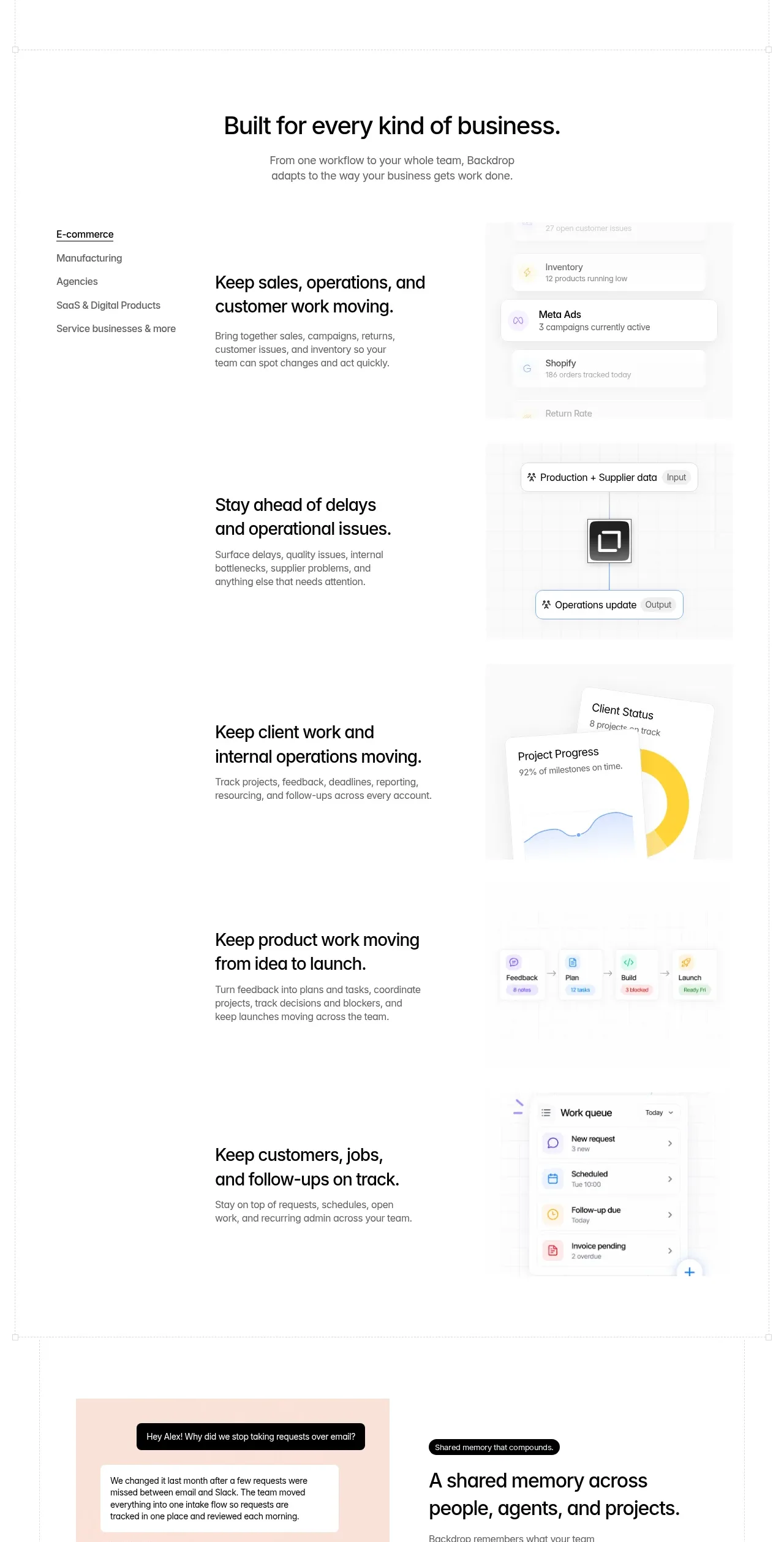
 Business use cases tabs
Backdrop · Tabs & steps
Business use cases tabs
Backdrop · Tabs & steps
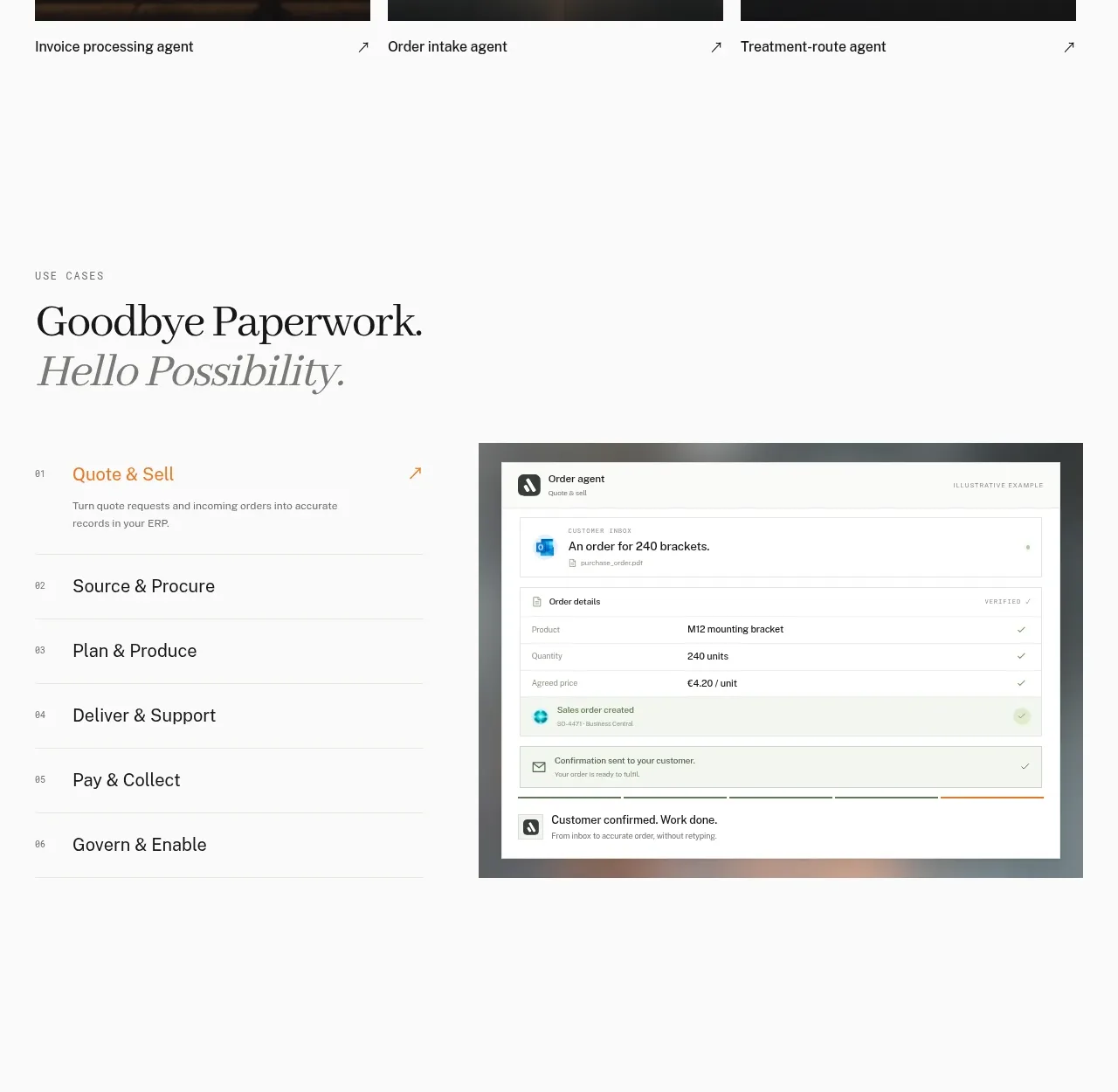
 Workflow stages with product preview
Lleverage · Tabs & steps
Workflow stages with product preview
Lleverage · Tabs & steps
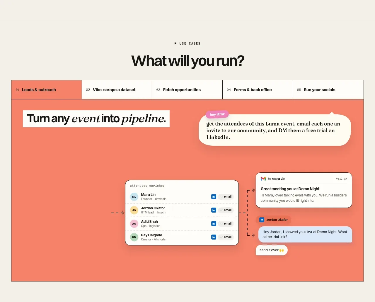
 Use-case selector and interactive showcase
Retriever AI · Tabs & steps
Use-case selector and interactive showcase
Retriever AI · Tabs & steps
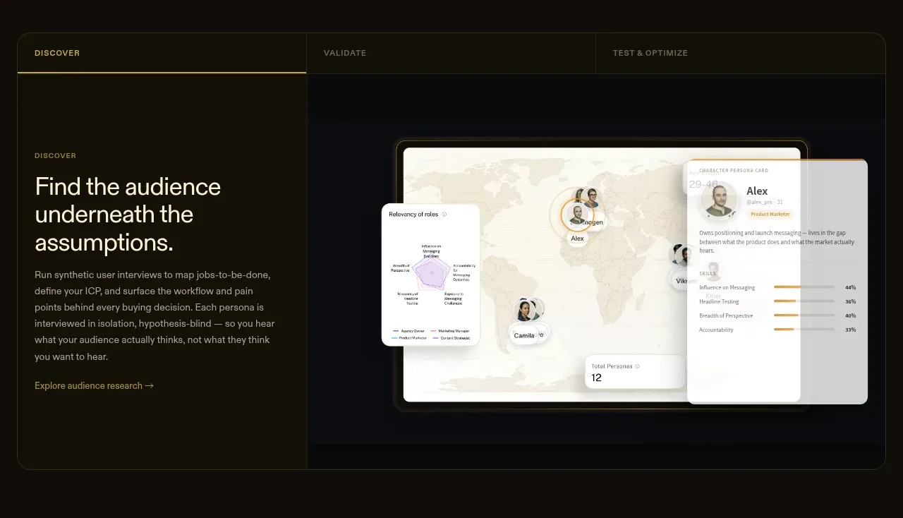
 Tabbed research workflow showcase
Articos MCP · Tabs & steps
Tabbed research workflow showcase
Articos MCP · Tabs & steps
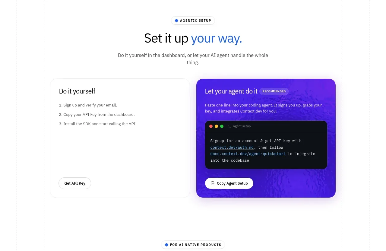
 Self-serve versus assisted setup
Scrape Anything by Context.dev · Tabs & steps
Self-serve versus assisted setup
Scrape Anything by Context.dev · Tabs & steps
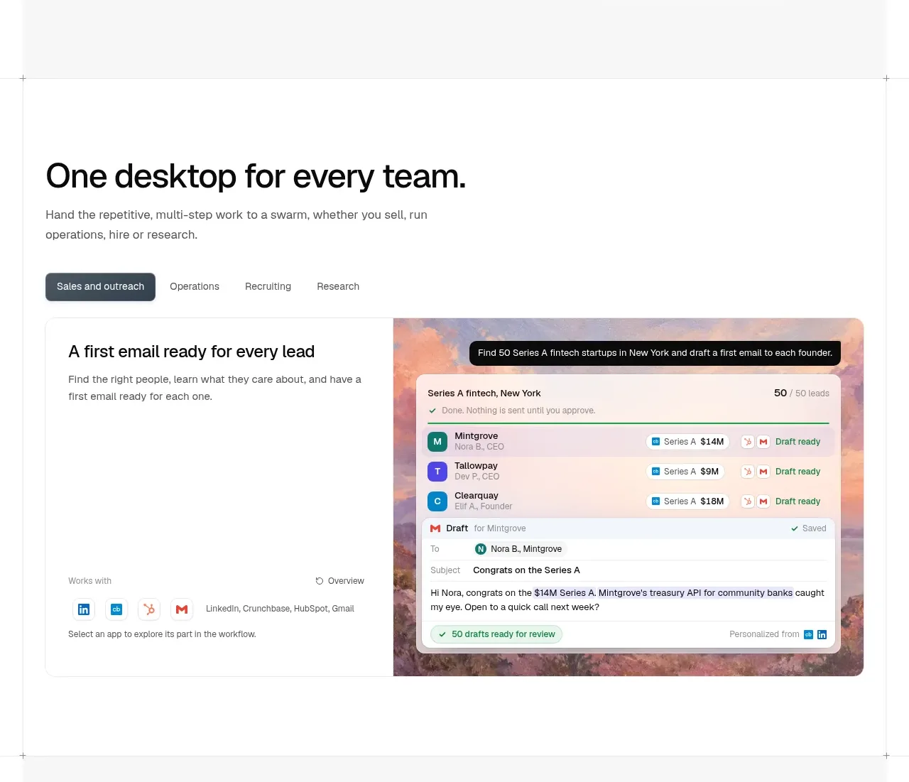
 Team workflow tabs
OpenSwarm · Tabs & steps
Team workflow tabs
OpenSwarm · Tabs & steps