 kage
kage
rtrvr.ai
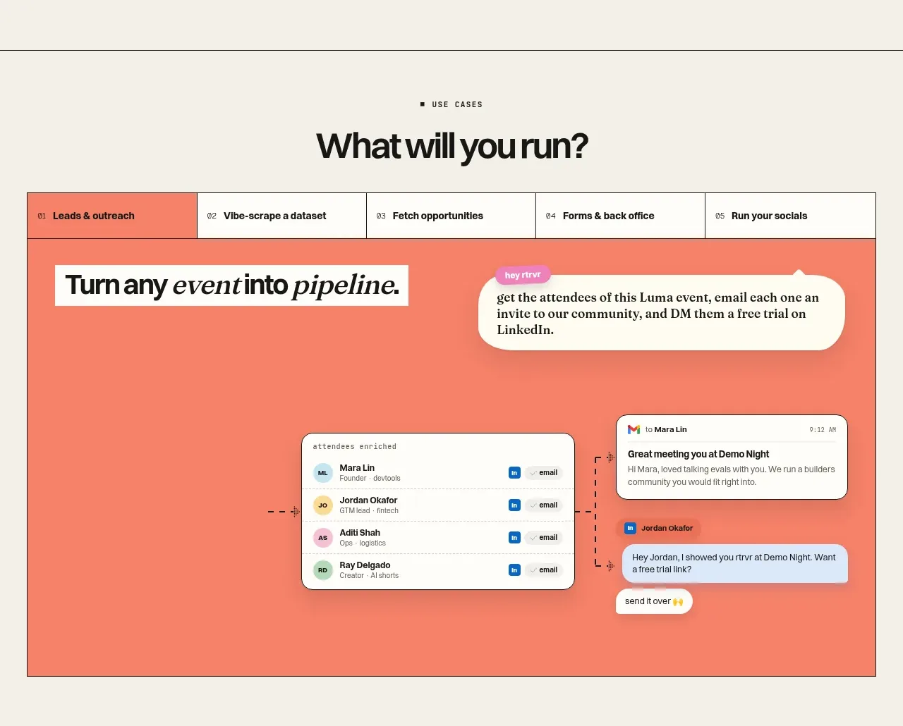
Design analysis
A centered use-case heading leads into a bordered tab bar and a large coral demonstration panel, making the product feel adaptable while keeping one scenario in focus.
Prompt preview
## Reference images

Study these alongside the description below: hierarchy, rhythm, spacing, colour. Build for the product you are asked about, using this design language.

- Component: https://kage-design-assets.t3.tigrisfiles.io/components/retriever-ai/4363ca9a-43f9-447c-8e7d-56b17f2dfed5-1792044246-4.webp
- Full page it was cut from: https://kage-design-assets.t3.tigrisfiles.io/screenshots/retriever-ai/4363ca9a-43f9-447c-8e7d-56b17f2dfed5-1792044106345-full.webp
- Component on Kage: https://kage.design/component/retriever-tabs

## Before you start
Ask what workflows or use cases the user's product supports and which one should be the initial active example. Apply this interaction model with original labels and visuals.

Create a use-case showcase section with a small eyebrow and centered headline above a contained interactive panel. The panel begins with a five-item tab strip using numbered labels, then displays one active scenario in a vivid background. Inside the active panel, place a large editorial statement, a conversational request bubble, and a believable workflow visualization such as a contact list, automation graph, inbox, or result table. Let the visualization overlap or float within the panel to create depth, but keep the active content understandable without animation.

Design language: page background #f4f1e8, panel coral #f57b68, panel border #20201c, white and cream UI surfaces, and black text. Use 28–36px display type for the panel statement, 12–14px tab labels, 1px dark borders, and 8–18px radii depending on the nested UI. Use a fixed aspect-ratio demo area around 16:8, generous 28–48px internal padding, and clear active-tab contrast. Tabs must be keyboard accessible, support arrow-key navigation, and update the panel without a layout jump.

Never: copy logos, product names, copy, illustrations, or imagery from the reference.
More components
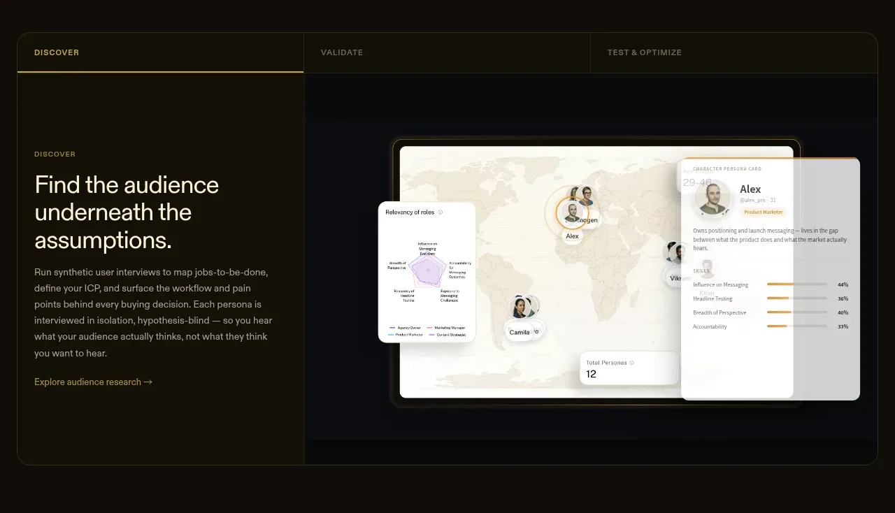
 Tabbed research workflow showcase
Articos MCP · Tabs & steps
Tabbed research workflow showcase
Articos MCP · Tabs & steps
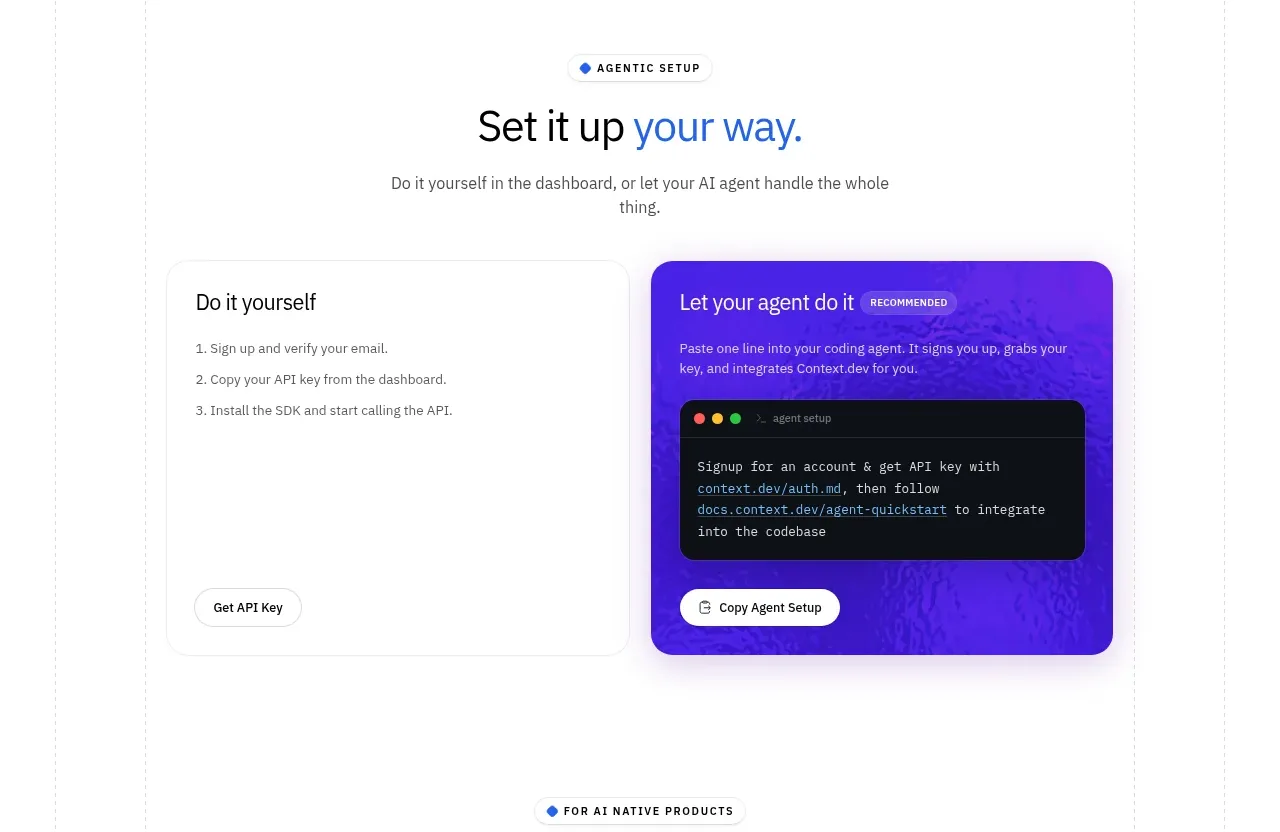
 Self-serve versus assisted setup
Scrape Anything by Context.dev · Tabs & steps
Self-serve versus assisted setup
Scrape Anything by Context.dev · Tabs & steps
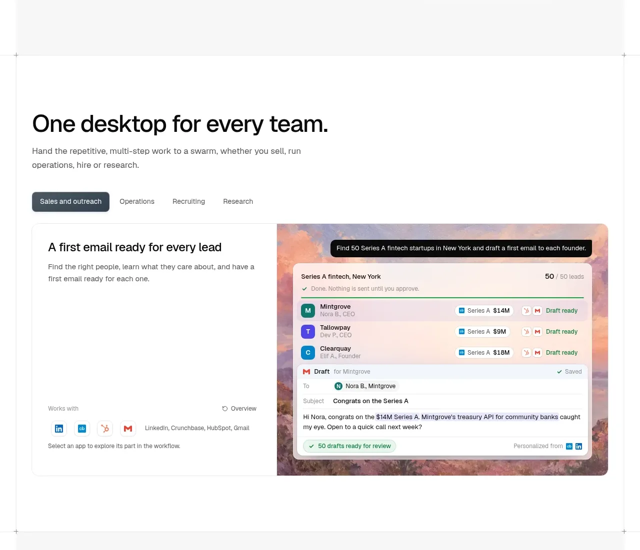
 Team workflow tabs
OpenSwarm · Tabs & steps
Team workflow tabs
OpenSwarm · Tabs & steps
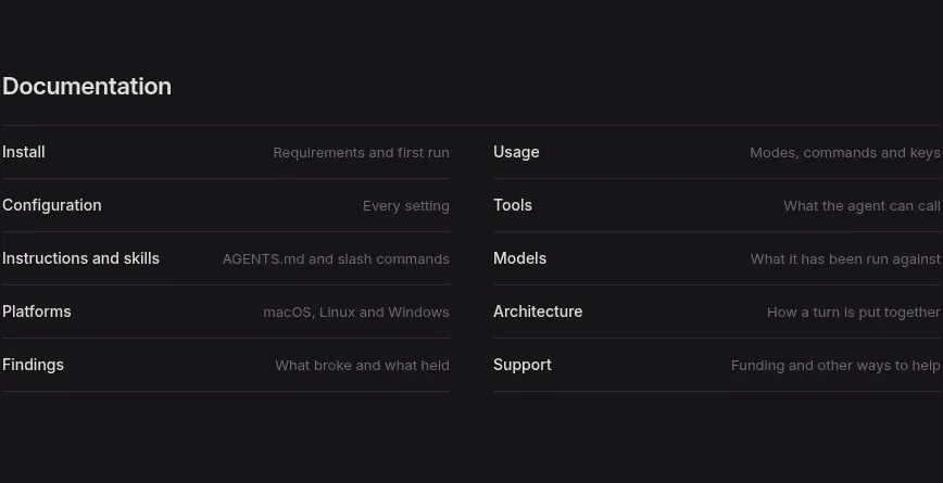
 Documentation link directory
Reika · Tabs & steps
Documentation link directory
Reika · Tabs & steps
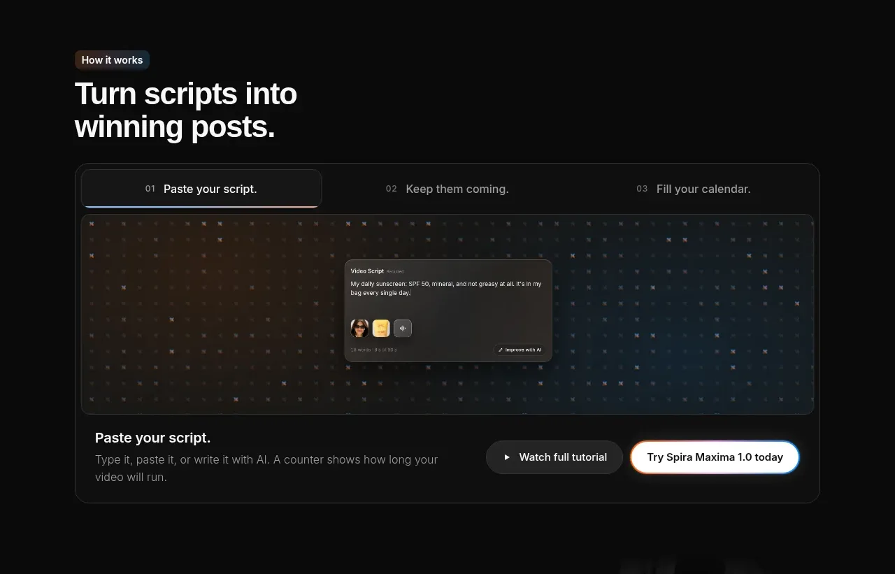
 Script-to-output workflow tabs
Spira Maxima · Tabs & steps
Script-to-output workflow tabs
Spira Maxima · Tabs & steps
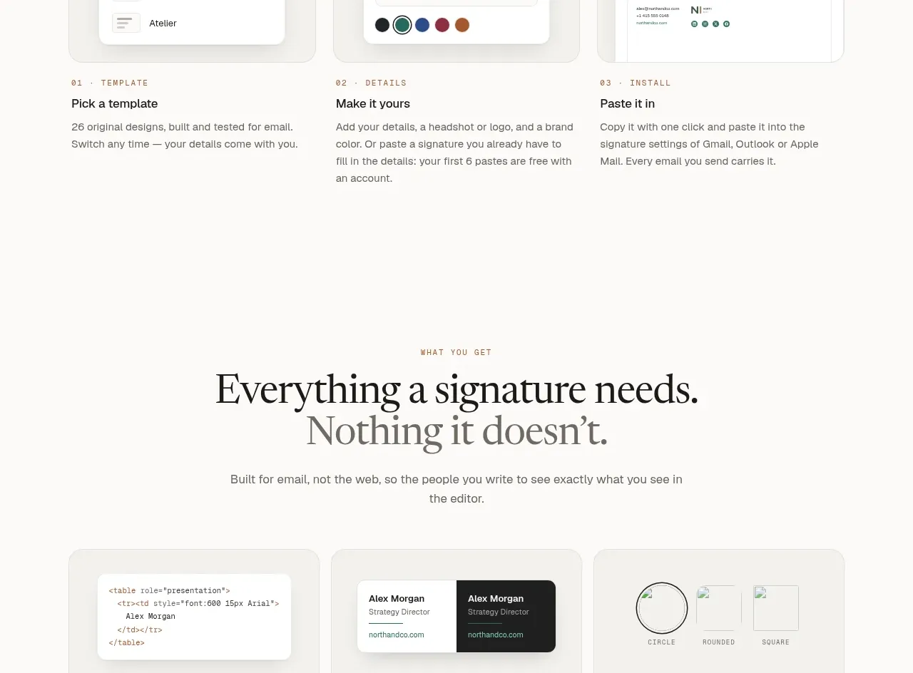
 Inbox preview tabs
esigna · Tabs & steps
Inbox preview tabs
esigna · Tabs & steps