 kage
kage
backdropagent.com
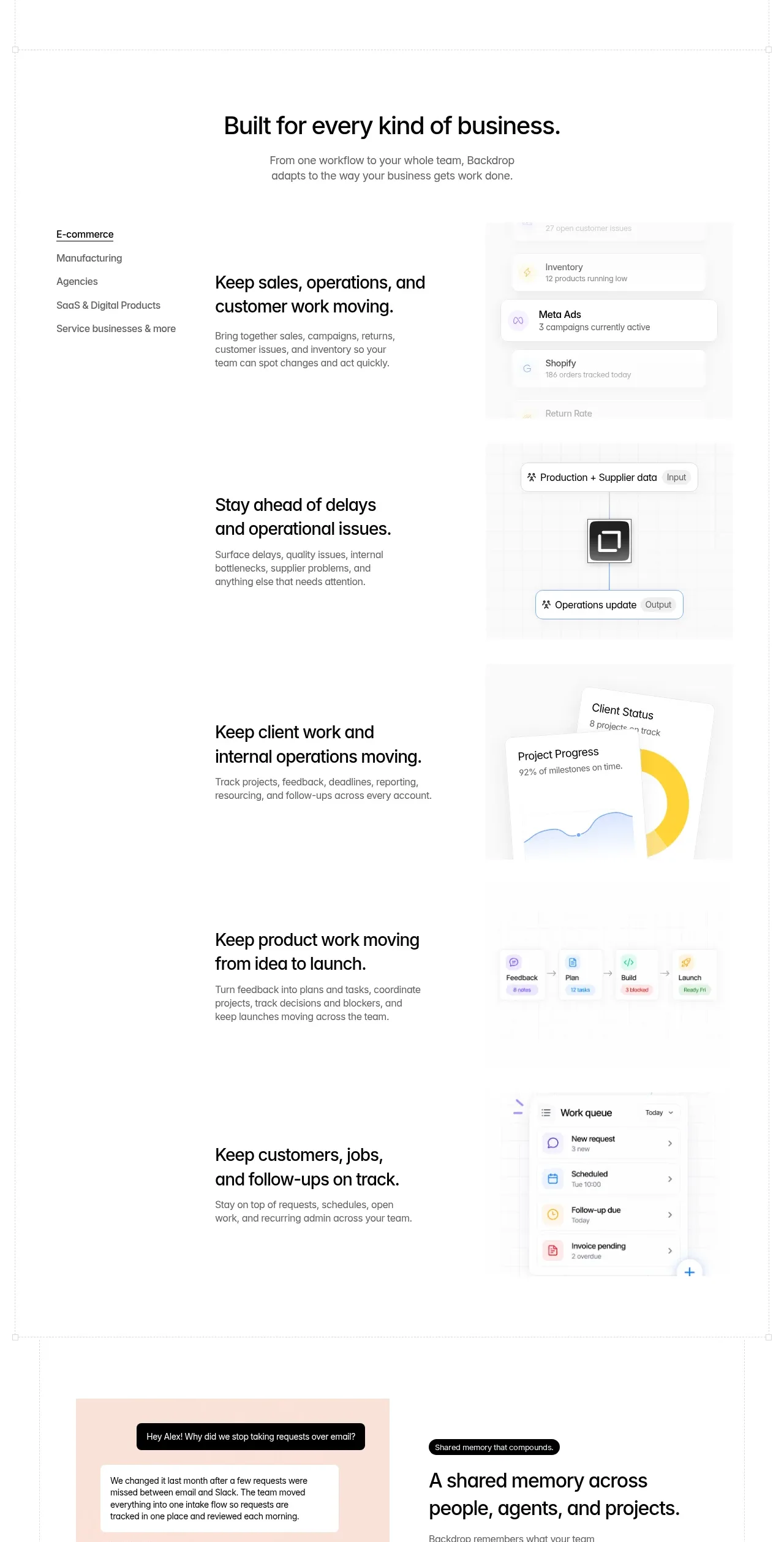
Design analysis
A centered section introduction leads into a vertical set of business use cases with a category rail, explanatory copy, and changing visual panels.
Prompt preview
## Reference images

Study these alongside the description below: hierarchy, rhythm, spacing, colour. Build for the product you are asked about, using this design language.

- Component: https://kage-design-assets.t3.tigrisfiles.io/components/backdrop/a4be162f-a1b8-4e5c-8da7-09cb7d37c0e3-1792130680-5.webp
- Full page it was cut from: https://kage-design-assets.t3.tigrisfiles.io/screenshots/backdrop/a4be162f-a1b8-4e5c-8da7-09cb7d37c0e3-1792130585649-full.webp
- Component on Kage: https://kage.design/component/backdrop-tabs

## Before you start
Ask which industries or use cases the user's product supports and what proof visual belongs to each. Then implement the same information architecture with original content.

Create an industry/use-case section. Begin with a centered headline and short supporting copy. Below it, provide a responsive tab or category navigation on the left and a large content area on the right. Each selected tab should show a concise two-line title, a short paragraph, and a pale product illustration or dashboard panel; stack multiple use-case rows vertically on desktop if the experience is designed as a scroll narrative. Use thin separators, 14–16px body text, strong 28–34px headings, #111111 text, #6f6f6f copy, white background, and very pale #fafafa visual surfaces. Highlight the active tab with underline and darker text, and support keyboard focus, arrow-key navigation, and URL/state persistence where useful.

### Never
- Never use the reference industry labels, product names, dashboard cards, or copy.
- Never use copied screenshots or illustrations.
- Never hide essential content behind tabs without an accessible mobile alternative.
More components
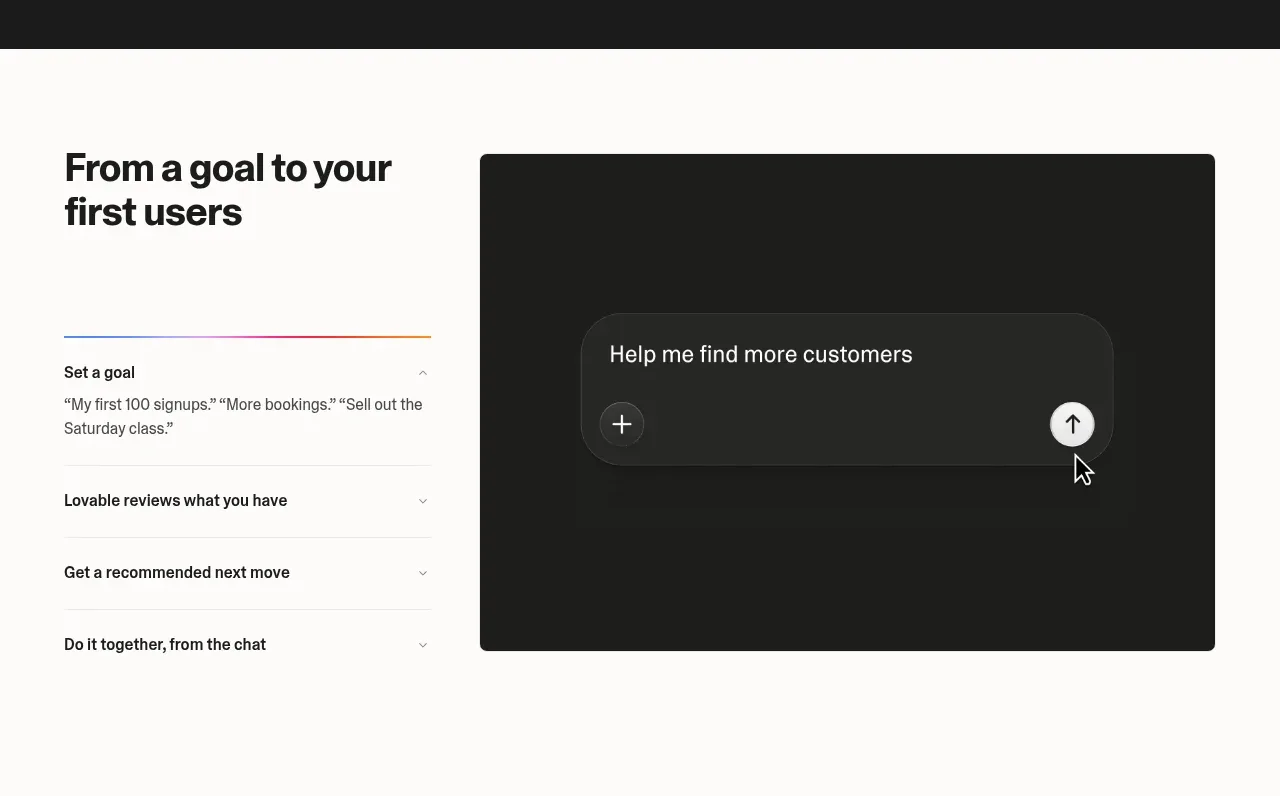
 Goal-to-first-users assistant
Lovable Growth Tools · Tabs & steps
Goal-to-first-users assistant
Lovable Growth Tools · Tabs & steps
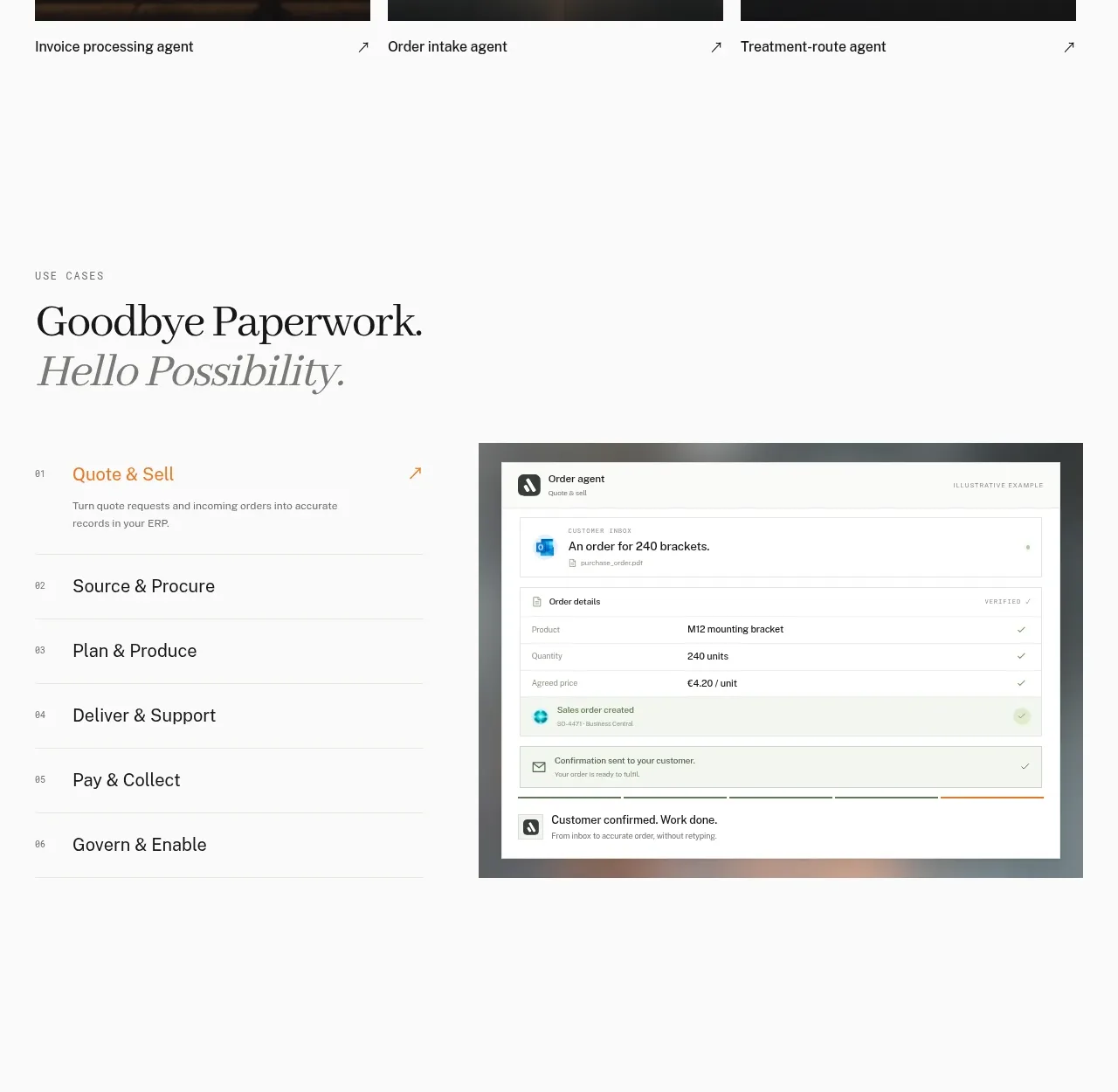
 Workflow stages with product preview
Lleverage · Tabs & steps
Workflow stages with product preview
Lleverage · Tabs & steps
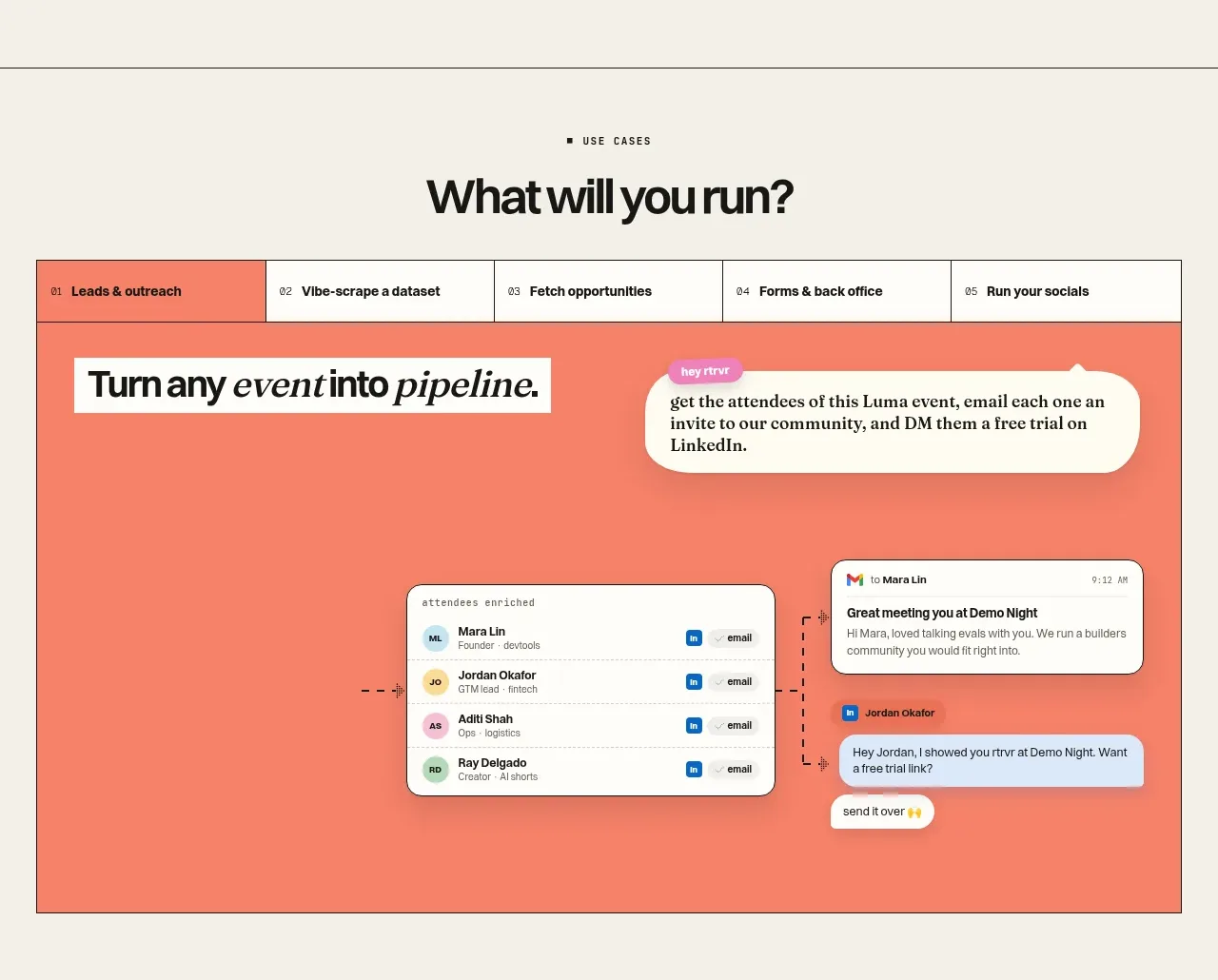
 Use-case selector and interactive showcase
Retriever AI · Tabs & steps
Use-case selector and interactive showcase
Retriever AI · Tabs & steps
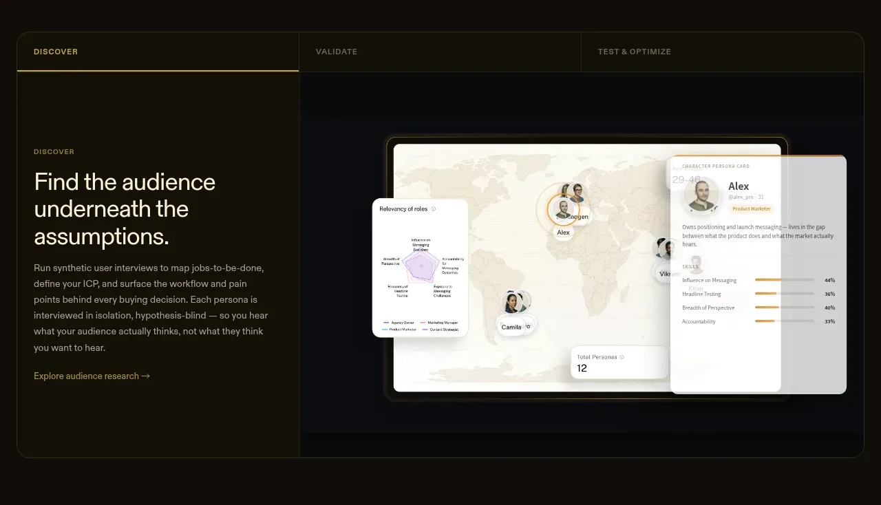
 Tabbed research workflow showcase
Articos MCP · Tabs & steps
Tabbed research workflow showcase
Articos MCP · Tabs & steps
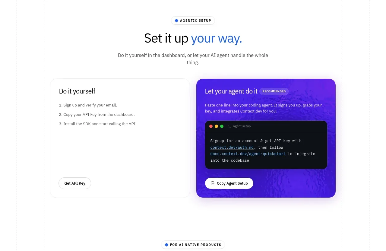
 Self-serve versus assisted setup
Scrape Anything by Context.dev · Tabs & steps
Self-serve versus assisted setup
Scrape Anything by Context.dev · Tabs & steps
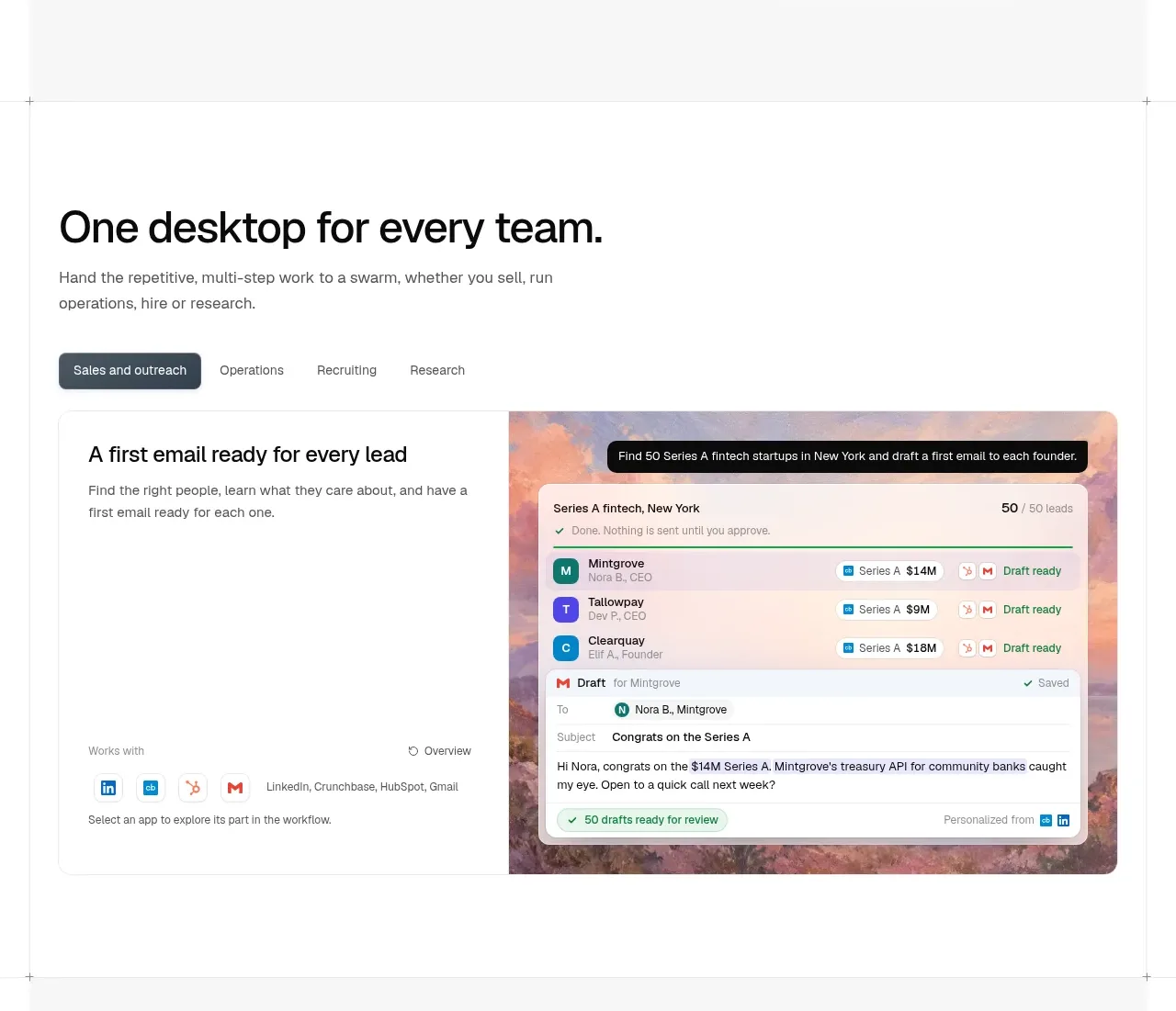
 Team workflow tabs
OpenSwarm · Tabs & steps
Team workflow tabs
OpenSwarm · Tabs & steps