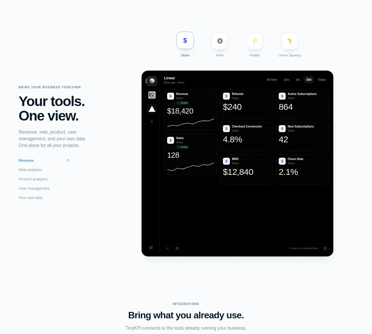
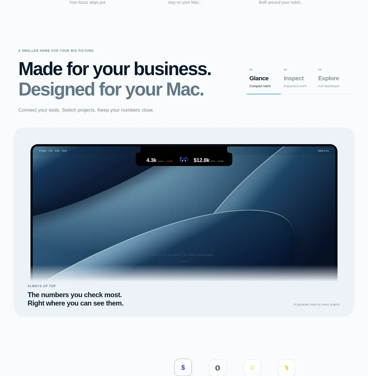
kage
kage
duvi.ai
Design analysis
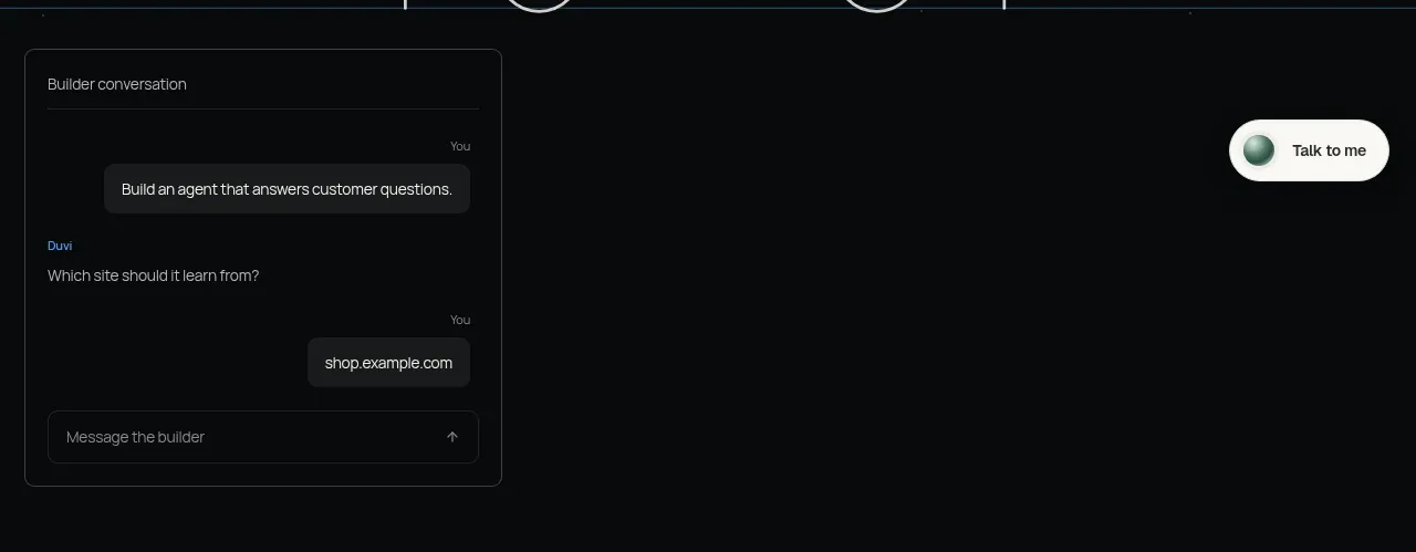
A floating chat-builder card demonstrates the product in use while the rest of the section remains intentionally empty and dark. The compact conversation, input row, and adjacent pill CTA make the product feel directly approachable.
Prompt preview
## Reference images

Study these alongside the description below: hierarchy, rhythm, spacing, colour. Build for the product you are asked about, using this design language.

- Component: https://kage-design-assets.t3.tigrisfiles.io/components/duvi/fdecc34f-2fb4-47cd-8615-09e917d211ca-1789884151-2.webp
- Full page it was cut from: https://kage-design-assets.t3.tigrisfiles.io/screenshots/duvi/fdecc34f-2fb4-47cd-8615-09e917d211ca-1789884106277-full.webp
- Component on Kage: https://kage.design/component/duvi-card

## Before you start
Ask what the user's product, audience, and brand are, then apply these principles to that product rather than reproducing the reference.

Build a dark product-demo section with a single compact conversation card aligned toward the left and a small floating contact/action pill toward the right. The card should have a near-black surface (#0d1011), a 1px charcoal border (#303536), 8–10px radius, a tiny title, subdued metadata, alternating user/assistant bubbles, and a bottom input with a send affordance. Keep the surrounding canvas spacious so the demo feels like an object in a gallery. Use small 11–13px UI typography, pale gray text, muted labels, and one soft mint/blue status glow for the action pill. Include keyboard-accessible input, hover states, and responsive stacking on small screens.

Never use logos, product names, copy, illustrations, or imagery from the reference.