kage
kage
duvi.ai
Design analysis
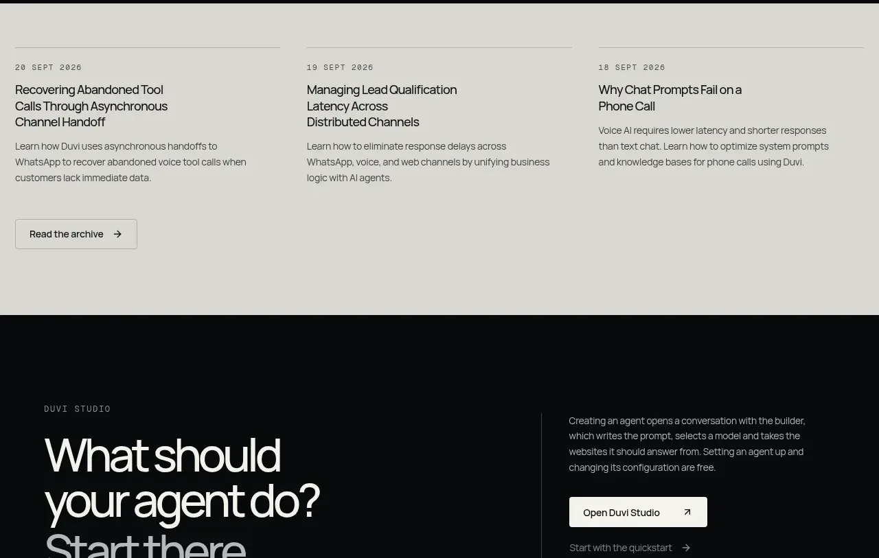
A light neutral band presents three evenly spaced article previews with dates, titles, descriptions, and a single archive button. The tonal inversion creates a calm transition after the dark proof section.
Prompt preview
## Reference images

Study these alongside the description below: hierarchy, rhythm, spacing, colour. Build for the product you are asked about, using this design language.

- Component: https://kage-design-assets.t3.tigrisfiles.io/components/duvi/fdecc34f-2fb4-47cd-8615-09e917d211ca-1789884154-10.webp
- Full page it was cut from: https://kage-design-assets.t3.tigrisfiles.io/screenshots/duvi/fdecc34f-2fb4-47cd-8615-09e917d211ca-1789884106277-full.webp
- Component on Kage: https://kage.design/component/duvi-card-2

## Before you start
Ask what the user's product, audience, and brand are, then apply these principles to that product rather than reproducing the reference.

Create a light resource-preview band that contrasts with the rest of the dark page. Use a warm pale gray background (#deded7), dark charcoal text (#171a1b), and three equal article columns separated by generous whitespace rather than heavy cards. Each item needs a small uppercase date, a compact multi-line title, and a muted description. Add one outlined archive button aligned under the first column or beneath the grid. Use a 3-column CSS grid with 64–96px vertical padding, 1px hairline dividers where useful, 14–16px titles, and 12–13px descriptions. On mobile, stack the articles and keep the button full-width or left-aligned.

Never use logos, product names, copy, illustrations, or imagery from the reference.