 kage
kage
duvi.ai
Design analysis
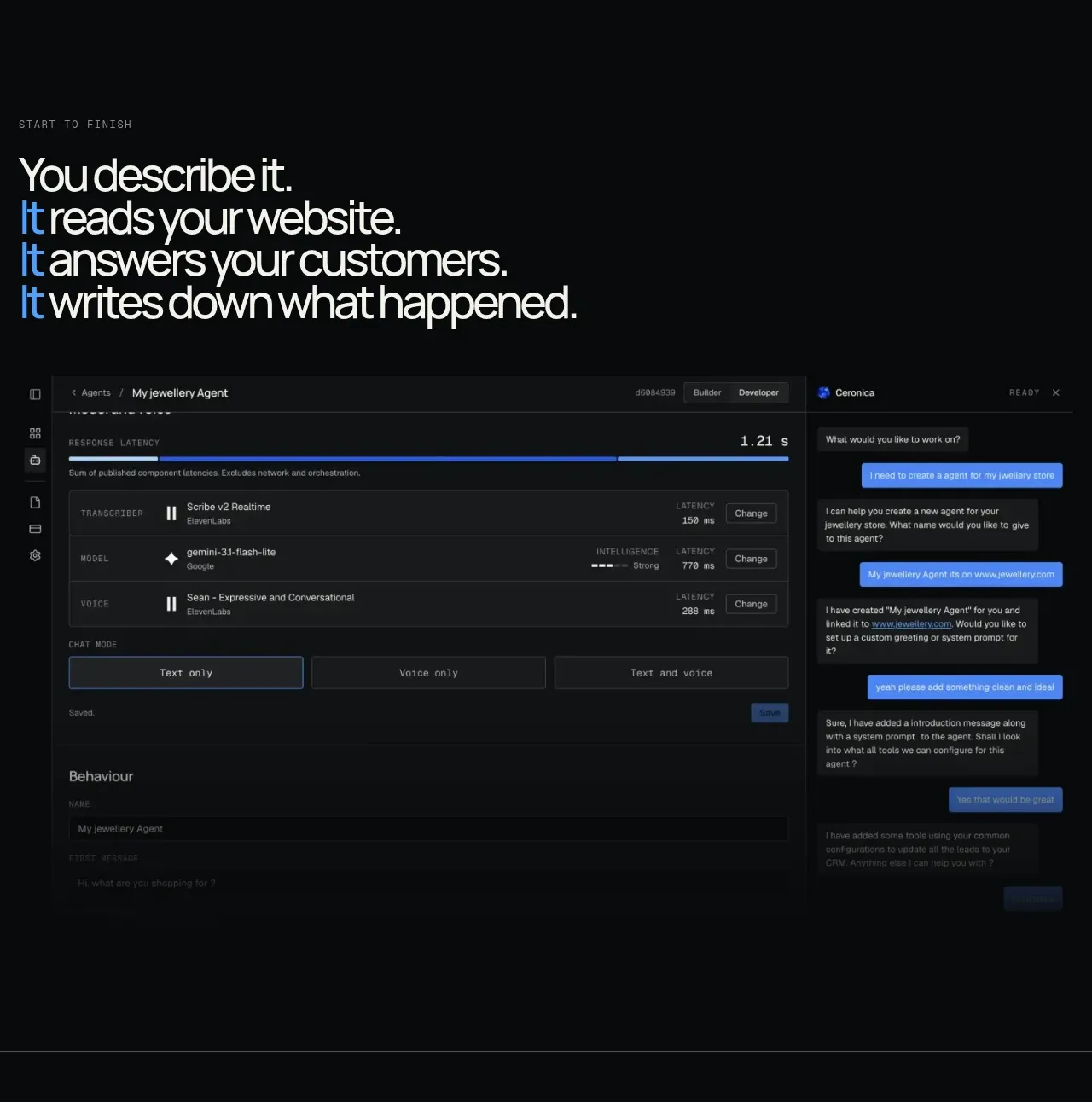
The section begins with a large typographic promise and then shows a wide, dark product workspace with layered configuration and conversation panels. The visual evidence makes the abstract claim tangible.
Prompt preview
## Reference images

Study these alongside the description below: hierarchy, rhythm, spacing, colour. Build for the product you are asked about, using this design language.

- Component: https://kage-design-assets.t3.tigrisfiles.io/components/duvi/fdecc34f-2fb4-47cd-8615-09e917d211ca-1789884152-4.webp
- Full page it was cut from: https://kage-design-assets.t3.tigrisfiles.io/screenshots/duvi/fdecc34f-2fb4-47cd-8615-09e917d211ca-1789884106277-full.webp
- Component on Kage: https://kage.design/component/duvi-feature-grid

## Before you start
Ask what the user's product, audience, and brand are, then apply these principles to that product rather than reproducing the reference.

Build an editorial product-workflow section. Start with a small uppercase eyebrow and a large left-aligned statement made of several short lines, using one accent color to emphasize the recurring action or capability. Below it, place a wide browser-like product mockup: dark chrome, a sidebar, a central configuration/workspace area, and a contrasting conversation panel on the right. Use #0b0e0f, #141819, #252a2b, off-white text, muted gray labels, and a bright but controlled blue (#4f9dff) for active controls. Give panels 6–10px radii, 1px borders, subtle shadows, and dense 12–14px UI typography. Preserve a strong left edge and generous whitespace above the mockup; on mobile, let the mockup scroll horizontally or stack its panels.

Never use logos, product names, copy, illustrations, or imagery from the reference.
More components

 AI-powered helpdesk feature section
intercom.com · Feature grid
AI-powered helpdesk feature section
intercom.com · Feature grid
 Integrations and ecosystem section
intercom.com · Feature grid
Integrations and ecosystem section
intercom.com · Feature grid
 AI agent capabilities section
intercom.com · Feature grid
AI agent capabilities section
intercom.com · Feature grid
 Unified support experience overview
intercom.com · Feature grid
Unified support experience overview
intercom.com · Feature grid

 Core invoicing capabilities
sendinvo.com · Feature grid
Core invoicing capabilities
sendinvo.com · Feature grid
 Audience and trade types
sendinvo.com · Feature grid
Audience and trade types
sendinvo.com · Feature grid