 kage
kage
duvi.ai
Design analysis
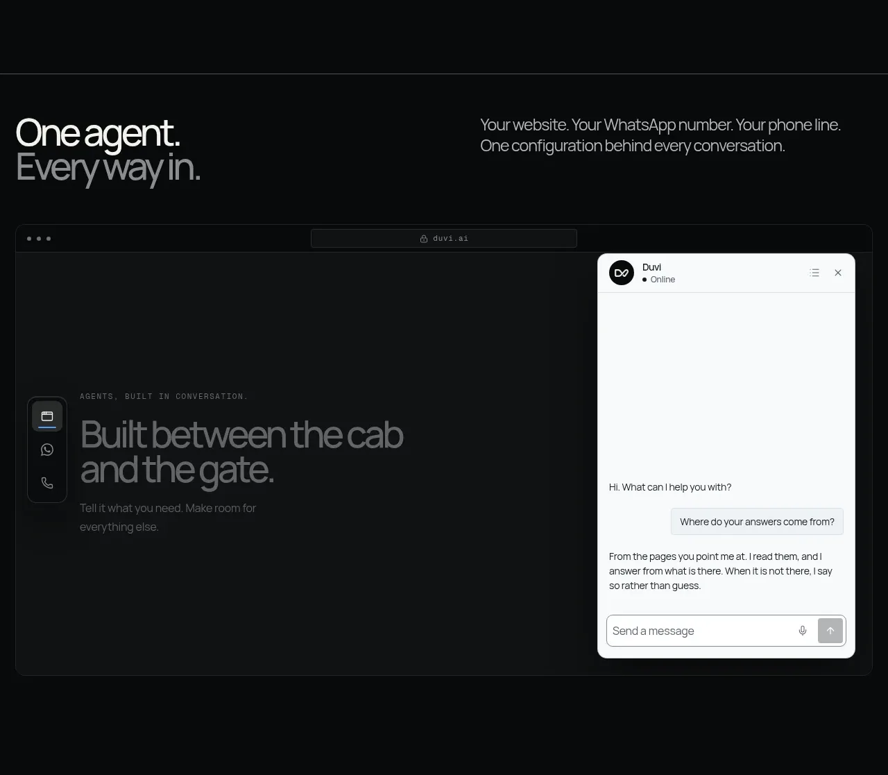
A two-column feature block pairs a large claim and explanatory copy with a browser/chat widget demonstration. The contrast between the dark browser frame and bright chat panel makes the integration immediately legible.
Prompt preview
## Reference images

Study these alongside the description below: hierarchy, rhythm, spacing, colour. Build for the product you are asked about, using this design language.

- Component: https://kage-design-assets.t3.tigrisfiles.io/components/duvi/fdecc34f-2fb4-47cd-8615-09e917d211ca-1789884152-5.webp
- Full page it was cut from: https://kage-design-assets.t3.tigrisfiles.io/screenshots/duvi/fdecc34f-2fb4-47cd-8615-09e917d211ca-1789884106277-full.webp
- Component on Kage: https://kage.design/component/duvi-feature-grid-2

## Before you start
Ask what the user's product, audience, and brand are, then apply these principles to that product rather than reproducing the reference.

Create a two-column feature section on a dark canvas. Put a large, compact headline and one paragraph in the left column; place a wide browser frame or channel mockup in the right or lower area. Inside the mockup, show a dark webpage with a bright, rounded chat panel overlay and a slim vertical channel selector. Use a near-black base, charcoal frame borders, soft white typography, and a near-white chat surface (#f3f4f1) with dark text; reserve blue or mint for status and active states. Use a 55/45 or 50/50 grid, 80–120px section padding, 12–16px body text, and 10–14px radii. The chat panel should look functional with header, transcript, and input affordance, and should adapt to a stacked mobile layout.

Never use logos, product names, copy, illustrations, or imagery from the reference.
More components

 AI-powered helpdesk feature section
intercom.com · Feature grid
AI-powered helpdesk feature section
intercom.com · Feature grid
 Integrations and ecosystem section
intercom.com · Feature grid
Integrations and ecosystem section
intercom.com · Feature grid
 AI agent capabilities section
intercom.com · Feature grid
AI agent capabilities section
intercom.com · Feature grid
 Unified support experience overview
intercom.com · Feature grid
Unified support experience overview
intercom.com · Feature grid

 Core invoicing capabilities
sendinvo.com · Feature grid
Core invoicing capabilities
sendinvo.com · Feature grid
 Audience and trade types
sendinvo.com · Feature grid
Audience and trade types
sendinvo.com · Feature grid