 kage
kage
duvi.ai
Design analysis
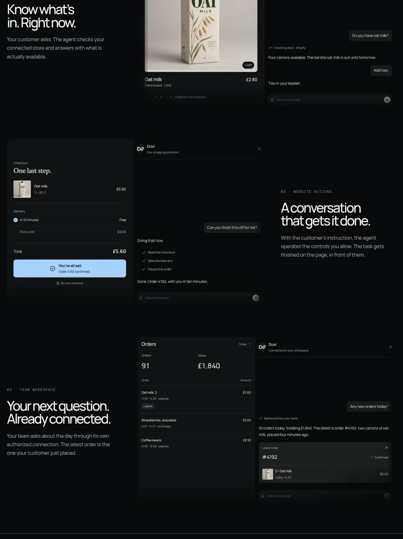
Two sequential product stories show the assistant completing an action and then connecting the team to resulting orders. Each uses text beside dark interface mockups, creating a clear progression from action to shared visibility.
Prompt preview
## Reference images

Study these alongside the description below: hierarchy, rhythm, spacing, colour. Build for the product you are asked about, using this design language.

- Component: https://kage-design-assets.t3.tigrisfiles.io/components/duvi/fdecc34f-2fb4-47cd-8615-09e917d211ca-1789884153-7.webp
- Full page it was cut from: https://kage-design-assets.t3.tigrisfiles.io/screenshots/duvi/fdecc34f-2fb4-47cd-8615-09e917d211ca-1789884106277-full.webp
- Component on Kage: https://kage.design/component/duvi-feature-grid-4

## Before you start
Ask what the user's product, audience, and brand are, then apply these principles to that product rather than reproducing the reference.

Build a vertically generous feature-story section with two related rows. Row one should show a checkout/task-completion interface and assistant transcript, with explanatory text aligned beside it. Row two should show a compact orders table beside a team conversation panel, with a second explanatory text block. Use a 2-column editorial grid, alternating media/text emphasis between rows, and 72–120px gaps. The UI should be dark (#0b0e0f) with #171b1c panels, 1px #2b3031 borders, 8px radii, small gray metadata, and pale text. Use sky blue (#77b8ff) only for completed actions and primary confirmations. Make tables readable with row separators and clear numeric hierarchy; provide horizontal scrolling on mobile.

Never use logos, product names, copy, illustrations, or imagery from the reference.
More components

 AI-powered helpdesk feature section
intercom.com · Feature grid
AI-powered helpdesk feature section
intercom.com · Feature grid
 Integrations and ecosystem section
intercom.com · Feature grid
Integrations and ecosystem section
intercom.com · Feature grid
 AI agent capabilities section
intercom.com · Feature grid
AI agent capabilities section
intercom.com · Feature grid
 Unified support experience overview
intercom.com · Feature grid
Unified support experience overview
intercom.com · Feature grid

 Core invoicing capabilities
sendinvo.com · Feature grid
Core invoicing capabilities
sendinvo.com · Feature grid
 Audience and trade types
sendinvo.com · Feature grid
Audience and trade types
sendinvo.com · Feature grid