kage
kage
duvi.ai
Design analysis
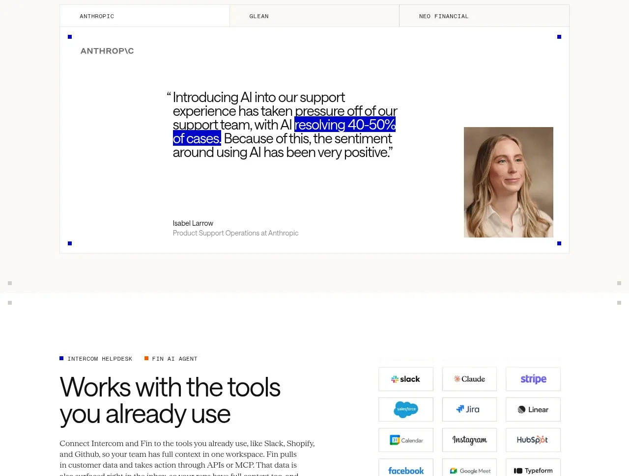
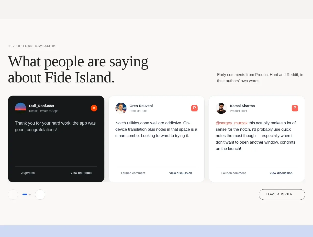
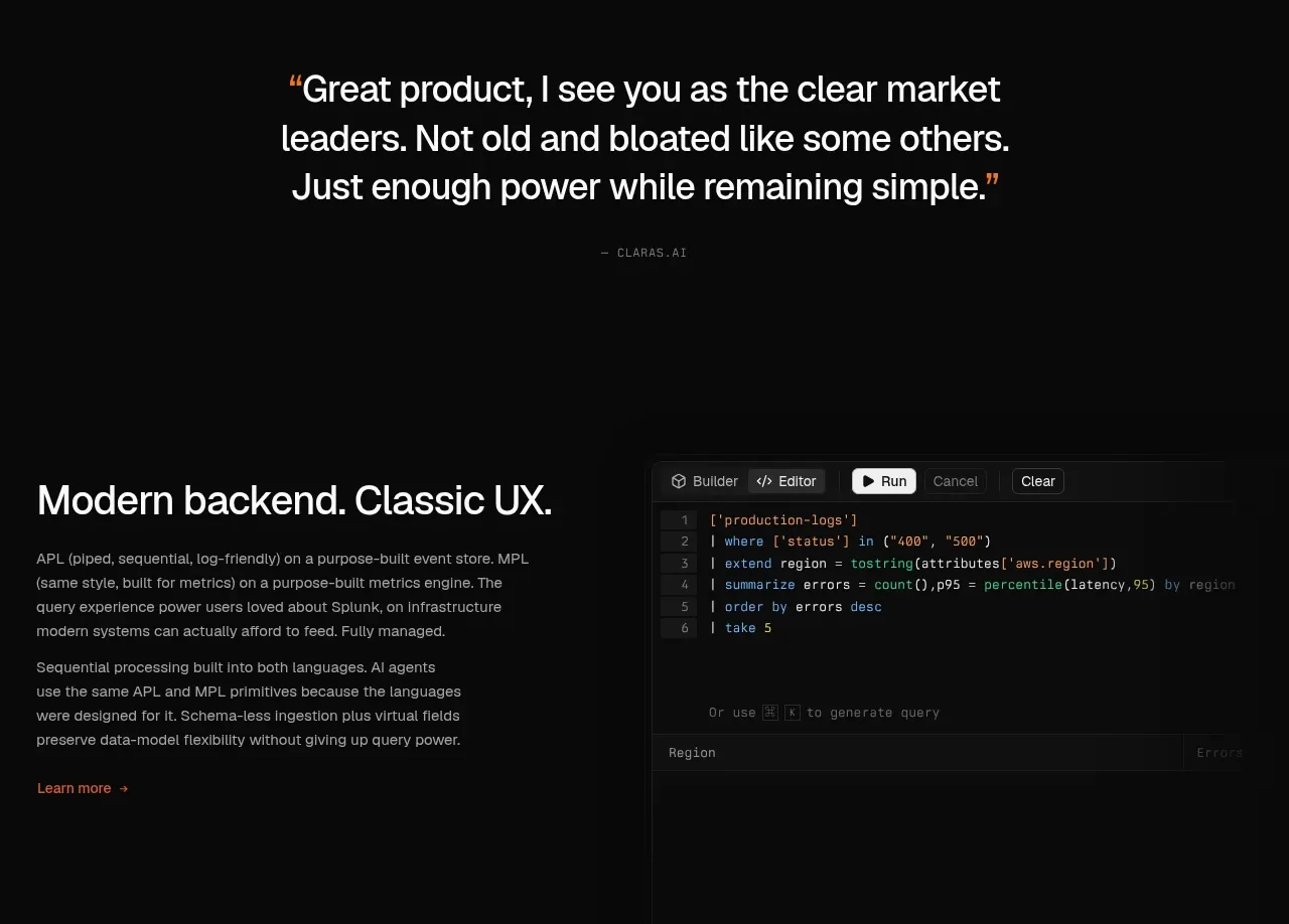
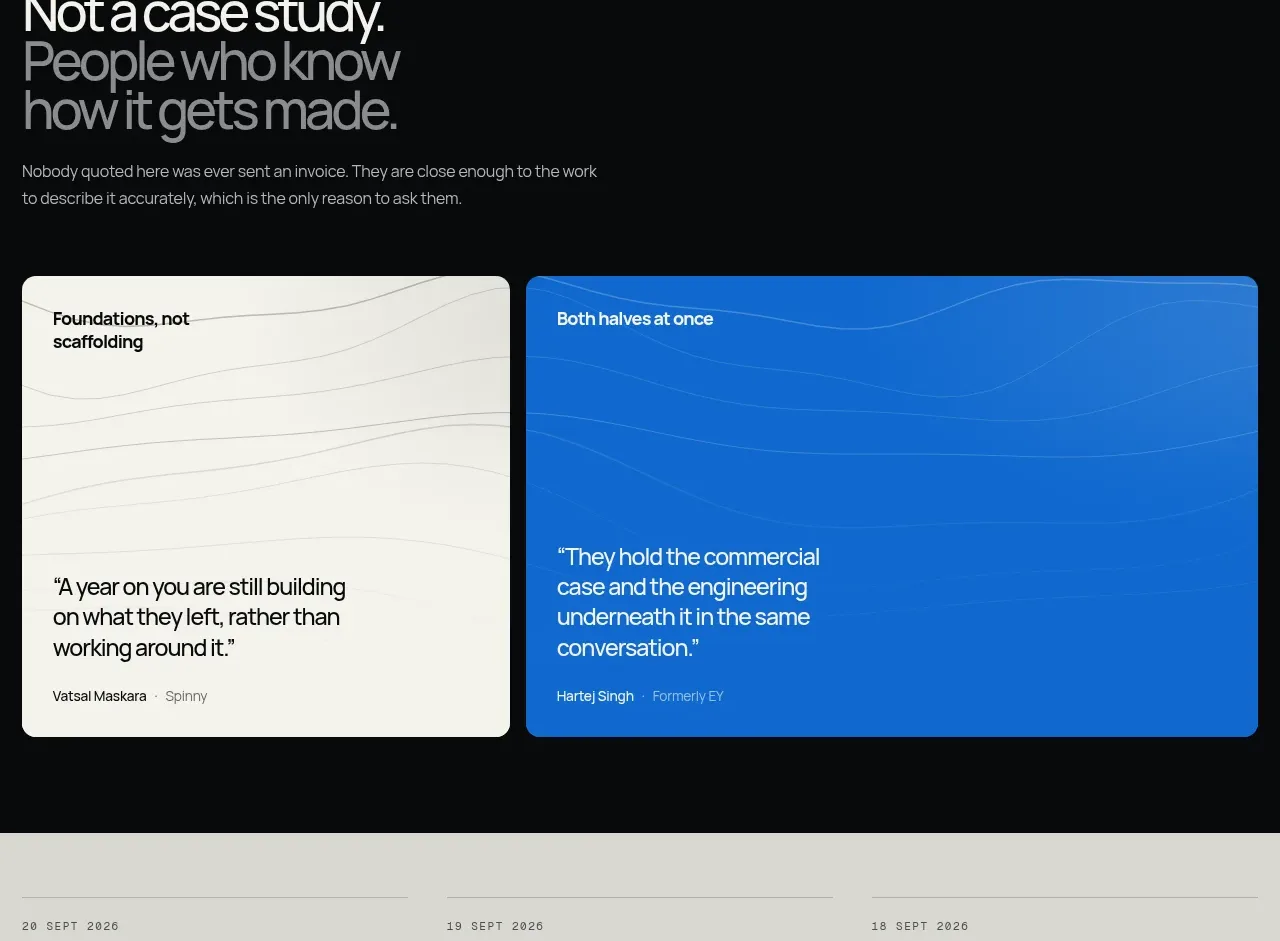
A bold introductory statement sets up two oversized quote cards, one warm and one electric blue. The contrasting surfaces and sparse attribution give the testimonials an editorial, high-confidence feel.
Prompt preview
## Reference images

Study these alongside the description below: hierarchy, rhythm, spacing, colour. Build for the product you are asked about, using this design language.

- Component: https://kage-design-assets.t3.tigrisfiles.io/components/duvi/fdecc34f-2fb4-47cd-8615-09e917d211ca-1789884153-9.webp
- Full page it was cut from: https://kage-design-assets.t3.tigrisfiles.io/screenshots/duvi/fdecc34f-2fb4-47cd-8615-09e917d211ca-1789884106277-full.webp
- Component on Kage: https://kage.design/component/duvi-testimonials

## Before you start
Ask what the user's product, audience, and brand are, then apply these principles to that product rather than reproducing the reference.

Build a testimonial section on a dark background. Begin with a large headline where the second line is gray, followed by a short supporting sentence. Below, place two equal-width quote cards with generous height and internal whitespace. Give one a warm off-white surface (#eeeee7) with near-black text and delicate wavy line texture; give the other a vivid blue surface (#176fd4) with white text and an extremely subtle tonal texture. Use 16–20px quote text, compact bold card titles, and small attribution text at the bottom. Use 14px corner radii, a 12–20px gap, and stack cards on mobile. Ensure contrast and semantic blockquote markup.

Never use logos, product names, copy, illustrations, or imagery from the reference.