 kage
kage
elevenlabs.io

Design analysis
A restrained editorial update section pairs a short introductory block with two compact, image-led announcement cards. The strong grid, generous whitespace, pill-shaped date labels, and quiet neutral styling make the content feel premium while keeping the calls to action easy to scan.
Prompt preview
## Reference images

Study these alongside the description below: hierarchy, rhythm, spacing, colour. Build for the product you are asked about, using this design language.

- Component: https://kage-design-assets.t3.tigrisfiles.io/components/elevenlabs-io/25703c4f-1ec9-434f-a8f0-8548c2191604-1789060953-8.webp
- Full page it was cut from: https://kage-design-assets.t3.tigrisfiles.io/screenshots/elevenlabs-io/25703c4f-1ec9-434f-a8f0-8548c2191604-1789060912-full.webp
- Component on Kage: https://kage.design/component/elevenlabs-chart

## Before you start
Ask the user what their product does, who it is for, and what brand personality, colours, typography, and content they want to use. Then apply the principles below to their product rather than reproducing the reference.

## Build this component
Create a responsive editorial updates section for the user's product. It should combine a brief introductory statement and primary link on the left with a two-card announcement grid on the right. The section should feel like a calm, high-end product website: content-led, spacious, precise, and visually light.

### Layout and alignment
- Place the component inside a wide centered container with a maximum width of approximately 1120–1200px and comfortable horizontal padding.
- Use a two-column desktop layout: a narrow left column of roughly 32–36% and a wider right column for two equal cards with a small gap between them.
- Align the introductory copy near the top of the cards, while allowing the call-to-action to sit lower in the left column so the composition has intentional vertical breathing room.
- On smaller screens, collapse to one column. Show the intro first, then stack the cards with consistent spacing.
- Keep card image areas equal in height and card widths equal. Avoid dense dashboard-style alignment; this is an editorial module.

### Typography hierarchy
- Use the product’s own font or a clean contemporary sans-serif.
- Intro copy: medium-sized body text, approximately 17–19px desktop, with a 1.35–1.5 line height and a restrained text measure of 300–360px.
- Card titles: 14–16px, medium weight, with compact line height.
- Date labels: 12–13px, medium weight, subdued but readable.
- Use near-black text for primary copy and a soft grey for metadata. Do not use oversized headings inside the cards.

### Spacing
- Give the section generous vertical padding, approximately 64–104px depending on the surrounding page.
- Use a 16–20px gap between the two cards and 24–32px between each card’s image and metadata area only where appropriate.
- Add 20–24px internal padding to the card title row.
- Keep the left CTA clearly separated from the introductory paragraph, using roughly 72–120px of vertical space on desktop when the layout allows.

### Colour and surfaces
- Use the user’s brand palette, but start from an understated base: page background around #FFFFFF or #FAFAF9, card footer around #FFFFFF, and primary text around #111111.
- Give each card a distinctive but brand-appropriate visual image or generative texture area. Use abstract colour fields, gradients, patterns, or product-relevant visualisations rather than literal stock photography.
- Keep image treatments contained within the card and ensure their contrast supports the date pill and title.
- Metadata can use a neutral grey around #777777; borders should be a very light grey around #E5E5E2.

### Borders and radius
- Use a subtle 1px border around each card, such as #E4E4E1, with a soft shadow only if the user’s brand calls for it.
- Use a moderately rounded card radius of approximately 16–20px and clip the image to the top corners.
- Style the date as a small white or brand-tinted pill with a 999px radius, light border or shadow, and compact horizontal padding.
- Style the CTA as a rounded outline or neutral pill button with a thin border, approximately 999px radius, and a small directional arrow or icon.

### Interaction
- Make the full card clickable if the product supports detail pages; otherwise make the title and image link together.
- On hover, slightly raise or brighten the card, subtly scale or shift the visual area, and preserve fast, restrained motion around 150–220ms.
- Make the CTA visibly respond to hover and keyboard focus without relying on colour alone.
- Ensure cards have clear focus-visible states and that date pills do not obscure important image content.

### Responsive and accessibility requirements
- Maintain readable text and sufficient contrast at all breakpoints.
- Stack the cards below the intro on narrow screens, with the CTA following the intro rather than floating beside it.
- Use semantic section, heading, list, article, and link elements where suitable.
- Provide meaningful alt text for any non-decorative card visuals; mark purely decorative textures as decorative.

## Never
- Never copy the reference site’s logos, product names, wording, dates, or announcement titles.
- Never reuse the reference’s exact artwork, gradients, patterns, illustrations, or imagery.
- Never assume the user’s brand is related to voice, audio, AI, or research.
- Never reproduce the reference layout so literally that it becomes a clone; adapt the structure, proportions, content, and visual language to the user’s product.
- Never use placeholder copy that mentions the reference product.
More components
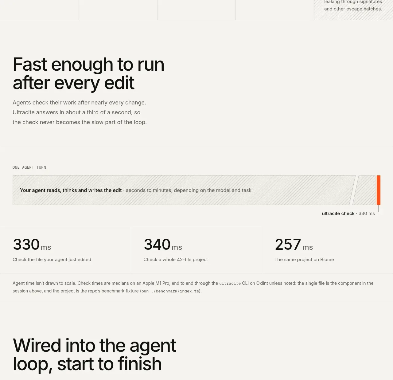
 Fast feedback timing comparison
Ultracite v8 · Chart
Fast feedback timing comparison
Ultracite v8 · Chart
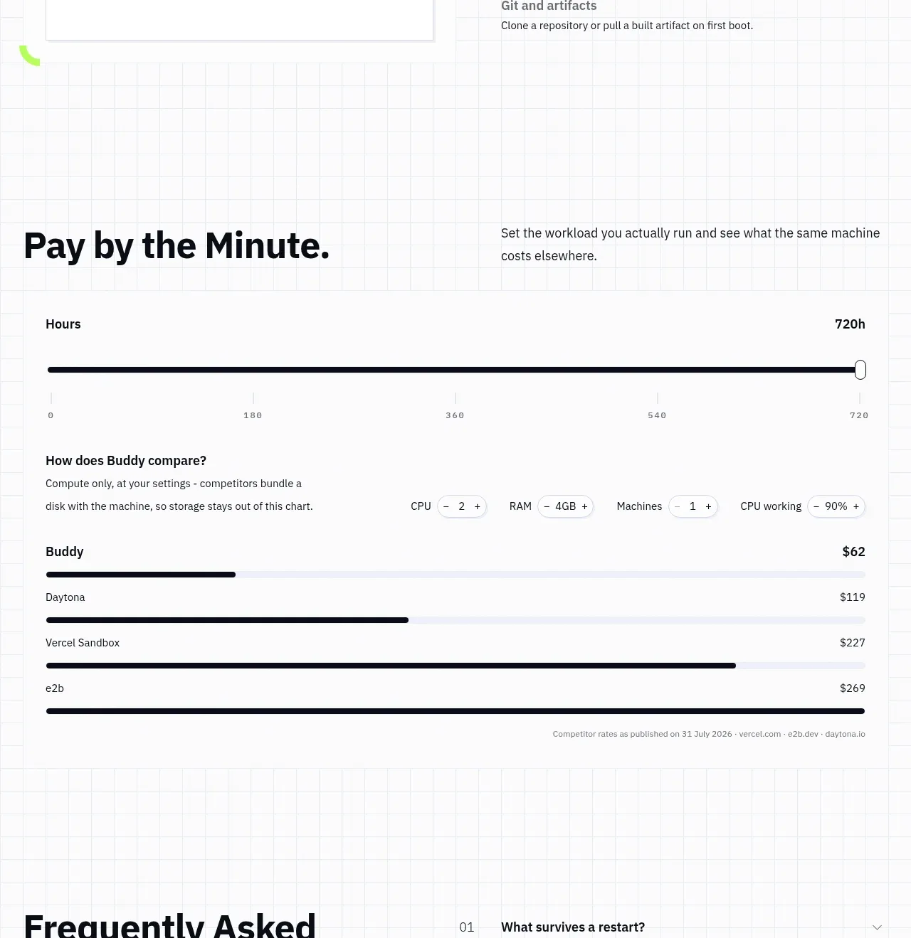
 Usage and cost comparison
AI Sandboxes by Buddy · Chart
Usage and cost comparison
AI Sandboxes by Buddy · Chart

 Time-to-impact comparison
Agent Craft · Chart
Time-to-impact comparison
Agent Craft · Chart

 Performance comparison chart
Request Eagle · Chart
Performance comparison chart
Request Eagle · Chart
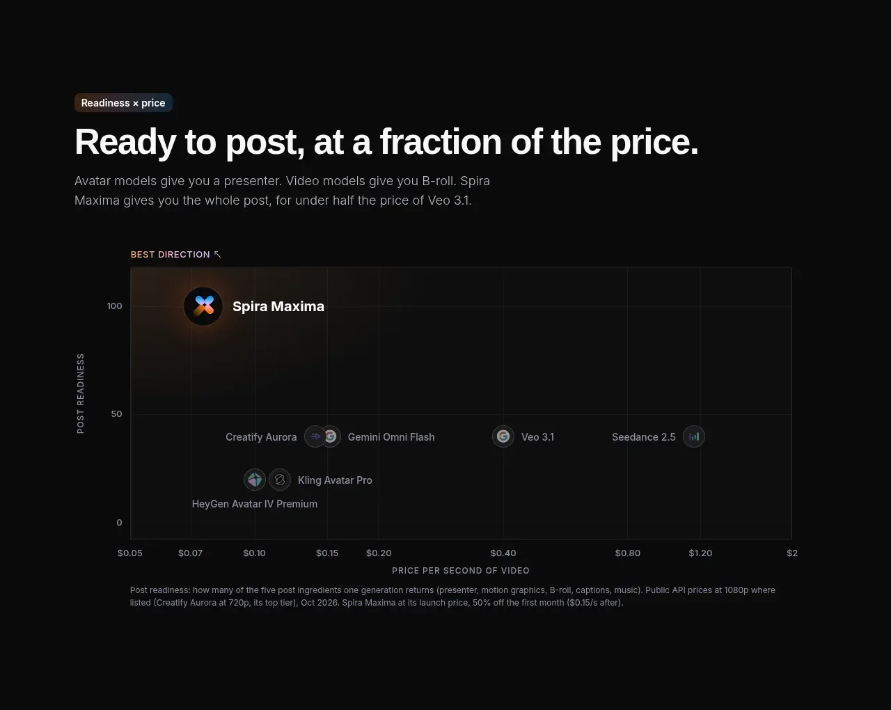
 Value positioning scatter chart
Spira Maxima · Chart
Value positioning scatter chart
Spira Maxima · Chart
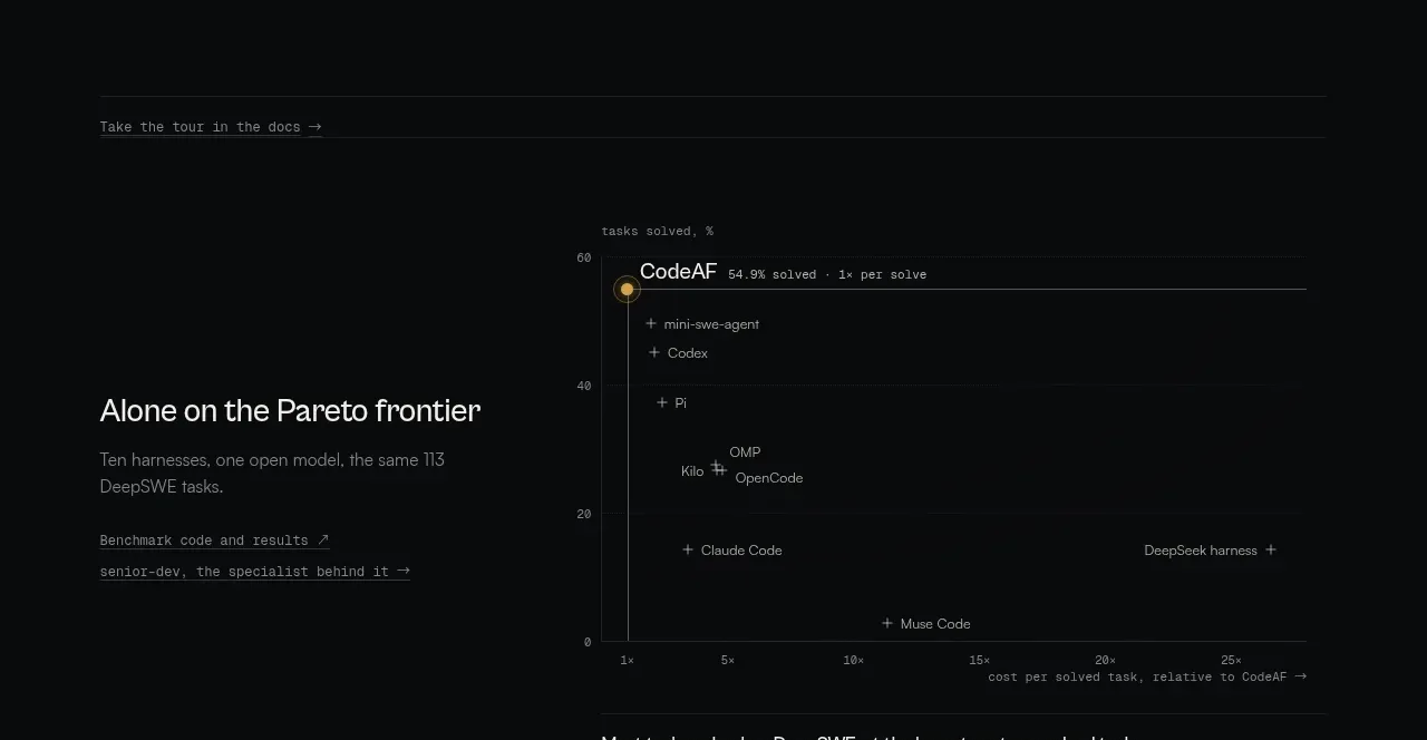
 Benchmark and Pareto proof
CodeAF · Chart
Benchmark and Pareto proof
CodeAF · Chart