 kage
kage
getelva.ai
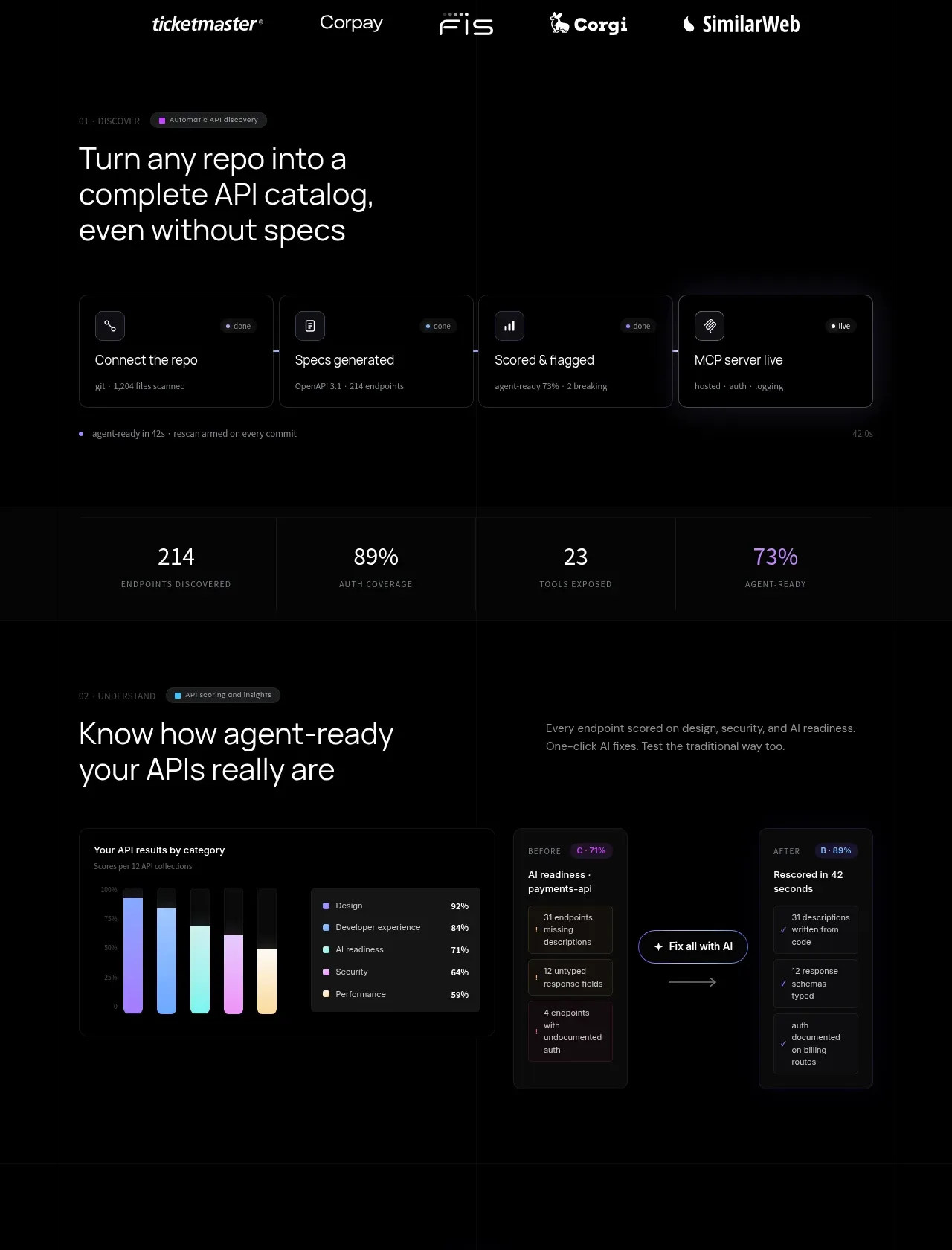
Design analysis
This product-proof band moves from automatic API discovery to readiness scoring, using compact feature cards, headline metrics, and a before/after diagnostic interface. The repeated dark surfaces make a complex workflow scannable.
Prompt preview
## Reference images

Study these alongside the description below: hierarchy, rhythm, spacing, colour. Build for the product you are asked about, using this design language.

- Component: https://kage-design-assets.t3.tigrisfiles.io/components/elva/1eb2f570-9576-4b74-bb9a-568459f8b568-1789452092-3.webp
- Full page it was cut from: https://kage-design-assets.t3.tigrisfiles.io/screenshots/elva/1eb2f570-9576-4b74-bb9a-568459f8b568-1789452038199-full.webp
- Component on Kage: https://kage.design/component/elva-feature-grid

## Before you start
Ask what workflow the user's product automates, what measurable outcomes matter, and which product screens best demonstrate it. Adapt this multi-step proof section to those answers.

Build a dark feature section with two stacked stages. Start each stage with a small uppercase eyebrow and a large 36–48px heading, using a two-column heading/copy layout. Below the first heading, show four compact connected cards representing sequential workflow steps; use #0b0b0e surfaces, #24242a borders, 12px radius, small line icons, and concise metadata. Follow with a horizontal metric bar containing 3–4 large values and tiny uppercase labels, divided by 1px #24242a rules. The second stage should pair a dark chart/card on the left with a before/after diagnostic panel on the right. Use near-black #070708, gray #9a9aa3, white #eeeeef, and one restrained violet accent around #9b7cff plus a small cyan or mint success accent. Maintain 32–56px gaps between stages and 80–120px section padding. Make cards responsive: stack the diagnostic columns on mobile and preserve readable chart labels.

Never use logos, product names, copy, illustrations, or imagery from the reference.







