 kage
kage
getelva.ai
Design analysis
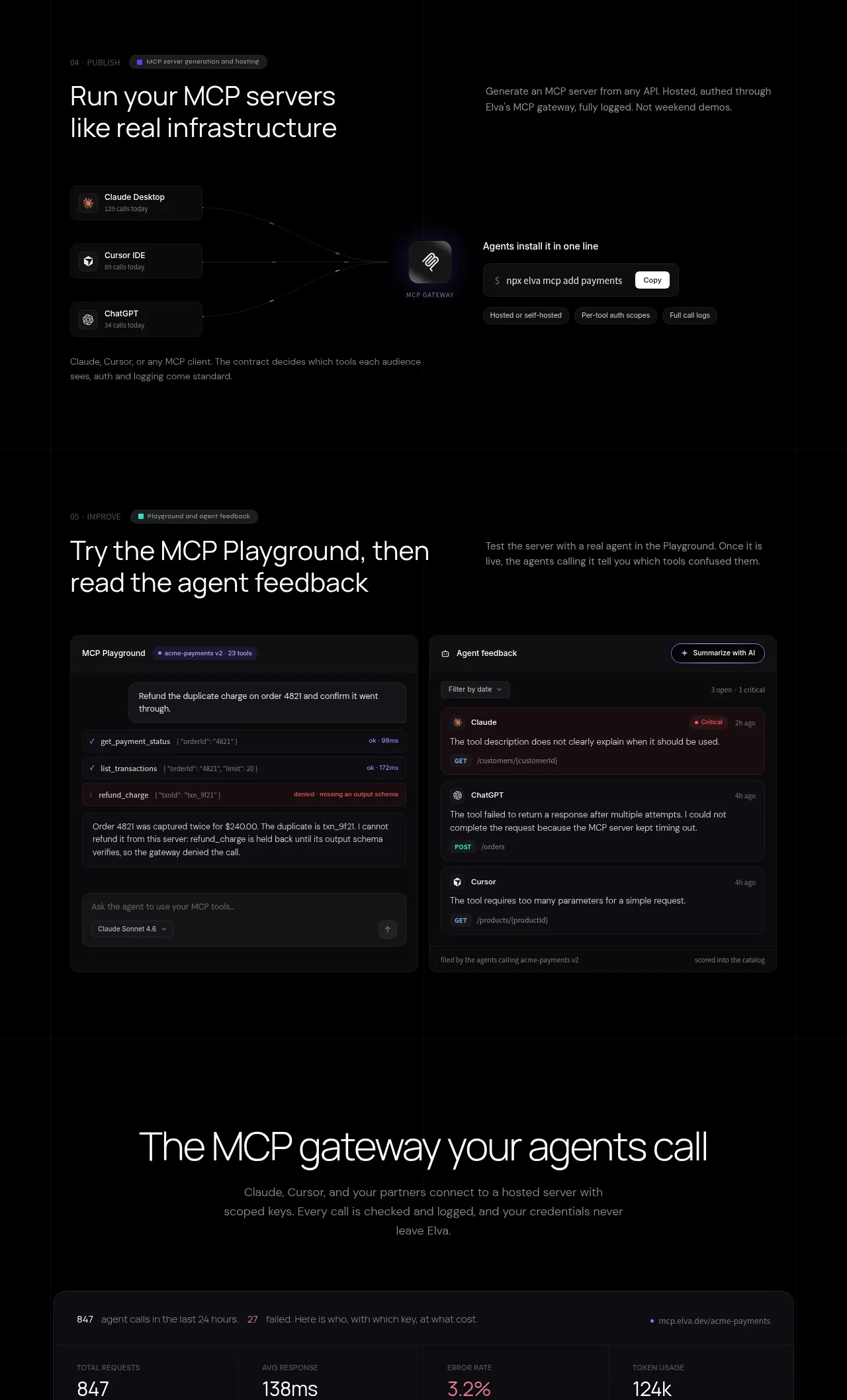
This band first shows how multiple agent clients connect through a gateway, then gives users a playground and feedback surface. The paired interface panels communicate infrastructure plus hands-on iteration.
Prompt preview
## Reference images

Study these alongside the description below: hierarchy, rhythm, spacing, colour. Build for the product you are asked about, using this design language.

- Component: https://kage-design-assets.t3.tigrisfiles.io/components/elva/1eb2f570-9576-4b74-bb9a-568459f8b568-1789452093-5.webp
- Full page it was cut from: https://kage-design-assets.t3.tigrisfiles.io/screenshots/elva/1eb2f570-9576-4b74-bb9a-568459f8b568-1789452038199-full.webp
- Component on Kage: https://kage.design/component/elva-feature-grid-3

## Before you start
Ask what integrations your product supports, how users test them, and what feedback loop proves quality. Then use this paired demonstration pattern with the user's own concepts.

Build a two-stage dark feature section. Stage one uses a split layout: a short heading and description on the left, and a flow diagram on the right with 2–3 client cards converging into a central gateway card and then a command/action card. Keep connectors as thin low-contrast lines, not decorative illustrations. Stage two uses a larger 2-column application mockup: an interactive playground panel and an agent feedback panel. Use #0a0a0c surfaces, #1f1f25 borders, 14px radii, subtle inset shadows, and tiny badges for live, warning, or critical states. Typography should be 12px UI labels, 14px interface text, and 38–48px section headings. Keep primary accents violet (#987bff), success mint (#60d7b0), and warnings muted coral (#db6f82) against #050506. Add visible controls such as filters, a prompt field, copy/action buttons, and expandable feedback rows. Stack the columns on mobile.

Never use logos, product names, copy, illustrations, or imagery from the reference.







