 kage
kage
getelva.ai
Design analysis
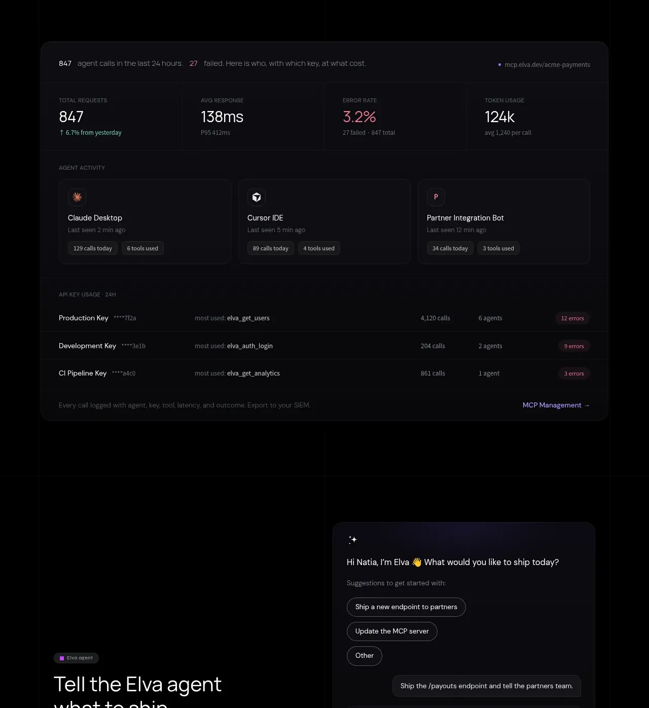
A centered proposition leads into a substantial operations console with request metrics, agent activity, and key usage rows. The section proves that the infrastructure is observable and operationally mature.
Prompt preview
## Reference images

Study these alongside the description below: hierarchy, rhythm, spacing, colour. Build for the product you are asked about, using this design language.

- Component: https://kage-design-assets.t3.tigrisfiles.io/components/elva/1eb2f570-9576-4b74-bb9a-568459f8b568-1789452094-6.webp
- Full page it was cut from: https://kage-design-assets.t3.tigrisfiles.io/screenshots/elva/1eb2f570-9576-4b74-bb9a-568459f8b568-1789452038199-full.webp
- Component on Kage: https://kage.design/component/elva-feature-grid-4

## Before you start
Ask what infrastructure your product operates, which metrics users need at a glance, and which logs or entities they investigate. Adapt this console to those operational needs.

Create a centered dark section with a 44–56px heading, a constrained supporting paragraph, and a wide dashboard card beneath. Use #050506 for the page and #0d0d11 for the console, with a 16px radius, 1px #24242a border, and a very subtle top glow. Inside, place a row of 4 headline metrics with large white values, tiny uppercase labels, and one muted accent value. Follow with 3 compact activity cards in a row, each showing an avatar/icon, last-seen text, and two small pills. Finish with a dense usage table of keys, calls, agents, and error badges. Use 12px labels, 14px values, 24px internal spacing, and faint horizontal rules. Make the table responsive by converting rows into stacked cards on mobile. Include hover highlighting and a clear link to deeper management.

Never use logos, product names, copy, illustrations, or imagery from the reference.







