 kage
kage
getelva.ai
Design analysis
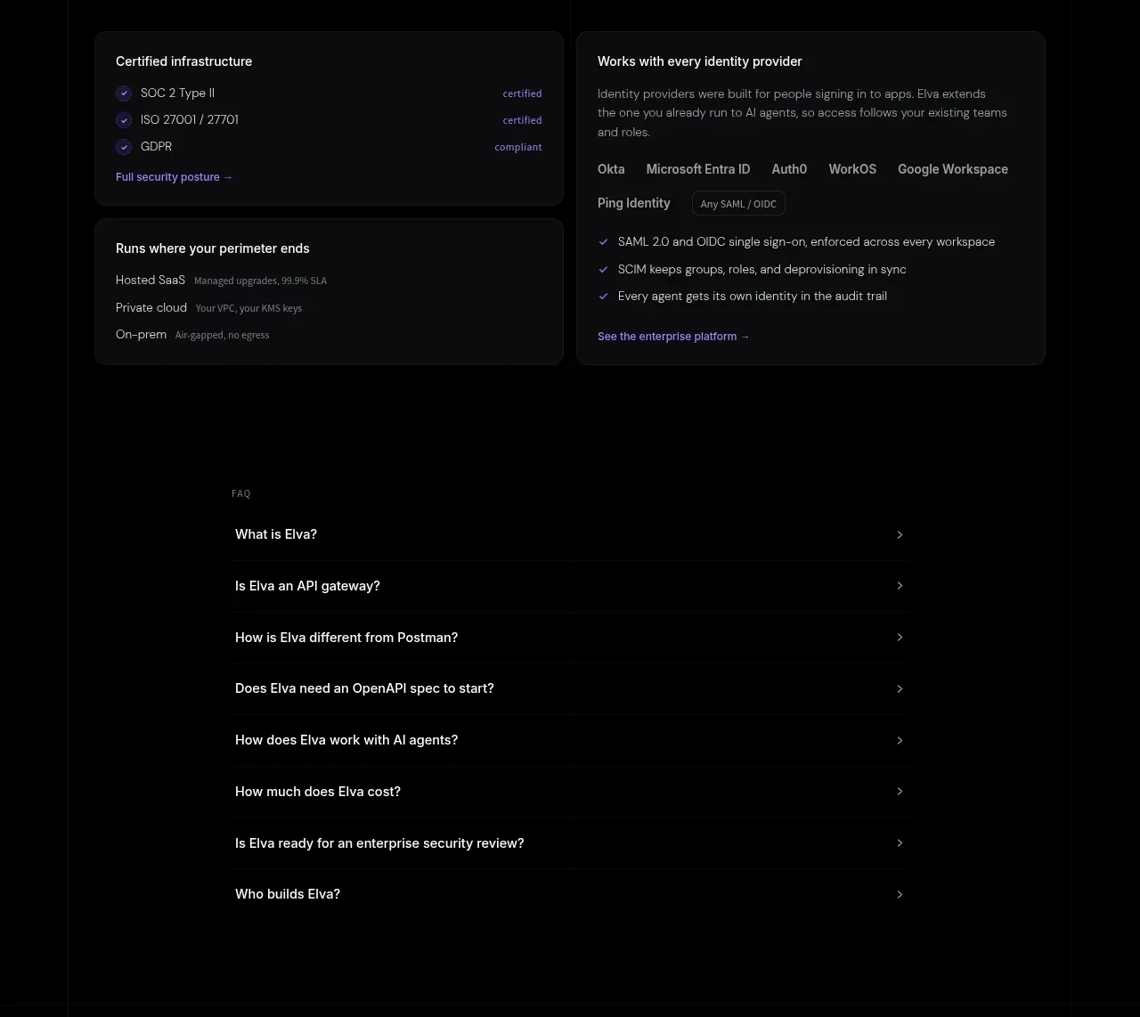
Security proof is presented as practical infrastructure coverage: certification cards, deployment modes, and identity-provider compatibility. The layout favors dense evidence over vague claims.
Prompt preview
## Reference images

Study these alongside the description below: hierarchy, rhythm, spacing, colour. Build for the product you are asked about, using this design language.

- Component: https://kage-design-assets.t3.tigrisfiles.io/components/elva/1eb2f570-9576-4b74-bb9a-568459f8b568-1789452095-9.webp
- Full page it was cut from: https://kage-design-assets.t3.tigrisfiles.io/screenshots/elva/1eb2f570-9576-4b74-bb9a-568459f8b568-1789452038199-full.webp
- Component on Kage: https://kage.design/component/elva-feature-grid-5

## Before you start
Ask what security, compliance, hosting, and identity requirements matter for the user's product and audience. Build an evidence-led section using only claims appropriate to that product.

Create a dark enterprise-security section with a two-column heading row: a 38–48px heading on the left and a concise explanation on the right. Below, use a 2x2 card arrangement. The first card lists certifications with small check icons and status labels; the second explains identity-provider coverage with a compact inline provider list; the lower cards cover hosting/perimeter options and operational controls. Use #0d0d10 cards, #25252b borders, 14px radius, 20–24px padding, and small violet check marks (#9274ff). Keep body text 13–14px in #94949d, headings #ededf0, and status labels in a softer violet or mint. Add a subtle link at the bottom of relevant cards. On mobile use one column and preserve clear grouping.

Never use logos, product names, copy, illustrations, or imagery from the reference.







