kage
kage
getelva.ai
Design analysis
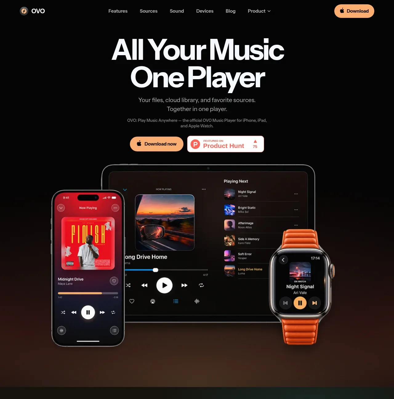
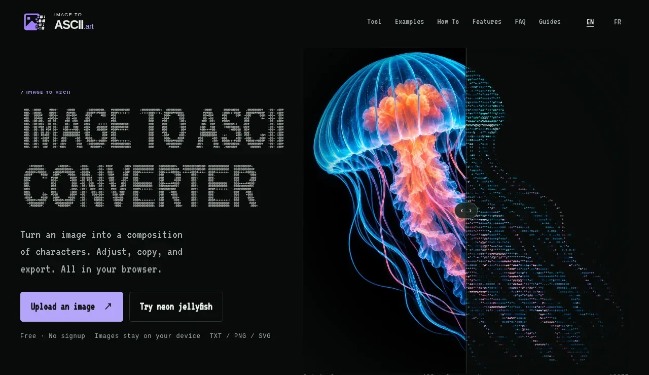
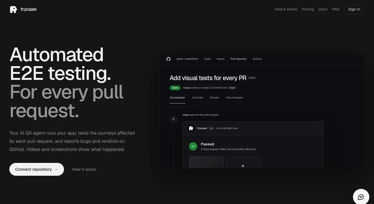
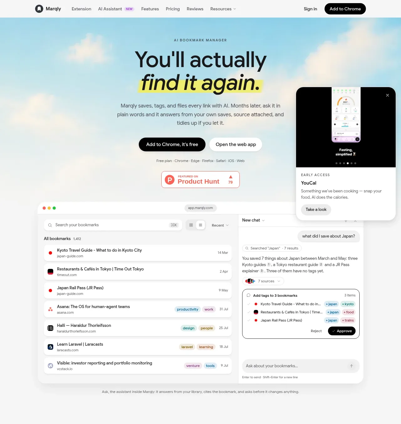
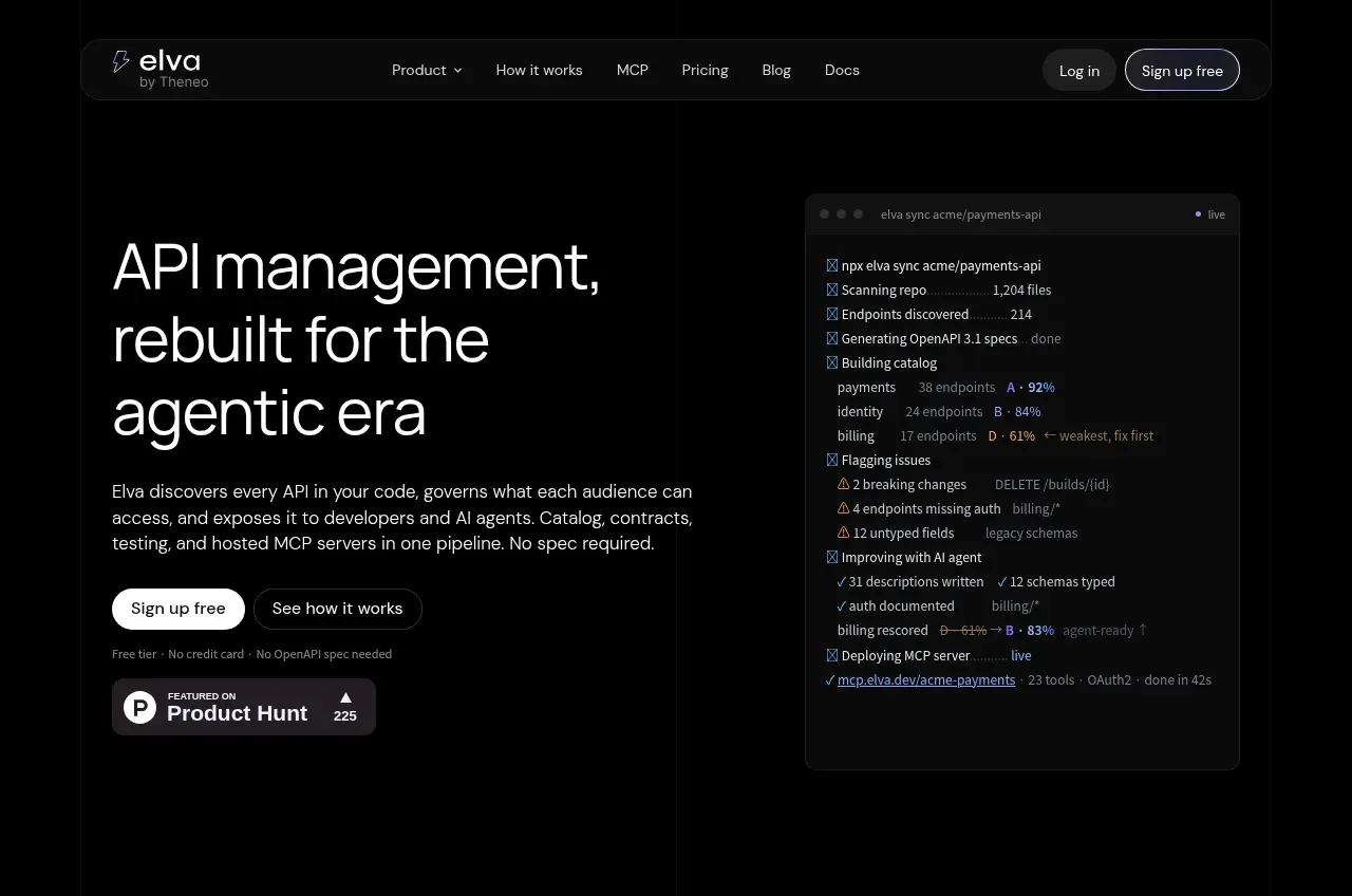
The hero pairs a large, tightly set statement with concise explanatory copy and two CTAs, while a tall dark product-console visual provides concrete proof on the right. The large empty black field makes the interface feel focused and premium.
Prompt preview
## Reference images

Study these alongside the description below: hierarchy, rhythm, spacing, colour. Build for the product you are asked about, using this design language.

- Component: https://kage-design-assets.t3.tigrisfiles.io/components/elva/1eb2f570-9576-4b74-bb9a-568459f8b568-1789452091-1.webp
- Full page it was cut from: https://kage-design-assets.t3.tigrisfiles.io/screenshots/elva/1eb2f570-9576-4b74-bb9a-568459f8b568-1789452038199-full.webp
- Component on Kage: https://kage.design/component/elva-hero

## Before you start
Ask what the user's product is, what outcome it promises, who the audience is, and what brand colors and tone should guide the design. Apply the following structure to that product, not to the reference.

Create a high-contrast dark hero beneath the navigation. Use a two-column layout inside a 716px-style max-width container: roughly 52% for text and 48% for a product visual, with the visual vertically centered. Set a large responsive headline around 52–68px with a 0.96–1.02 line-height, normal-to-light weight, and off-white text (#f2f1f5). Keep supporting copy at 16px, 1.5 line-height, and muted gray (#a0a0a8), constrained to about 430px. Place a filled white CTA beside a dark outlined secondary CTA; use 13–14px type, 999px radius, and 12px spacing. Add a tiny reassurance line beneath. The right visual should be an abstract product dashboard or terminal card, not a decorative illustration: use #111114 panels, #1b1b20 borders, subtle shadows, and tiny green/purple status accents. Leave substantial black breathing room around the composition. On mobile stack the visual below the copy and align everything left.

Never use logos, product names, copy, illustrations, or imagery from the reference.