kage
kage
getelva.ai
Design analysis
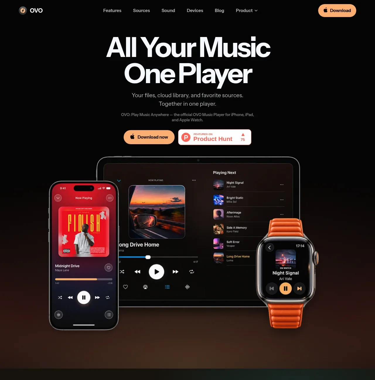
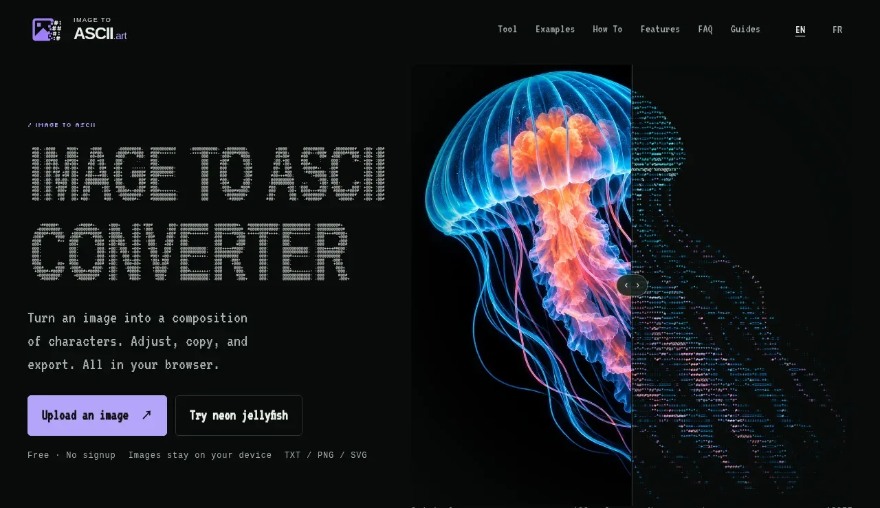
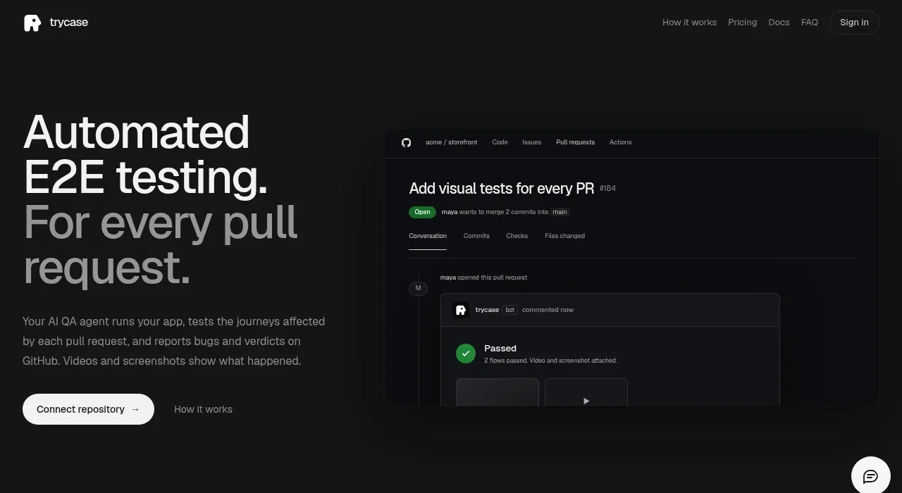
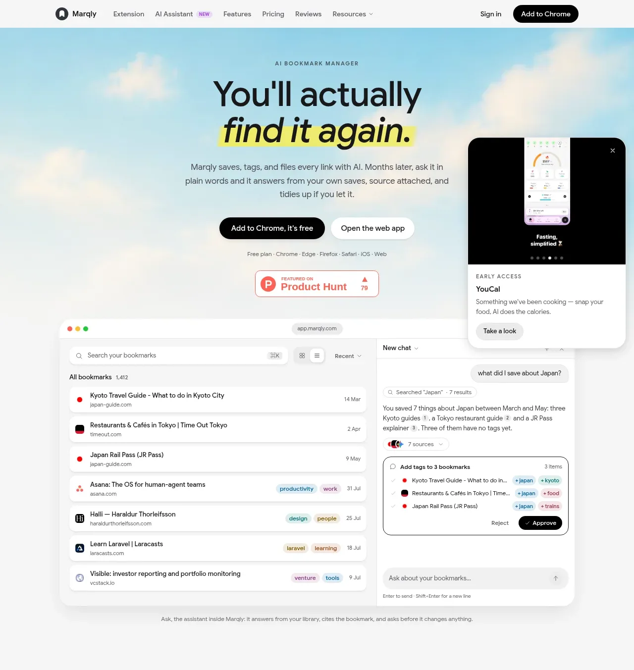
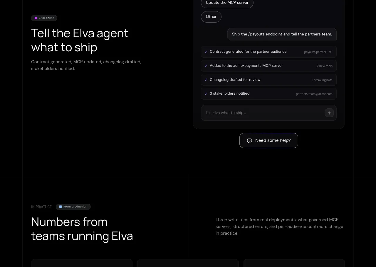
A product-led assistant section combines a plain-language value statement with a floating conversation panel showing suggested actions and completed work. The panel is the focal proof point while the left side stays editorial.
Prompt preview
## Reference images

Study these alongside the description below: hierarchy, rhythm, spacing, colour. Build for the product you are asked about, using this design language.

- Component: https://kage-design-assets.t3.tigrisfiles.io/components/elva/1eb2f570-9576-4b74-bb9a-568459f8b568-1789452094-7.webp
- Full page it was cut from: https://kage-design-assets.t3.tigrisfiles.io/screenshots/elva/1eb2f570-9576-4b74-bb9a-568459f8b568-1789452038199-full.webp
- Component on Kage: https://kage.design/component/elva-hero-2

## Before you start
Ask what tasks the user's assistant can complete, what language users would naturally use, and what brand voice the assistant should have. Then create a version grounded in those answers.

Build a dark split section with a left-aligned 40–48px headline and muted supporting copy on the left, and a tall assistant conversation panel on the right. The panel should use #101014, a #292932 border, and a 16px radius with a slight violet ambient glow; keep it clearly inside the layout rather than floating offscreen. Include an assistant greeting, 3–4 rounded suggestion chips, one user request, and a checklist of completed actions with subtle separators. Use 13–14px UI text, off-white primary text (#ededf1), muted gray (#8e8e98), violet highlights (#9678ff), and green checks (#63d6ad). Add a small outlined help CTA beneath or after the panel. On mobile stack the panel below the statement and keep all actions keyboard accessible.

Never use logos, product names, copy, illustrations, or imagery from the reference.