kage
kage
elyx.design
Design analysis
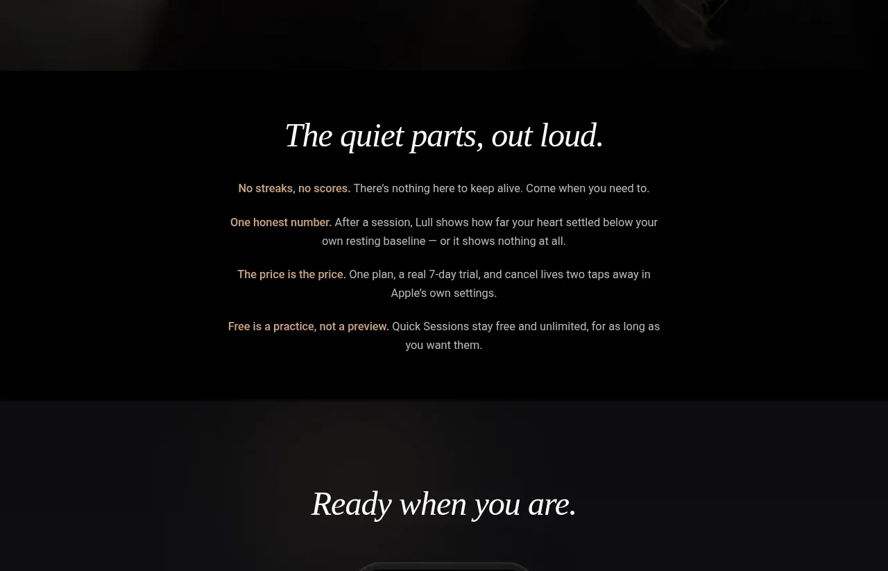
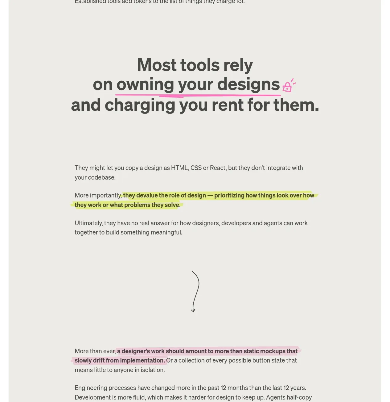
A spacious text-only band moves from a bold claim into several short paragraphs, using highlighted text and a small hand-drawn directional cue to sustain attention.
Prompt preview
## Reference images

Study these alongside the description below: hierarchy, rhythm, spacing, colour. Build for the product you are asked about, using this design language.

- Component: https://kage-design-assets.t3.tigrisfiles.io/components/elyx-design/634f2ca9-e930-42fa-918f-46bd7d94fb82-1789563433-2.webp
- Full page it was cut from: https://kage-design-assets.t3.tigrisfiles.io/screenshots/elyx-design/634f2ca9-e930-42fa-918f-46bd7d94fb82-1789563404568-full.webp
- Component on Kage: https://kage.design/component/elyx-card

## Before you start
Ask about the user's product, the audience's current frustration, and the argument the page should make. Apply this narrative structure to their story.

Build a text-led problem framing section on the same warm off-white background. Center a bold sans-serif statement around 42–52px with compact line-height; emphasize a key phrase using a pink hand-drawn underline and a tiny abstract accent mark. Follow it with a narrow reading column around 550–620px wide, left-aligned, using 15–17px sans-serif text and generous paragraph spacing. Highlight one important clause with a soft yellow marker treatment (`#e8f06c`) that looks slightly imperfect, not like a standard rounded label. Insert a small curved arrow or line between narrative beats as a CSS/SVG gesture. Use large whitespace so the section feels like an editorial essay rather than a feature list.

Never: use logos, product names, copy, illustrations, or imagery from the reference.