kage
kage
elyx.design

Design analysis
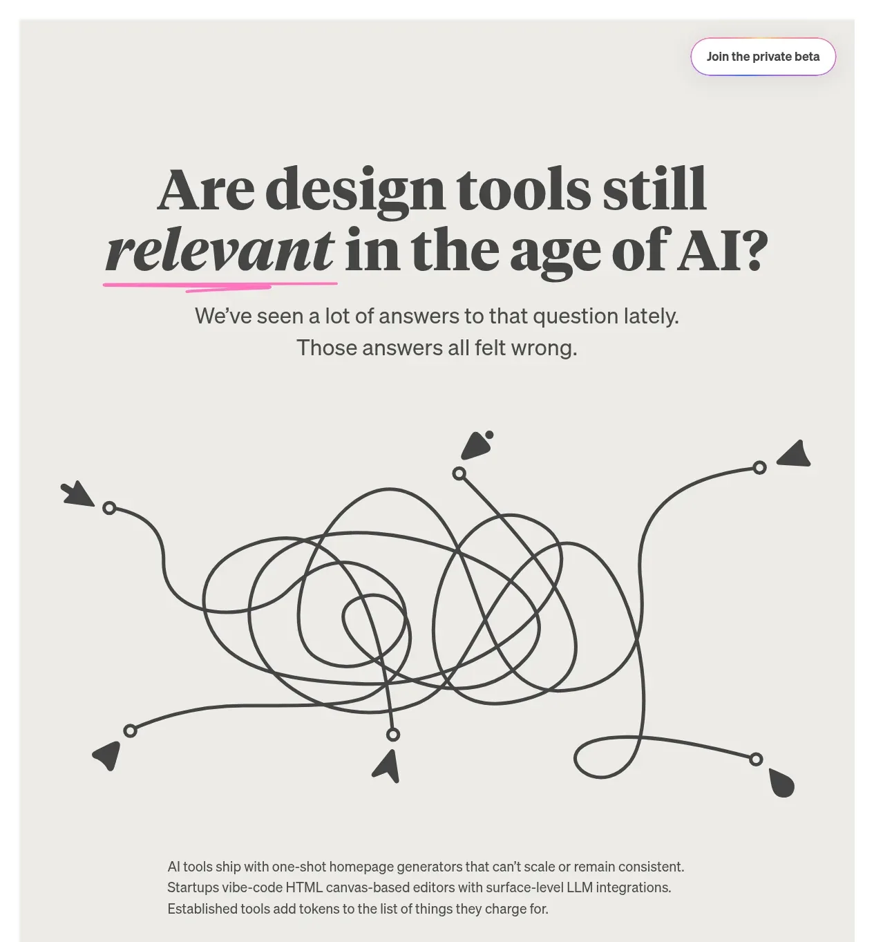
A long-form manifesto page that reads like an essay: a warm light-grey first half argues that current design tools fail, using oversized serif display type, hand-drawn scribble illustrations, and highlighter strokes (pink, yellow, lilac) to emphasise phrases. Mid-page the page hard-cuts to black, where the product pitch unfolds in a repeating "Elyx is…" rhythm with iridescent gradient text and a venn-diagram of three product parts, ending in a private-beta email capture over a subtle gradient. Colour, type and motif are used sparingly but consistently: gradient accents, highlighter underlines, generous white space and narrow, centred measure throughout.
Prompt preview
## Reference images

Study these alongside the description below: hierarchy, rhythm, spacing, colour. Build for the product you are asked about, using this design language.

- Full page: https://kage-design-assets.t3.tigrisfiles.io/screenshots/elyx-design/634f2ca9-e930-42fa-918f-46bd7d94fb82-1789563404568-full.webp
- Above the fold: https://kage-design-assets.t3.tigrisfiles.io/screenshots/elyx-design/634f2ca9-e930-42fa-918f-46bd7d94fb82-1789563402100.webp
- Design on Kage: https://kage.design/designs/elyx-landing-page

## Before you start
Ask the user what they are building, who it is for, and what brand assets (name, colours, fonts, logo) they already have. Wait for the answers, then apply the design language below to *their* product — never to the reference product.

## Page structure
Build a single long scrolling landing page structured as a narrative manifesto, top to bottom:

1. **Top bar**: only a single pill-shaped "join the beta" CTA button in the top-right corner; no full nav. Keep it minimal.
2. **Hero**: a large centred serif headline posing a provocative question, with one word in italic and a hand-drawn highlighter underline. Below it, two short lines of quiet body text. Above/below, a large abstract line-art scribble illustration (SVG paths with pen-node handles) that fills the width.
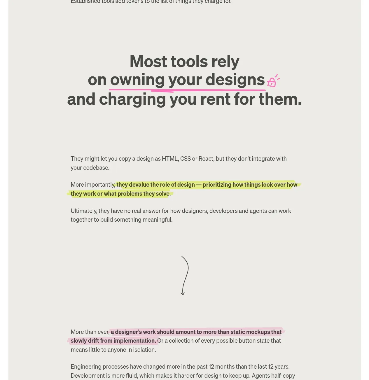
3. **Problem copy block**: a narrow centred measure (~60ch) of small grey body paragraphs explaining the problem. Rhythm: short bold centred statement paragraphs interspersed with quiet left-aligned body text.
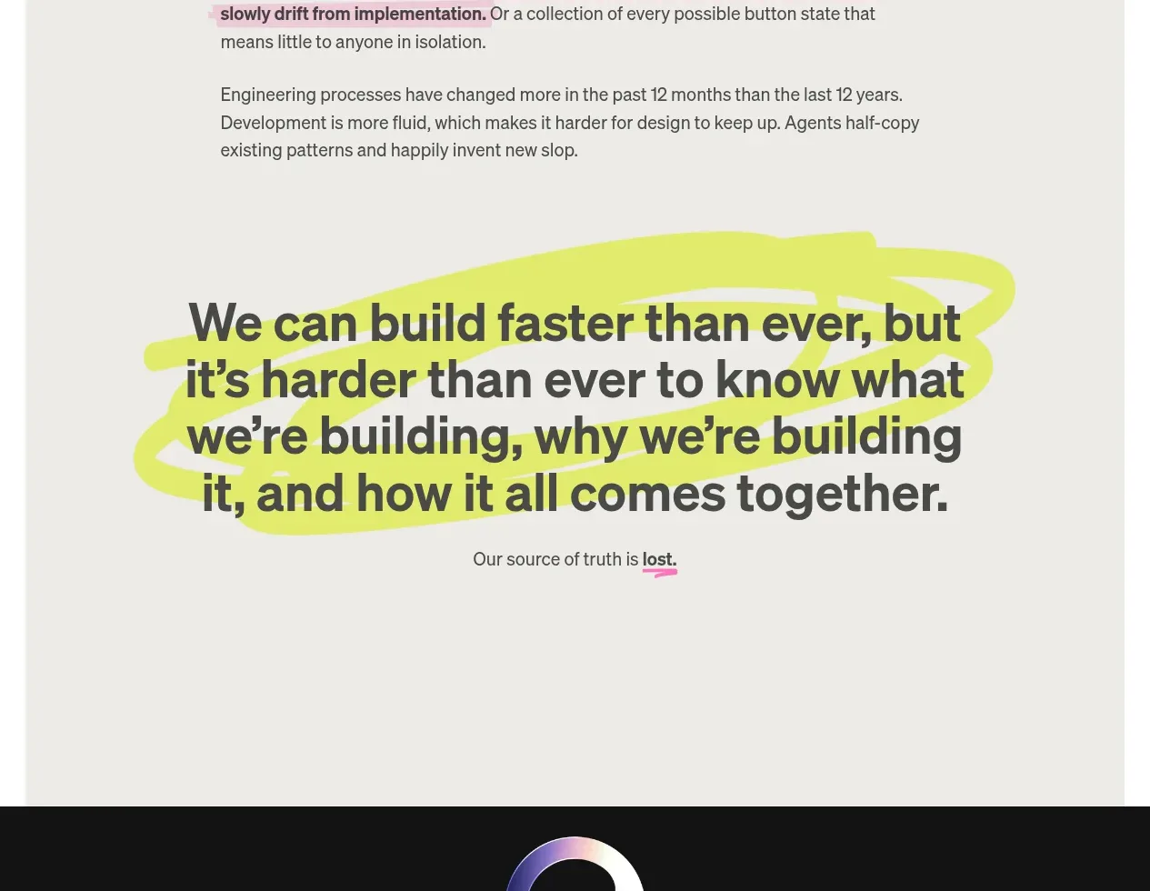
4. **Pulled quote sections**: larger centred statement paragraphs with highlighter or scribble emphasis marks on key phrases (pink underline, yellow marker circle, strikethrough). Use a small hand-drawn arrow between sections to signal scrolling.
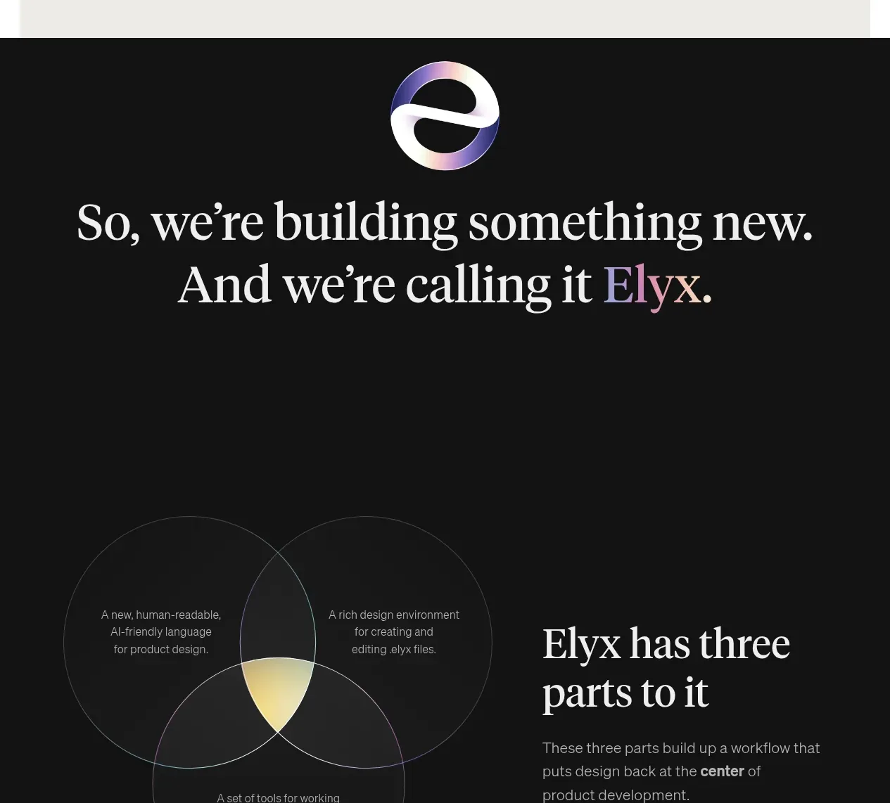
5. **Hard transition to dark**: background switches abruptly from light (#ece9e4-ish) to near-black (#0d0d0c). A glowing gradient logo mark, then a large centred serif line introducing the product name (product name in gradient text).
6. **Three-part overview**: left side a venn diagram of three overlapping translucent circles, each circle labelled with one product concept, with a gradient fill in the intersection; right side a serif heading ("X has three parts to it") plus one short body paragraph. Two-column, roughly 55/45.
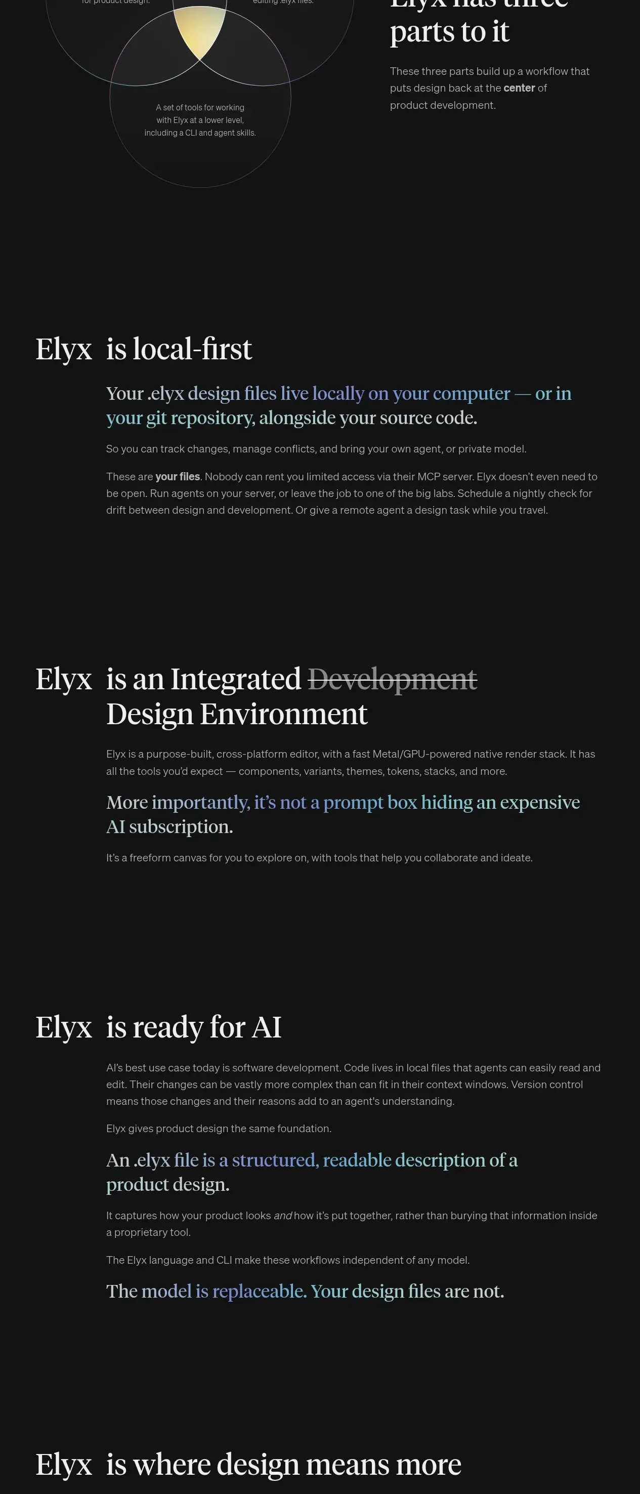
7. **"Elyx is…" repeating feature rhythm**: 3–4 sections, each starting with a large serif heading of the form "[Product] is [claim]", then a gradient-tinted lead sentence, then 1–2 short body paragraphs with bold key phrases. Vary the layouts slightly per section so the rhythm doesn't feel mechanical.
8. **Closing statement**: one large serif line with gradient highlight on the key phrase.
9. **Beta signup**: centred "Join the Private Beta" heading, one line of reassurance copy, a small card with email + optional role fields, and a full-width pill submit button.
10. **Footer**: single quiet row with © line and a couple of text links over a very subtle multicolour gradient glow at the bottom edge.

## Design language
- Two-act structure: light, warm essay on top; dark product pitch below. The abrupt background switch is the page's key moment — place the product reveal exactly there.
- Type pairing: a high-contrast serif (e.g. Playfair/Tiempos style) for display and section headings, with a neutral grotesque sans (small, 15–16px, generous line height) for body. Display scale steps up steeply: ~64–80px hero, ~48–56px section headings, ~28–36px pulled statements.
- Colour: near-black #0d0d0c and warm off-white #ece9e4 as the two backgrounds; text in #1a1a18 (light) / #f2f0ec (dark). Accent treatments: a pink/magenta → violet → teal iridescent gradient (~#e879d0 → #a78bfa → #5eead4) used only for the logo, one keyword per section, and subtle glows; hand-drawn highlighter marks in pink #f472b6, yellow #d9e64a, and pale lilac.
- Highlighter motif: emphasise phrases with marker strokes, rough underlines, strikethroughs and hand-drawn arrows/scratchy circles — SVG, slightly rotated, sitting behind the text. Use sparingly, one or two per screen.
- Measure and density: everything on a narrow centred column (~620–720px) with lots of vertical whitespace (120–200px between sections). Density is low; the page breathes. Bold within body copy does micro-hierarchy instead of colour.
- Borders/radius: nearly borderless; use pill-shaped buttons (fully rounded), soft rounded input cards (~12px) with hairline #ffffff1a borders on dark. No drop shadows except a soft glow behind the gradient logo.
- Motion: keep it calm — subtle fades/reveals on scroll; the hand-drawn arrow hints at scrolling. No carousels or autoplay.
- Illustration: abstract black line-art (pen-tool style curves and nodes) on light, and translucent gradient-filled geometric shapes (venn circles) on dark. No stock photography.

## Never
Never copy the reference's product name "Elyx", its logo, its .elyx file-format wording, its manifesto copy, its scribble illustrations, or its exact gradient palette as-is. Do not present the output as that product; apply the language to the user's own brand, copy and assets.
Components from this page
All components
 Minimal beta navigation
elyx.design · Navigation
Minimal beta navigation
elyx.design · Navigation
 Editorial question hero
elyx.design · Hero
Editorial question hero
elyx.design · Hero
 Problem framing narrative
elyx.design · Card
Problem framing narrative
elyx.design · Card
 Manifesto transition
elyx.design · Call to action
Manifesto transition
elyx.design · Call to action
 Dark product introduction
elyx.design · Hero
Dark product introduction
elyx.design · Hero
 Product principles sequence
elyx.design · Feature grid
Product principles sequence
elyx.design · Feature grid
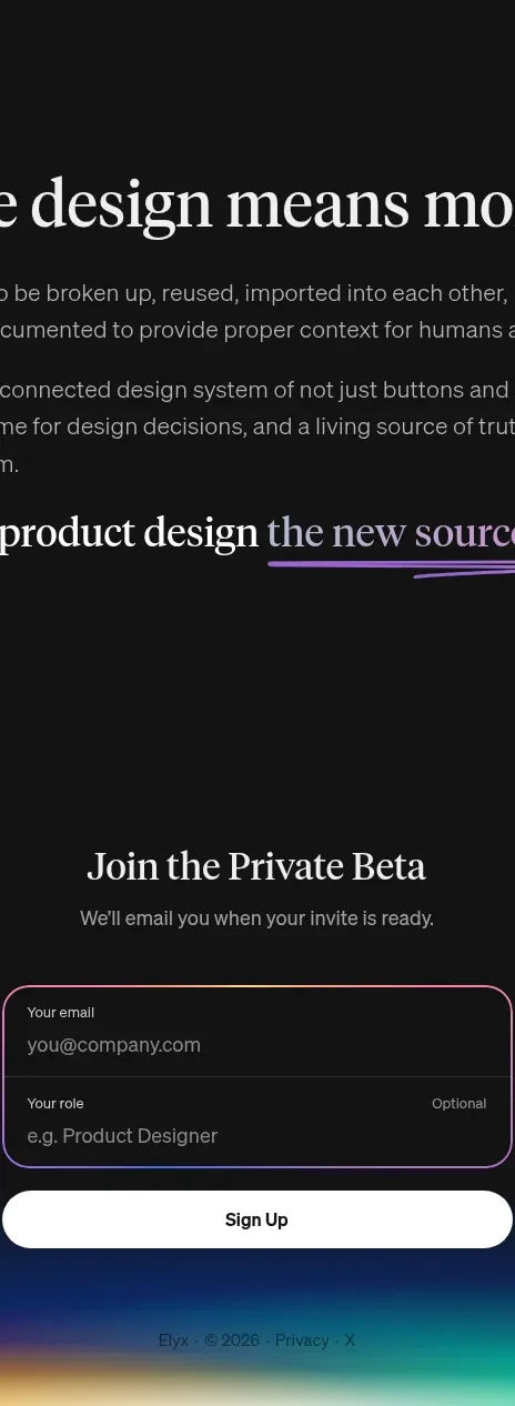 Private beta signup
elyx.design · Form
Private beta signup
elyx.design · Form