 kage
kage
elyx.design
Design analysis
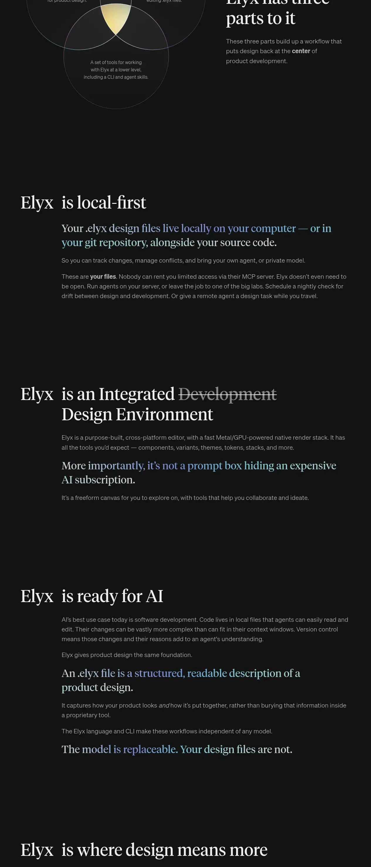
Several dark editorial feature bands explain the product’s principles one at a time, with consistent left-aligned headings and highlighted serif sub-statements.
Prompt preview
## Reference images

Study these alongside the description below: hierarchy, rhythm, spacing, colour. Build for the product you are asked about, using this design language.

- Component: https://kage-design-assets.t3.tigrisfiles.io/components/elyx-design/634f2ca9-e930-42fa-918f-46bd7d94fb82-1789563434-5.webp
- Full page it was cut from: https://kage-design-assets.t3.tigrisfiles.io/screenshots/elyx-design/634f2ca9-e930-42fa-918f-46bd7d94fb82-1789563404568-full.webp
- Component on Kage: https://kage.design/component/elyx-feature-grid

## Before you start
Ask what the user's product principles are, what evidence supports them, and which principle should land last. Adapt this sequence to the user's product.

Create a vertical series of three or four editorial feature bands on `#111111`. Each band should use a consistent content container around 800px wide: a large left-aligned serif heading in off-white, followed by a narrower body column with 15–17px muted gray text (`#aaa7a5`). Include one larger serif takeaway line per band, using a restrained blue-to-lilac-to-teal gradient (`#9aa8e8` to `#b7e1d7`) on selected words. Keep each band separated by substantial vertical padding and avoid boxed cards. Use clear hierarchy: heading first, explanatory paragraphs second, memorable conclusion last. Allow occasional crossed-out or dimmed words only where the product argument benefits from contrast. The layout should collapse to one column on mobile while preserving reading order.

Never: use logos, product names, copy, illustrations, or imagery from the reference.
More components

 AI-powered helpdesk feature section
intercom.com · Feature grid
AI-powered helpdesk feature section
intercom.com · Feature grid
 Integrations and ecosystem section
intercom.com · Feature grid
Integrations and ecosystem section
intercom.com · Feature grid
 AI agent capabilities section
intercom.com · Feature grid
AI agent capabilities section
intercom.com · Feature grid
 Unified support experience overview
intercom.com · Feature grid
Unified support experience overview
intercom.com · Feature grid

 Core invoicing capabilities
sendinvo.com · Feature grid
Core invoicing capabilities
sendinvo.com · Feature grid
 Audience and trade types
sendinvo.com · Feature grid
Audience and trade types
sendinvo.com · Feature grid