 kage
kage
epilude.com
Design analysis
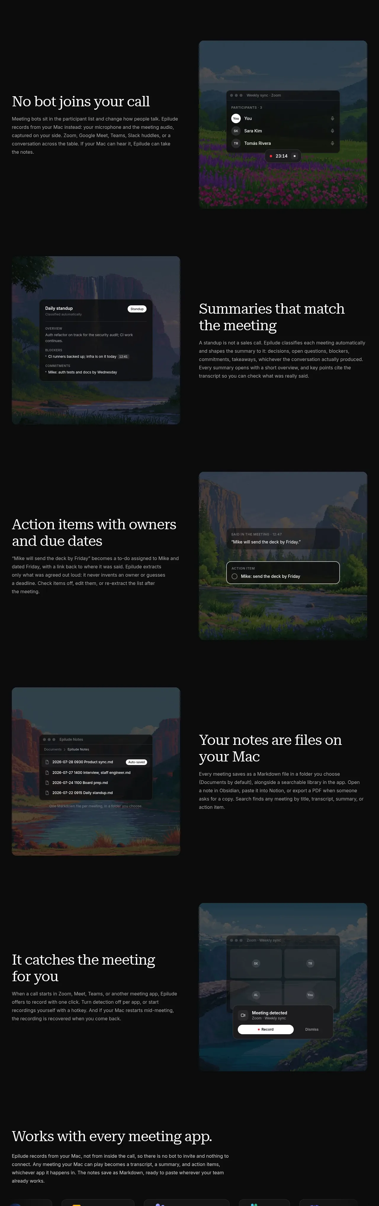
Four alternating feature bands explain the product benefits with concise copy on one side and tall rounded interface visuals on the other.
Prompt preview
## Reference images

Study these alongside the description below: hierarchy, rhythm, spacing, colour. Build for the product you are asked about, using this design language.

- Component: https://kage-design-assets.t3.tigrisfiles.io/components/epilude-notetaker/4c1f6c09-8367-4067-b5eb-19bb83b45625-1789365730-3.webp
- Full page it was cut from: https://kage-design-assets.t3.tigrisfiles.io/screenshots/epilude-notetaker/4c1f6c09-8367-4067-b5eb-19bb83b45625-1789365700735-full.webp
- Component on Kage: https://kage.design/component/epilude-notetaker-feature-grid

## Before you start
Ask what the user's product does, which four benefits deserve emphasis, and what visual assets or interface states are available. Adapt this component to those answers.

Create a vertical feature showcase made of four generous alternating rows. Each row should use a two-column grid with a concise serif heading, supporting paragraph, and a tall rounded product or workflow visual. Alternate the text and visual sides to create rhythm, while keeping a consistent content width, vertical alignment, and generous empty space between rows. Use near-black background #090909, warm white serif headings #efeee8, muted sans-serif body text #a1a19c, and image cards with 14px radius, subtle borders, dark overlays, and understated shadows. Keep each paragraph around readable measure, use 32–48px display headings on desktop, 16–24px row gaps inside content groups, and 120–180px vertical separation between feature rows. Let visuals demonstrate concrete states such as participants, summaries, action items, files, or automation without requiring dense UI chrome. On smaller screens, stack text above the visual and preserve the alternating rhythm through spacing rather than awkward reordering.

Never: use logos, product names, copy, illustrations, or imagery from the reference.
More components
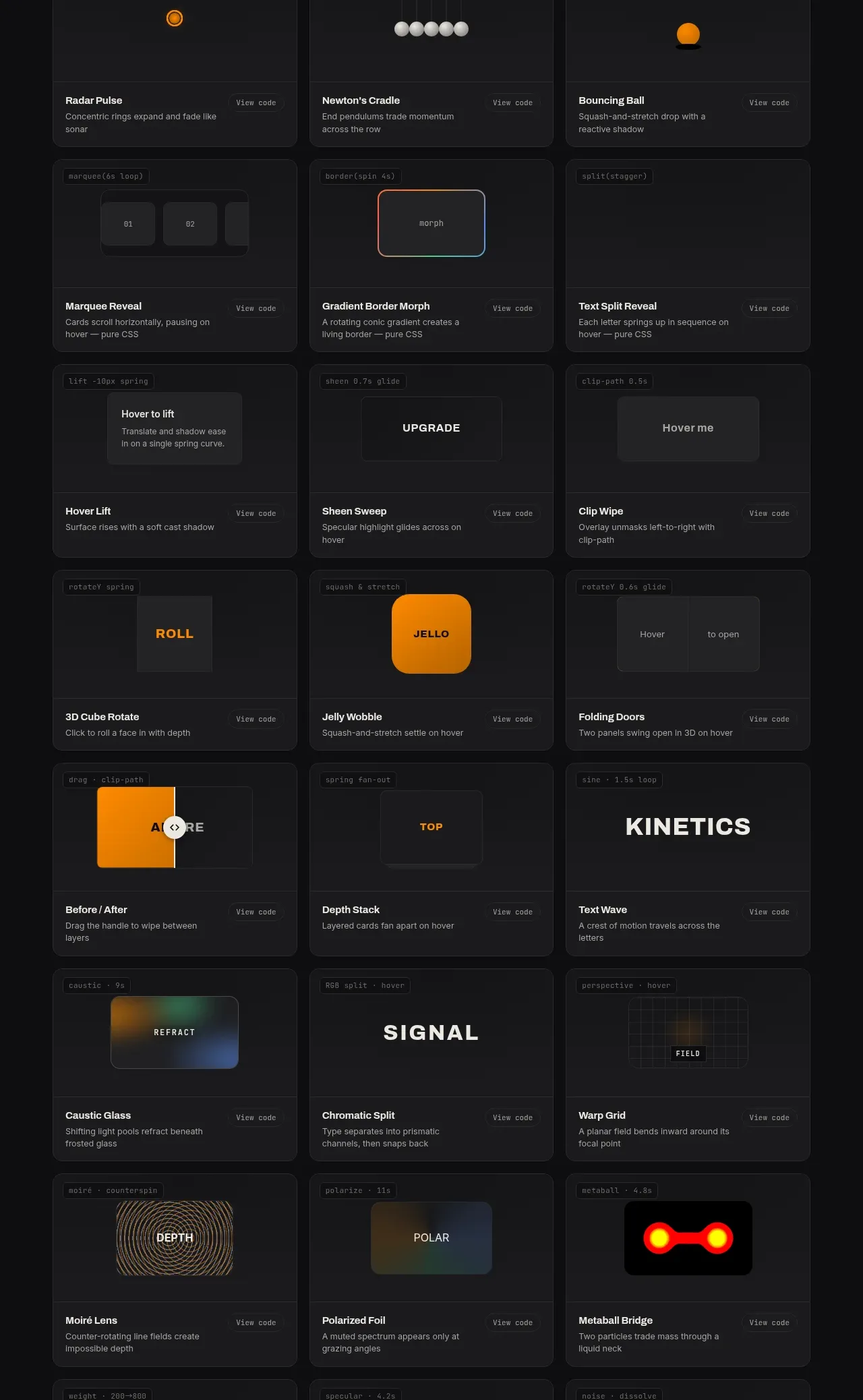
 Surface and motion pattern library
kinetics.colorion.co · Feature grid
Surface and motion pattern library
kinetics.colorion.co · Feature grid
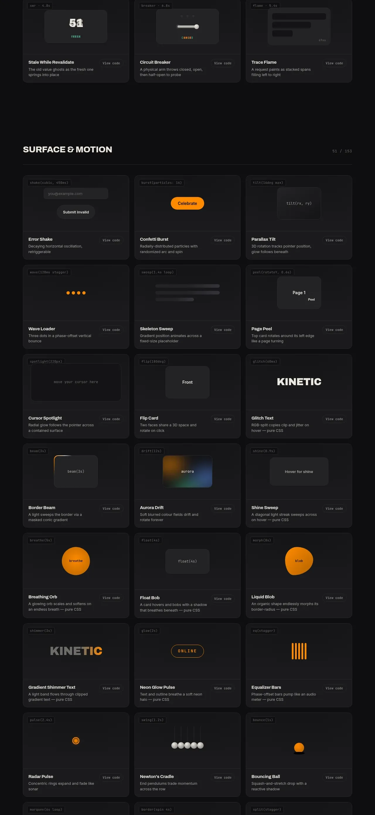 Feedback and state pattern library
kinetics.colorion.co · Feature grid
Feedback and state pattern library
kinetics.colorion.co · Feature grid
 Interaction and input pattern library
kinetics.colorion.co · Feature grid
Interaction and input pattern library
kinetics.colorion.co · Feature grid
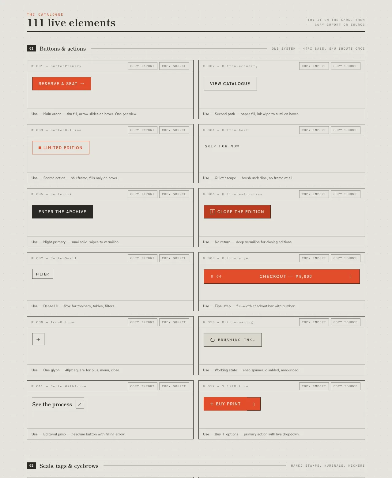
 Buttons and actions inventory
SHIUI · Feature grid
Buttons and actions inventory
SHIUI · Feature grid
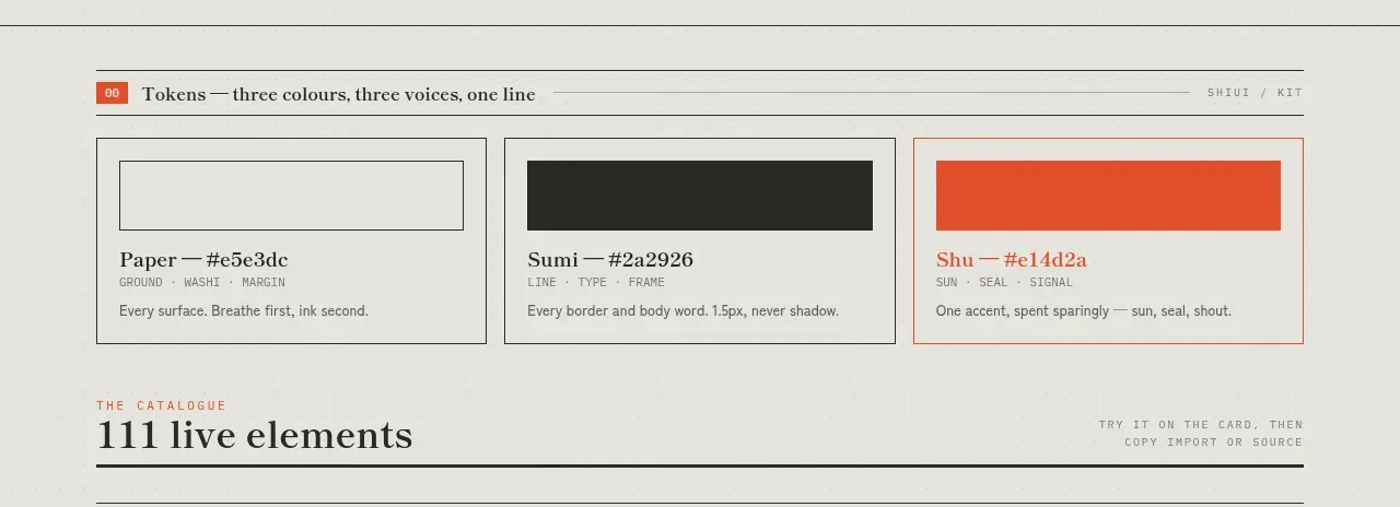 Colour and element catalogue
SHIUI · Feature grid
Colour and element catalogue
SHIUI · Feature grid
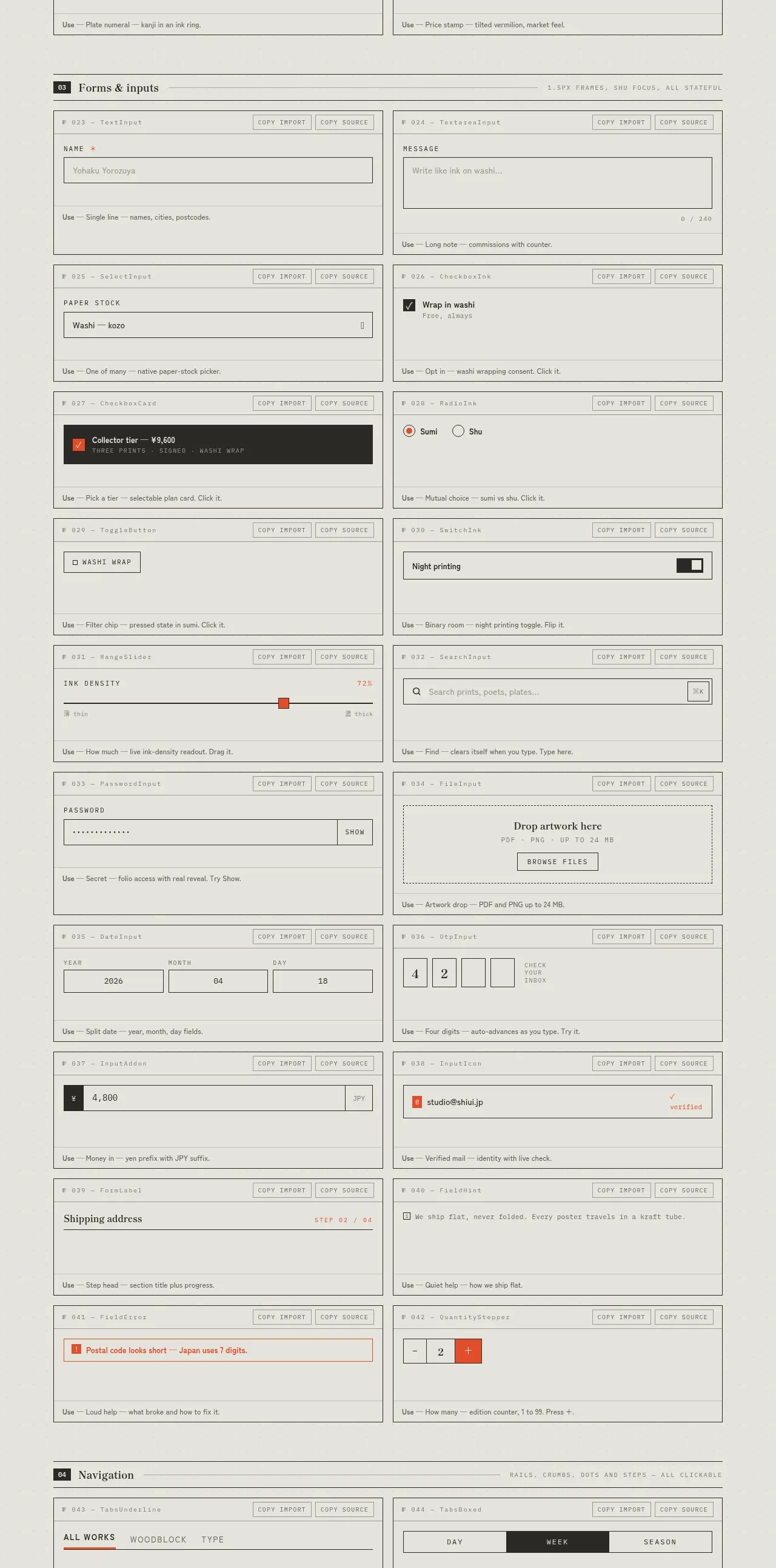 Forms and inputs inventory
SHIUI · Feature grid
Forms and inputs inventory
SHIUI · Feature grid