 kage
kage
epilude.com
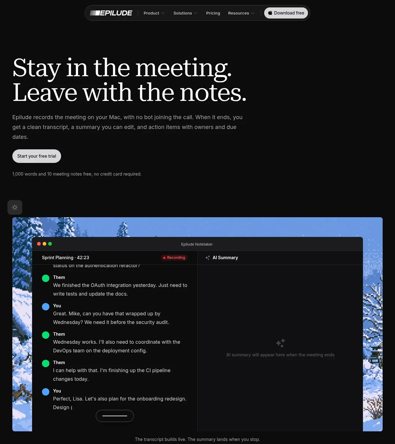
Design analysis
The hero pairs a large editorial headline and concise explanation with a trial CTA, then demonstrates the product in a wide, rounded application visual.
Prompt preview
## Reference images

Study these alongside the description below: hierarchy, rhythm, spacing, colour. Build for the product you are asked about, using this design language.

- Component: https://kage-design-assets.t3.tigrisfiles.io/components/epilude-notetaker/4c1f6c09-8367-4067-b5eb-19bb83b45625-1789365729-1.webp
- Full page it was cut from: https://kage-design-assets.t3.tigrisfiles.io/screenshots/epilude-notetaker/4c1f6c09-8367-4067-b5eb-19bb83b45625-1789365700735-full.webp
- Component on Kage: https://kage.design/component/epilude-notetaker-hero

## Before you start
Ask what the user's product is, who it serves, and what brand personality, colors, and conversion goal should shape the hero. Then apply these principles to that product.

Create a dark, editorial product hero. Put a large high-contrast serif headline in the left-aligned content column, followed by a short readable paragraph, a light pill-shaped primary CTA, and a small reassurance line beneath it. Below the copy, include a large rounded product demonstration frame spanning most of the content width; it should feel like a real interface preview with layered panels and a restrained scenic or abstract backdrop. Keep the hero generous vertically: navigation above, copy first, visual second. Use a near-black background (#090909), warm white type (#f1f0eb), muted gray body text (#a5a5a1), pale CTA (#f1f1ed), thin dark-gray borders (#292929), and 14–18px corner radii. Use a serif display face for the headline and a clean sans-serif for supporting UI. Add subtle depth through gradients and shadows, not loud decoration.

Never: use logos, product names, copy, illustrations, or imagery from the reference.
More components
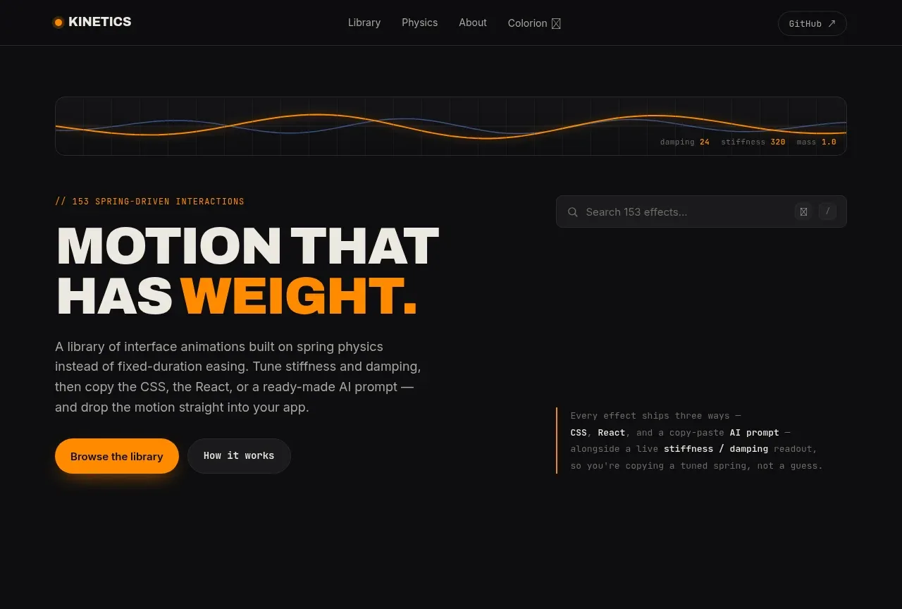
 Motion-focused hero introduction
kinetics.colorion.co · Hero
Motion-focused hero introduction
kinetics.colorion.co · Hero
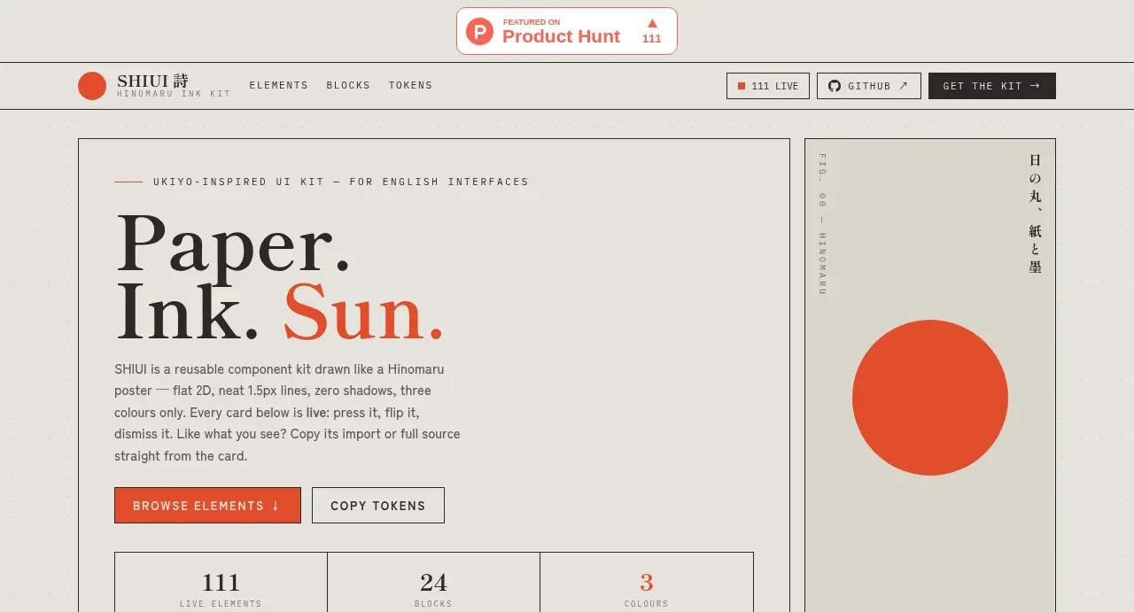
 Editorial introduction hero
SHIUI · Hero
Editorial introduction hero
SHIUI · Hero
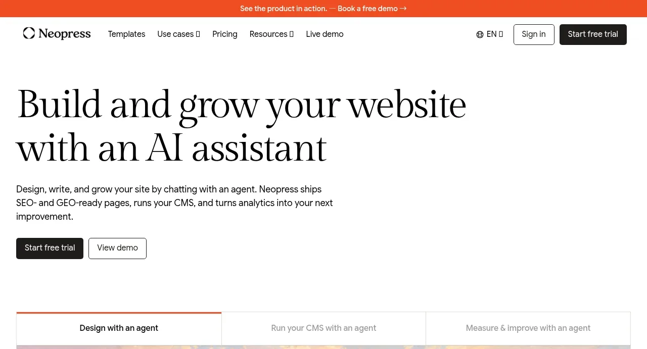
 AI website builder hero
Neopress · Hero
AI website builder hero
Neopress · Hero
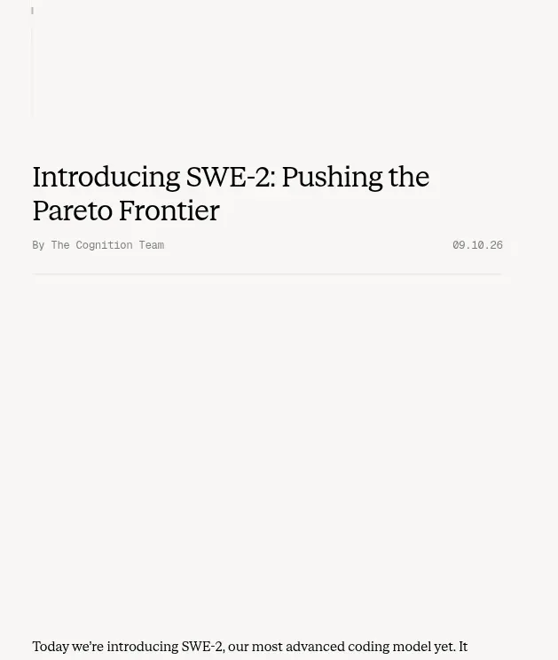
 Article introduction and opening chart
Cognition's SWE-2 · Hero
Article introduction and opening chart
Cognition's SWE-2 · Hero
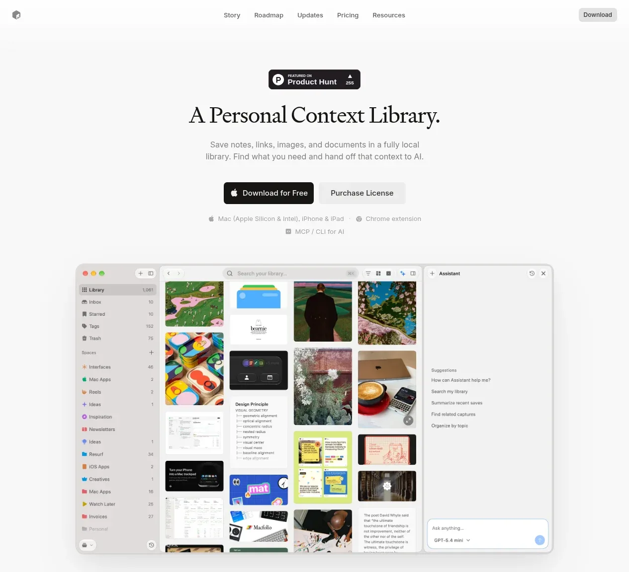
 Product introduction with interface preview
Resurf · Hero
Product introduction with interface preview
Resurf · Hero
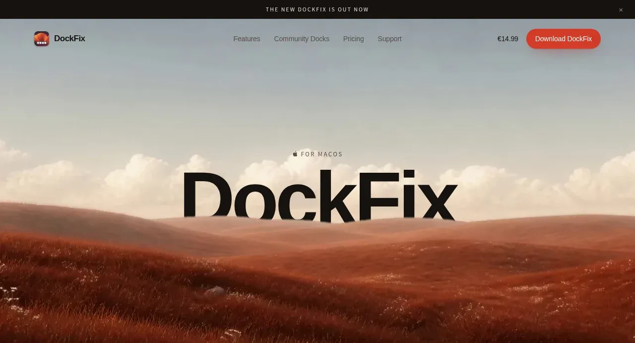
 Editorial product hero
DockFix 5.0 · Hero
Editorial product hero
DockFix 5.0 · Hero