 kage
kage
esigna.app
Design analysis
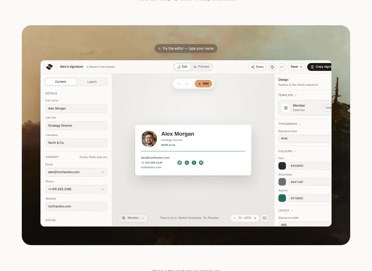
A large rounded product screenshot acts as the first proof point, framed by a soft photographic backdrop and followed by a simple compatibility logo row.
Prompt preview
## Reference images

Study these alongside the description below: hierarchy, rhythm, spacing, colour. Build for the product you are asked about, using this design language.

- Component: https://kage-design-assets.t3.tigrisfiles.io/components/esigna/76bcd194-d16d-4973-9e2e-b189e2506cae-1791007554-2.webp
- Full page it was cut from: https://kage-design-assets.t3.tigrisfiles.io/screenshots/esigna/76bcd194-d16d-4973-9e2e-b189e2506cae-1791007443637-full.webp
- Component on Kage: https://kage.design/component/esigna-feature-grid

## Before you start
Ask what product interface or workflow should be demonstrated and what proof matters most to the user's audience. Apply these principles to the user's own product.

Build a showcase section with a large centered product UI image or live mockup inside a wide rounded container, approximately 88–90% of the content width. Give the frame a muted natural or abstract background, 24px radius, and a soft shadow; place the interface screenshot prominently with enough scale to read its main interaction. Below it, add a small centered compatibility statement and a single horizontal row of five or six understated platform labels/icons. Keep the section airy, with warm off-white background (#faf9f7), pale stone frame (#d8d5cc), ink text (#272622), and muted labels (#77746d). On mobile, let the mockup scroll or crop intentionally while keeping its main action legible.

Never: use logos, product names, copy, illustrations, or imagery from the reference.
More components

 Three-step process cards
godaylight.com · Feature grid
Three-step process cards
godaylight.com · Feature grid

 Use-case selector with vertical video preview
Spira Maxima · Feature grid
Use-case selector with vertical video preview
Spira Maxima · Feature grid

 Insights and enterprise model access
FastRouter.ai · Feature grid
Insights and enterprise model access
FastRouter.ai · Feature grid
 Solutions by organizational role
FastRouter.ai · Feature grid
Solutions by organizational role
FastRouter.ai · Feature grid
 Routing reliability and model collaboration
FastRouter.ai · Feature grid
Routing reliability and model collaboration
FastRouter.ai · Feature grid
 Goal-oriented product capabilities
FastRouter.ai · Feature grid
Goal-oriented product capabilities
FastRouter.ai · Feature grid