 kage
kage
esigna.app
Design analysis
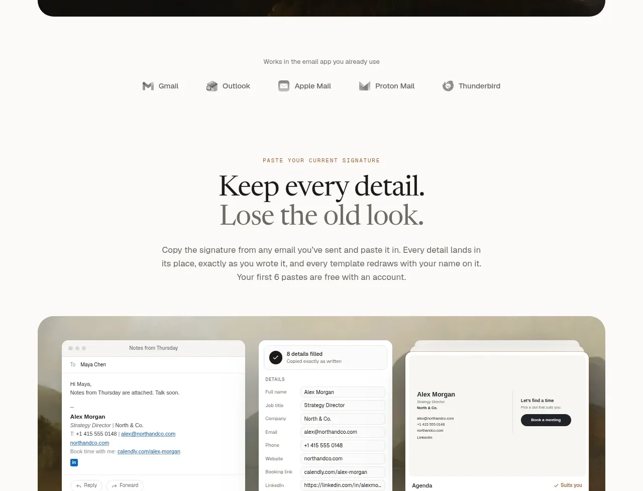
A focused promise headline introduces a visual workflow, then four short numbered explanations turn the product behavior into an easy mental model.
Prompt preview
## Reference images

Study these alongside the description below: hierarchy, rhythm, spacing, colour. Build for the product you are asked about, using this design language.

- Component: https://kage-design-assets.t3.tigrisfiles.io/components/esigna/76bcd194-d16d-4973-9e2e-b189e2506cae-1791007554-3.webp
- Full page it was cut from: https://kage-design-assets.t3.tigrisfiles.io/screenshots/esigna/76bcd194-d16d-4973-9e2e-b189e2506cae-1791007443637-full.webp
- Component on Kage: https://kage.design/component/esigna-feature-grid-2

## Before you start
Ask what the user's core workflow is and what sequence of actions helps customers reach value fastest. Apply the structure to that workflow.

Create a workflow feature section with a centered eyebrow, a two-line serif heading, and a short explanatory paragraph. Follow it with one large rounded visual showing the workflow in three related panels, then a four-column row of numbered benefit explanations and a pair of CTAs beneath. Use a strict max-width grid, thin top rules on each text item, compact uppercase step labels, and generous gaps. Keep visuals in a soft stone card (#eeece7) with 22px radius; use warm white background (#fbfaf8), black headings (#1b1a18), muted gray copy (#706e68), and a restrained terracotta or tan accent (#b98b68) only for active controls. Buttons should use one filled dark pill and one outlined pill. Stack the columns on mobile.

Never: use logos, product names, copy, illustrations, or imagery from the reference.
More components

 Three-step process cards
godaylight.com · Feature grid
Three-step process cards
godaylight.com · Feature grid

 Use-case selector with vertical video preview
Spira Maxima · Feature grid
Use-case selector with vertical video preview
Spira Maxima · Feature grid

 Insights and enterprise model access
FastRouter.ai · Feature grid
Insights and enterprise model access
FastRouter.ai · Feature grid
 Solutions by organizational role
FastRouter.ai · Feature grid
Solutions by organizational role
FastRouter.ai · Feature grid
 Routing reliability and model collaboration
FastRouter.ai · Feature grid
Routing reliability and model collaboration
FastRouter.ai · Feature grid
 Goal-oriented product capabilities
FastRouter.ai · Feature grid
Goal-oriented product capabilities
FastRouter.ai · Feature grid