 kage
kage
esigna.app
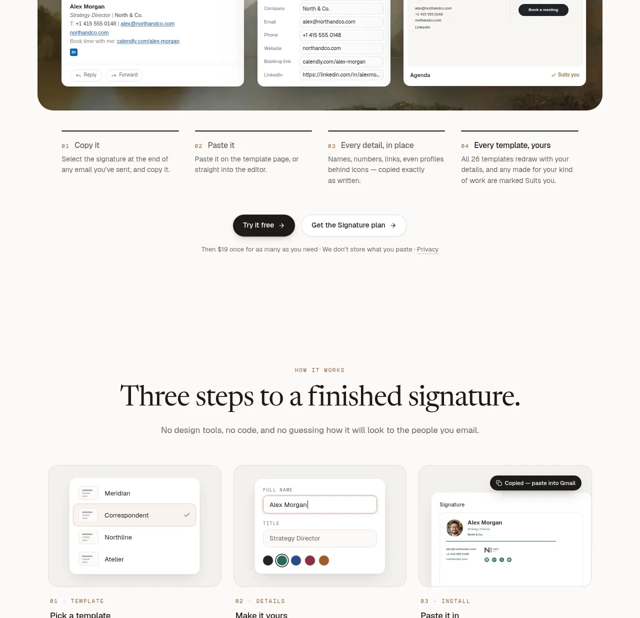
Design analysis
Six compact cards organize the product's practical advantages into a scan-friendly 3-by-2 grid with visual examples and direct explanations.
Prompt preview
## Reference images

Study these alongside the description below: hierarchy, rhythm, spacing, colour. Build for the product you are asked about, using this design language.

- Component: https://kage-design-assets.t3.tigrisfiles.io/components/esigna/76bcd194-d16d-4973-9e2e-b189e2506cae-1791007554-4.webp
- Full page it was cut from: https://kage-design-assets.t3.tigrisfiles.io/screenshots/esigna/76bcd194-d16d-4973-9e2e-b189e2506cae-1791007443637-full.webp
- Component on Kage: https://kage.design/component/esigna-feature-grid-3

## Before you start
Ask which capabilities are most valuable for the user's product and which can be shown visually. Use those answers to define the card content.

Build a capabilities section with a centered eyebrow, editorial serif headline, supporting sentence, and a 3-column by 2-row card grid. Each card should contain a small UI example or micro-demo, a short title, and two lines of explanatory copy. Use equal-height cards, consistent internal padding around 26px, 18px radius, a very pale gray-beige surface (#f0efeb), and a 1px border (#e1dfd9). Keep card visuals simple, with white inset panels, thin dividers, compact labels, and one restrained accent color such as muted green (#2e7866) or rust (#a6644d). Cards may subtly lift on hover but should not become noisy. Collapse to one column on small screens.

Never: use logos, product names, copy, illustrations, or imagery from the reference.
More components

 Three-step process cards
godaylight.com · Feature grid
Three-step process cards
godaylight.com · Feature grid

 Use-case selector with vertical video preview
Spira Maxima · Feature grid
Use-case selector with vertical video preview
Spira Maxima · Feature grid

 Insights and enterprise model access
FastRouter.ai · Feature grid
Insights and enterprise model access
FastRouter.ai · Feature grid
 Solutions by organizational role
FastRouter.ai · Feature grid
Solutions by organizational role
FastRouter.ai · Feature grid
 Routing reliability and model collaboration
FastRouter.ai · Feature grid
Routing reliability and model collaboration
FastRouter.ai · Feature grid
 Goal-oriented product capabilities
FastRouter.ai · Feature grid
Goal-oriented product capabilities
FastRouter.ai · Feature grid