 kage
kage
esigna.app
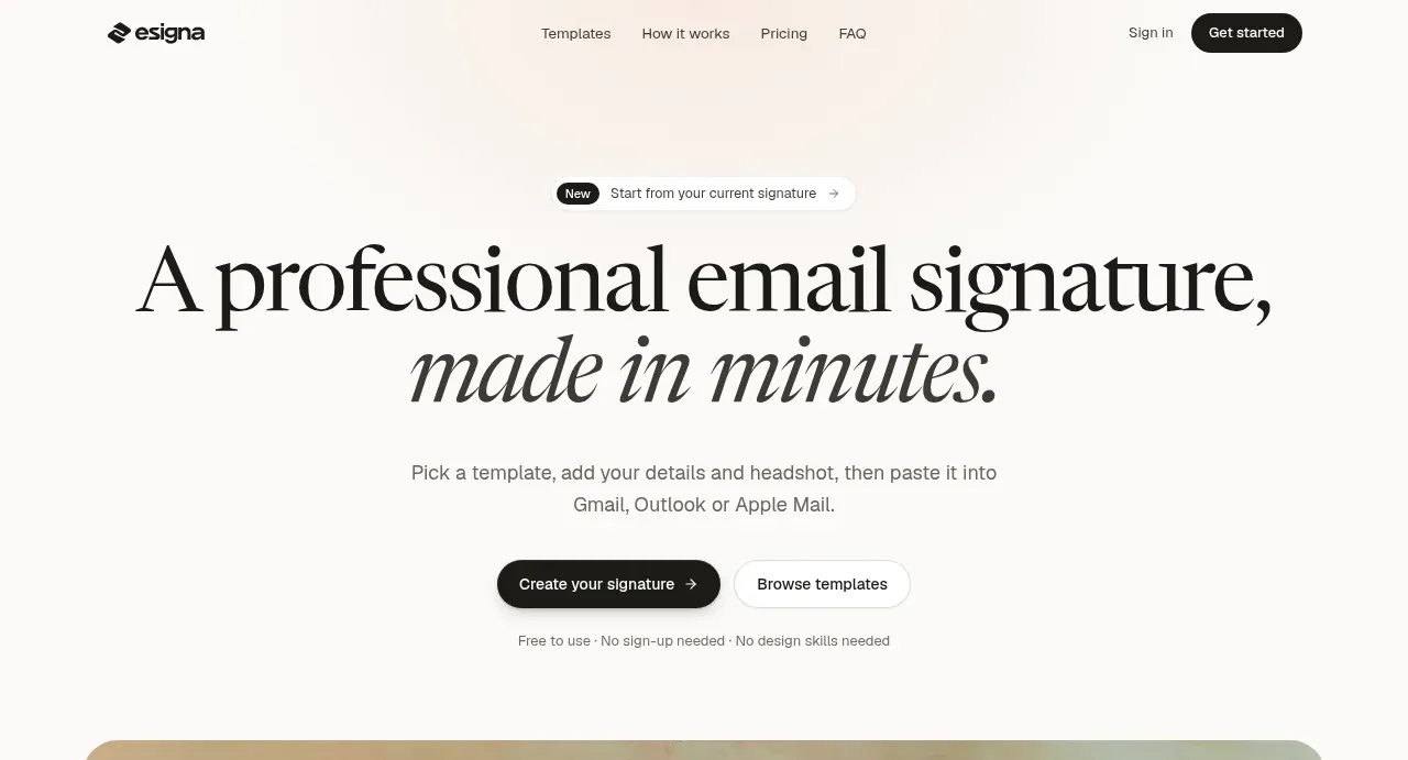
Design analysis
The oversized editorial headline establishes the promise immediately, while two contrasting actions and a short reassurance reduce friction before the product visual.
Prompt preview
## Reference images

Study these alongside the description below: hierarchy, rhythm, spacing, colour. Build for the product you are asked about, using this design language.

- Component: https://kage-design-assets.t3.tigrisfiles.io/components/esigna/76bcd194-d16d-4973-9e2e-b189e2506cae-1791007553-1.webp
- Full page it was cut from: https://kage-design-assets.t3.tigrisfiles.io/screenshots/esigna/76bcd194-d16d-4973-9e2e-b189e2506cae-1791007443637-full.webp
- Component on Kage: https://kage.design/component/esigna-hero

## Before you start
Ask what the user's product does, what outcome it promises, and what brand voice it should use. Apply the principles below to that product rather than copying this page.

Create a centered hero directly below the navigation. Include a small announcement pill, an oversized two-line serif headline with a subtle italic emphasis on the outcome phrase, a concise supporting paragraph, two horizontally aligned CTAs, and a tiny reassurance line beneath them. Use generous vertical whitespace and a max text width around 760px. Pair a near-white warm canvas (#faf9f7) with charcoal text (#171716), muted gray body copy (#6b6965), black filled primary button, and white outlined secondary button with 999px radius. Use a high-contrast editorial serif for the headline (roughly 58–72px desktop, 0.92 line height) and a neutral sans-serif for UI text. Add understated hover transitions; primary button can translate up 1–2px and secondary can gain a soft gray fill. Responsive typography should reduce smoothly rather than clip.

Never: use logos, product names, copy, illustrations, or imagery from the reference.
More components
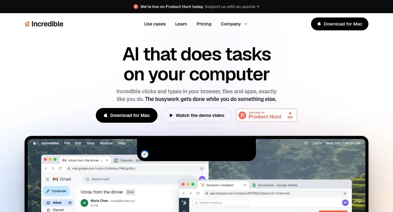
 AI workflow hero
Incredible · Hero
AI workflow hero
Incredible · Hero
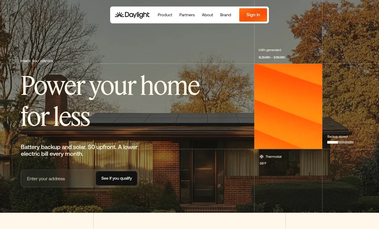
 Photographic power-home hero
godaylight.com · Hero
Photographic power-home hero
godaylight.com · Hero
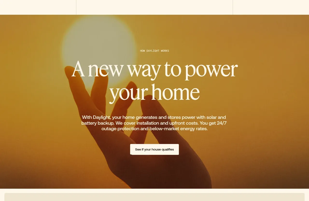 Warm mission statement panel
godaylight.com · Hero
Warm mission statement panel
godaylight.com · Hero
 Grid problem statement
godaylight.com · Hero
Grid problem statement
godaylight.com · Hero
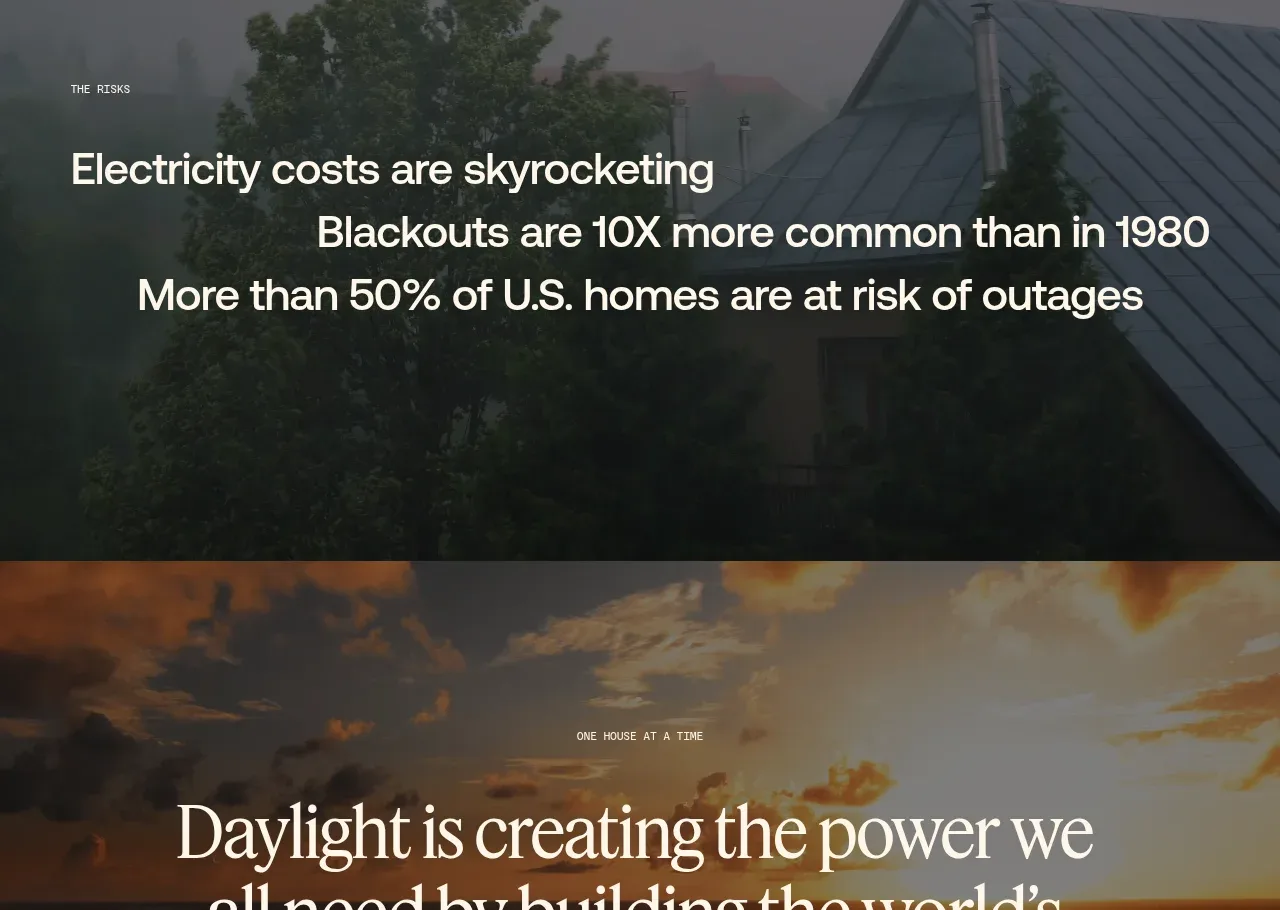 Decentralized energy statement
godaylight.com · Hero
Decentralized energy statement
godaylight.com · Hero
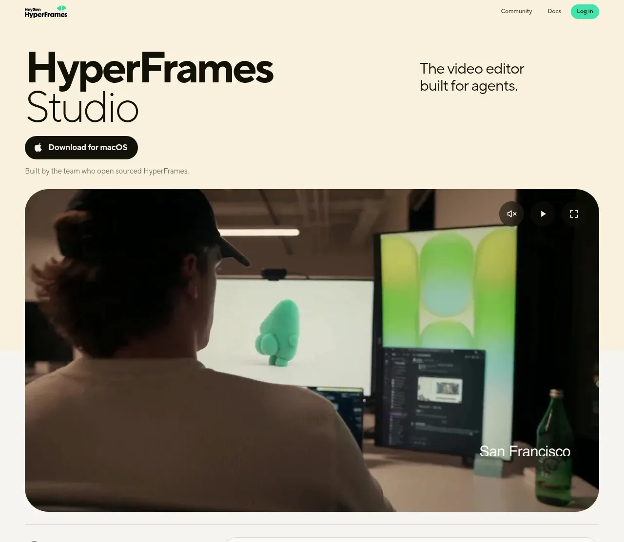
 Product hero with download action and video
HyperFrames Studio (Desktop) · Hero
Product hero with download action and video
HyperFrames Studio (Desktop) · Hero