 kage
kage
esigna.app
Design analysis
A large contained pricing panel makes the free-versus-paid decision easy by comparing only two clear plans and ending with direct actions.
Prompt preview
## Reference images

Study these alongside the description below: hierarchy, rhythm, spacing, colour. Build for the product you are asked about, using this design language.

- Component: https://kage-design-assets.t3.tigrisfiles.io/components/esigna/76bcd194-d16d-4973-9e2e-b189e2506cae-1791007556-8.webp
- Full page it was cut from: https://kage-design-assets.t3.tigrisfiles.io/screenshots/esigna/76bcd194-d16d-4973-9e2e-b189e2506cae-1791007443637-full.webp
- Component on Kage: https://kage.design/component/esigna-pricing-table

## Before you start
Ask what the user's pricing model, plan limits, billing behavior, and primary conversion goal are. Apply those facts to a simple comparison rather than copying this offer.

Build a two-column pricing section inside a large white rounded panel with a faint border and soft shadow. Start with a centered eyebrow, serif pricing headline, and short explanation above the columns. Each plan needs a name, prominent price, billing qualifier, one-sentence summary, a concise check-list of included features, and a full-width or compact CTA. Separate columns with a thin vertical rule; visually prioritize the recommended plan with a subtle tinted surface or small badge, never with excessive decoration. Use warm white page background (#f6f5f2), panel #ffffff, charcoal #181817, muted copy #77736c, divider #e2dfd8, and one restrained accent (#b68a67). Use 20–28px radius and generous padding. Include a small reassurance note below the actions and make the comparison stack cleanly on mobile.

Never: use logos, product names, copy, illustrations, or imagery from the reference.
More components
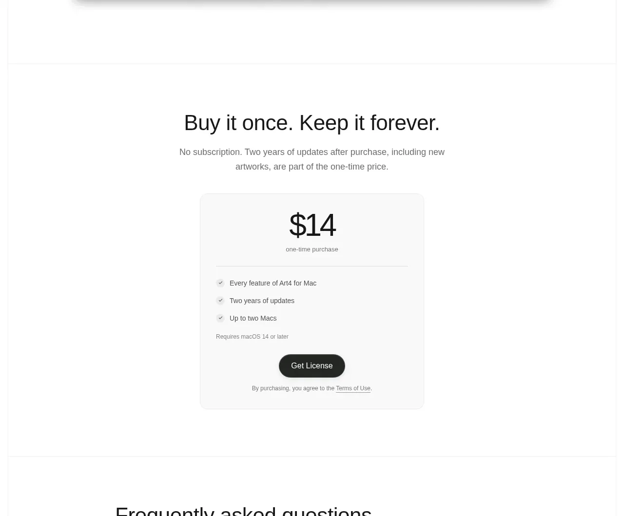
 Single purchase pricing card
Art4 · Pricing table
Single purchase pricing card
Art4 · Pricing table
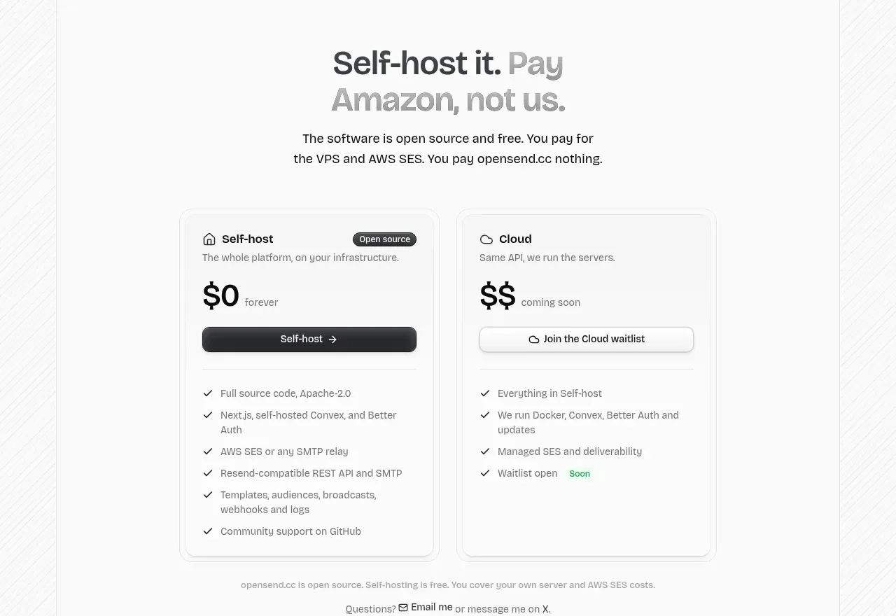
 Self-host versus cloud pricing
opensend.cc · Pricing table
Self-host versus cloud pricing
opensend.cc · Pricing table
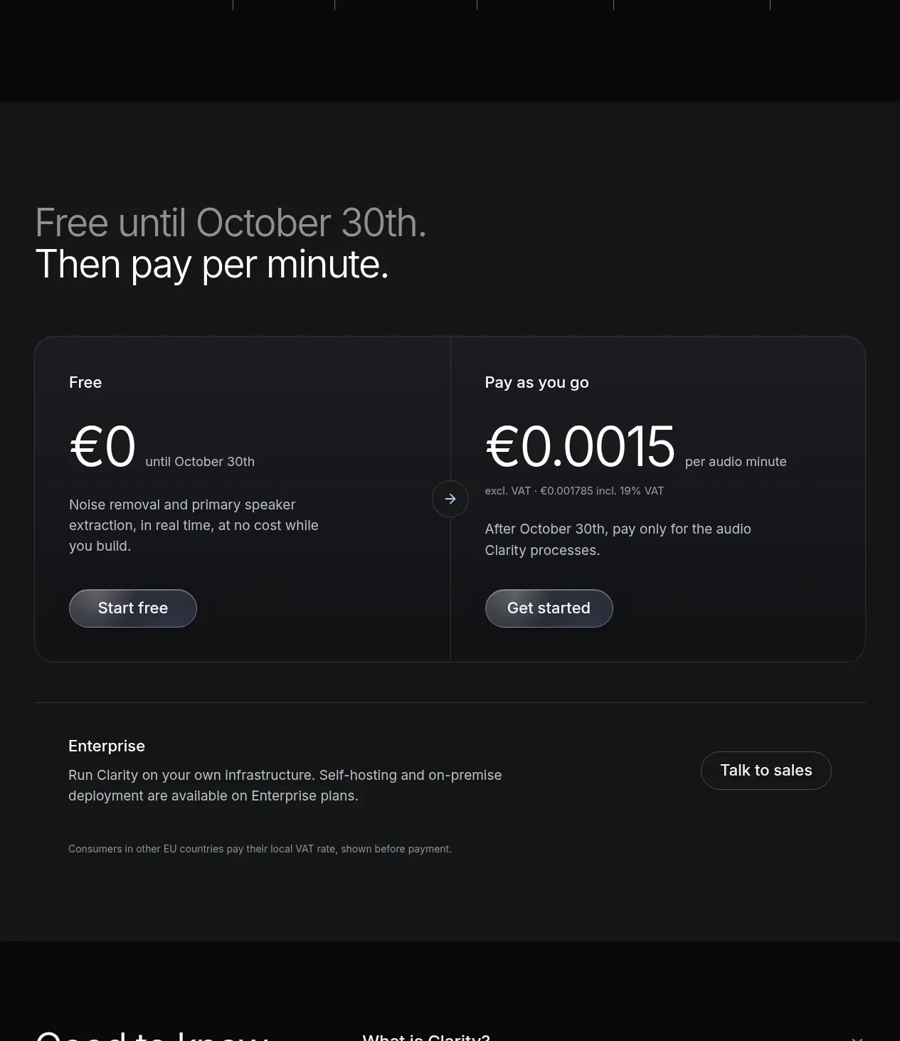
 Usage-based pricing
Clarity · Pricing table
Usage-based pricing
Clarity · Pricing table
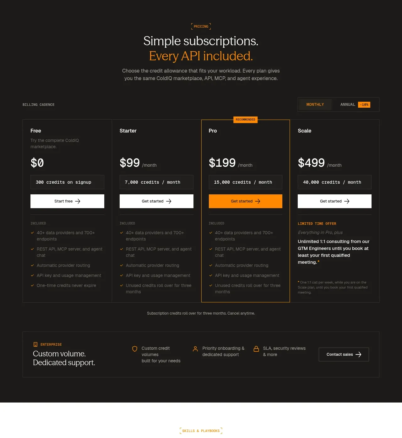
 Four-tier subscription pricing
ColdIQ x Slack · Pricing table
Four-tier subscription pricing
ColdIQ x Slack · Pricing table
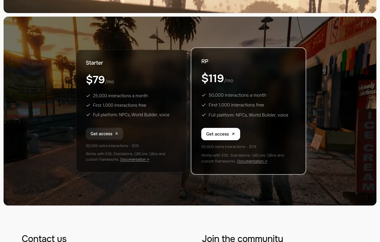
 Two-plan access pricing
Humalike x GTA RP · Pricing table
Two-plan access pricing
Humalike x GTA RP · Pricing table
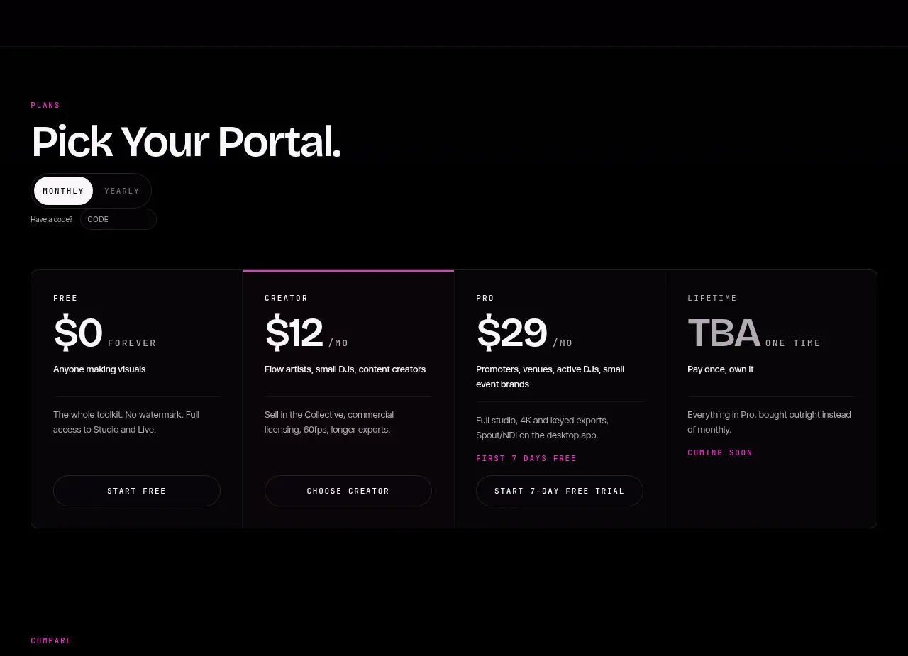
 Four-tier pricing selector
FRCTL · Pricing table
Four-tier pricing selector
FRCTL · Pricing table