 kage
kage
evvery.app
Design analysis
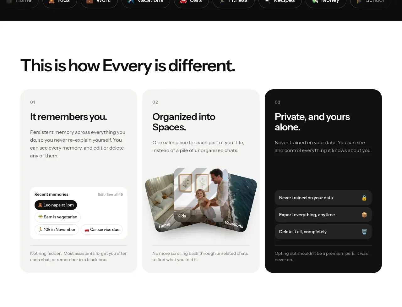
Three tall cards explain the product's differentiators with a consistent editorial rhythm, while the final dark card creates contrast for the privacy promise.
Prompt preview
## Reference images

Study these alongside the description below: hierarchy, rhythm, spacing, colour. Build for the product you are asked about, using this design language.

- Component: https://kage-design-assets.t3.tigrisfiles.io/components/evvery/a269aa57-af78-4f36-91fc-487db18a20bb-1790402472-2.webp
- Full page it was cut from: https://kage-design-assets.t3.tigrisfiles.io/screenshots/evvery/a269aa57-af78-4f36-91fc-487db18a20bb-1790402436622-full.webp
- Component on Kage: https://kage.design/component/evvery-feature-grid

## Before you start
Ask about the user's product, its three strongest differentiators, and its visual identity. Use those answers to create an original version.

Build a three-column feature card grid on a white or warm-white section. Start with a large left-aligned section heading and then three equal-height cards with generous rounded corners. Each card needs a small ordinal label, concise headline, short explanatory text, and a lower proof element such as a UI snippet, image placeholder, or checklist. Make one card dark (#111111) with white type to create deliberate contrast; keep the other cards around #f3f3f1. Use 28–32px radius, 22–28px internal padding, 16–20px gaps, and a clear type hierarchy. Stack cards vertically on mobile.

Never use the reference's logo, product name, copy, illustrations, imagery, or exact UI content.
More components

 Three-step process cards
godaylight.com · Feature grid
Three-step process cards
godaylight.com · Feature grid

 Use-case selector with vertical video preview
Spira Maxima · Feature grid
Use-case selector with vertical video preview
Spira Maxima · Feature grid

 Insights and enterprise model access
FastRouter.ai · Feature grid
Insights and enterprise model access
FastRouter.ai · Feature grid
 Solutions by organizational role
FastRouter.ai · Feature grid
Solutions by organizational role
FastRouter.ai · Feature grid
 Routing reliability and model collaboration
FastRouter.ai · Feature grid
Routing reliability and model collaboration
FastRouter.ai · Feature grid
 Goal-oriented product capabilities
FastRouter.ai · Feature grid
Goal-oriented product capabilities
FastRouter.ai · Feature grid