 kage
kage
evvery.app
Design analysis
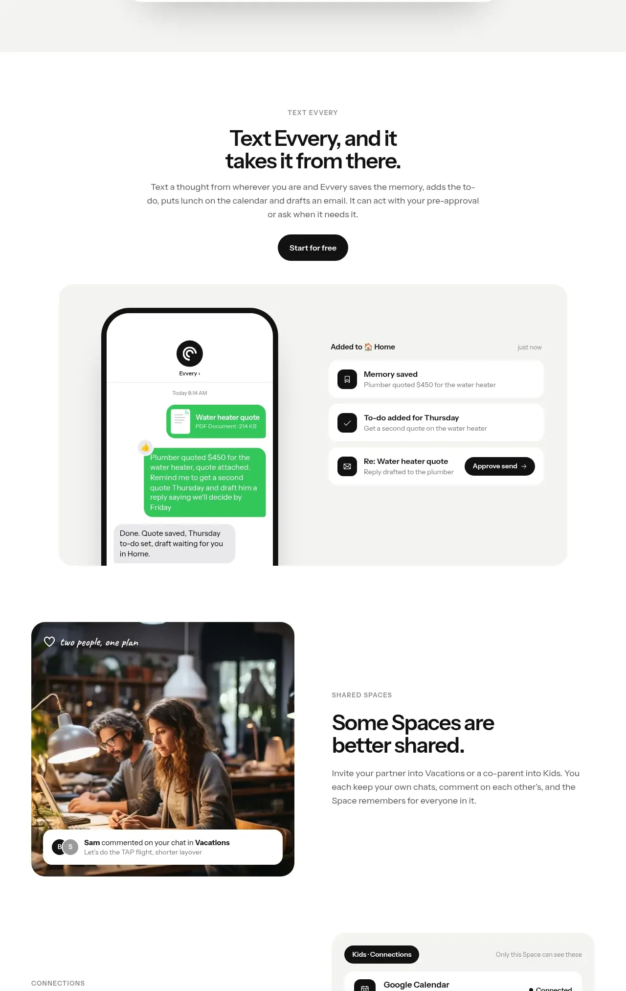
Several product capabilities are explained through alternating editorial layouts: a text-to-action demo, a shared-space image, and an integrations panel.
Prompt preview
## Reference images

Study these alongside the description below: hierarchy, rhythm, spacing, colour. Build for the product you are asked about, using this design language.

- Component: https://kage-design-assets.t3.tigrisfiles.io/components/evvery/a269aa57-af78-4f36-91fc-487db18a20bb-1790402473-5.webp
- Full page it was cut from: https://kage-design-assets.t3.tigrisfiles.io/screenshots/evvery/a269aa57-af78-4f36-91fc-487db18a20bb-1790402436622-full.webp
- Component on Kage: https://kage.design/component/evvery-feature-grid-3

## Before you start
Ask what workflows, collaboration scenarios, and integrations are most valuable for the user's product. Then use this structure with original content.

Create a sequence of feature rows inside one cohesive section. Begin with a centered eyebrow, headline, supporting copy, and a compact dark CTA. Follow with a wide pale product demo: a phone or input surface on one side and resulting action cards on the other. Then add an alternating split row with a rounded image or visual on one side and a heading plus paragraph on the other, followed by another split row showing a connected-services panel. Keep each row separated by generous whitespace, align everything to a shared max-width of about 800px, and use 20–28px radii, subtle borders, and #f4f4f2 panels. Make the rows stack naturally on mobile.

Never use the reference's logo, product name, copy, illustrations, imagery, or exact integration names.
More components

 Three-step process cards
godaylight.com · Feature grid
Three-step process cards
godaylight.com · Feature grid

 Use-case selector with vertical video preview
Spira Maxima · Feature grid
Use-case selector with vertical video preview
Spira Maxima · Feature grid

 Insights and enterprise model access
FastRouter.ai · Feature grid
Insights and enterprise model access
FastRouter.ai · Feature grid
 Solutions by organizational role
FastRouter.ai · Feature grid
Solutions by organizational role
FastRouter.ai · Feature grid
 Routing reliability and model collaboration
FastRouter.ai · Feature grid
Routing reliability and model collaboration
FastRouter.ai · Feature grid
 Goal-oriented product capabilities
FastRouter.ai · Feature grid
Goal-oriented product capabilities
FastRouter.ai · Feature grid