 kage
kage
evvery.app
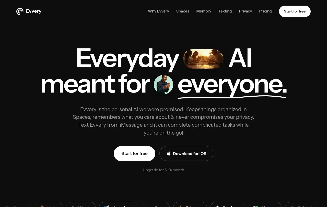
Design analysis
The hero uses oversized centered typography, restrained supporting copy, two clear actions, and a row of space shortcuts to make the product feel broad but approachable.
Prompt preview
## Reference images

Study these alongside the description below: hierarchy, rhythm, spacing, colour. Build for the product you are asked about, using this design language.

- Component: https://kage-design-assets.t3.tigrisfiles.io/components/evvery/a269aa57-af78-4f36-91fc-487db18a20bb-1790402471-1.webp
- Full page it was cut from: https://kage-design-assets.t3.tigrisfiles.io/screenshots/evvery/a269aa57-af78-4f36-91fc-487db18a20bb-1790402436622-full.webp
- Component on Kage: https://kage.design/component/evvery-hero

## Before you start
Ask what the user's product is, its audience, and its brand direction. Then reinterpret this structure for that product.

Create a dark, full-width hero beneath the nav. Center a very large, tightly tracked headline with optional inline product imagery or a coloured word treatment only if it fits the user's brand. Add a calm gray paragraph below, then a white primary pill CTA and a dark outlined secondary CTA. Include a small muted pricing or reassurance note. Finish with a horizontally scrollable row of rounded category chips that suggests multiple use cases. Use #0d0d0d, white text, #8d8d8d supporting text, thin #393939 borders, 999px button radii, and generous vertical spacing. Keep the hero readable and avoid competing visuals.

Never use the reference's logo, product name, copy, illustrations, imagery, or exact category labels.
More components

 AI workflow hero
Incredible · Hero
AI workflow hero
Incredible · Hero

 Decentralized energy statement
godaylight.com · Hero
Decentralized energy statement
godaylight.com · Hero
 Photographic power-home hero
godaylight.com · Hero
Photographic power-home hero
godaylight.com · Hero
 Warm mission statement panel
godaylight.com · Hero
Warm mission statement panel
godaylight.com · Hero
 Grid problem statement
godaylight.com · Hero
Grid problem statement
godaylight.com · Hero

 Product hero with download action and video
HyperFrames Studio (Desktop) · Hero
Product hero with download action and video
HyperFrames Studio (Desktop) · Hero