 kage
kage
evvery.app
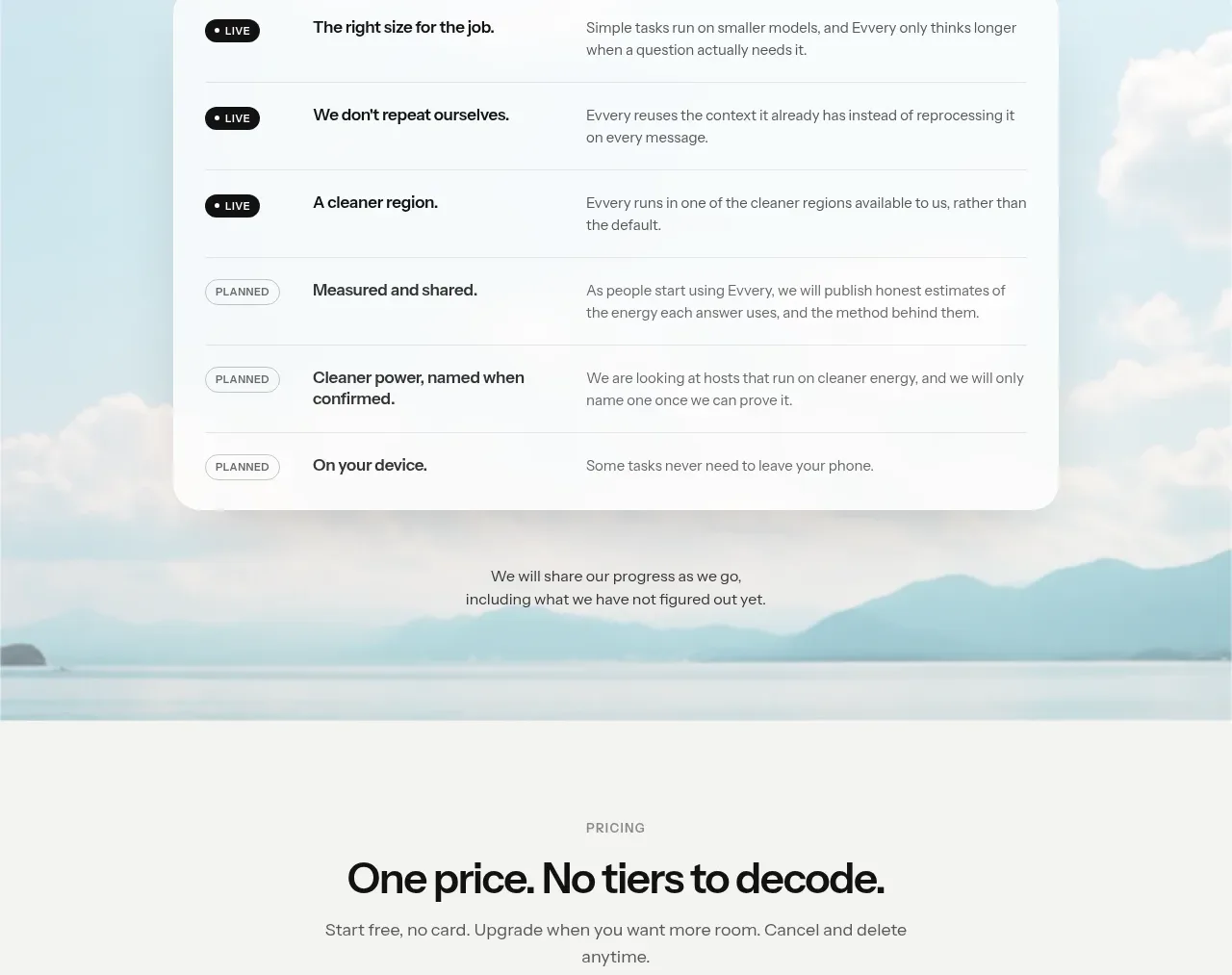
Design analysis
The pricing section is intentionally simple: a clear promise above two contrasting cards, one free and one paid, with one action per tier.
Prompt preview
## Reference images

Study these alongside the description below: hierarchy, rhythm, spacing, colour. Build for the product you are asked about, using this design language.

- Component: https://kage-design-assets.t3.tigrisfiles.io/components/evvery/a269aa57-af78-4f36-91fc-487db18a20bb-1790402474-8.webp
- Full page it was cut from: https://kage-design-assets.t3.tigrisfiles.io/screenshots/evvery/a269aa57-af78-4f36-91fc-487db18a20bb-1790402436622-full.webp
- Component on Kage: https://kage.design/component/evvery-pricing-table

## Before you start
Ask about the user's actual pricing model, limits, billing terms, and brand style. Build a truthful version using those details.

Create a centered pricing section on a light neutral background. Use an eyebrow, a direct headline, and a short reassurance line above two side-by-side pricing cards. One card should be light and one dark for contrast; each needs a plan label, large price, billing qualifier, short description, four or five benefits, and a full-width button. Use 28px rounded corners, generous 28–32px padding, subtle shadows only where useful, and highly scannable bullets. Include a small footnote below about billing or privacy. Stack the cards on mobile and keep the recommended action visually obvious.

Never use the reference's logo, product name, copy, illustrations, imagery, or exact prices.
More components
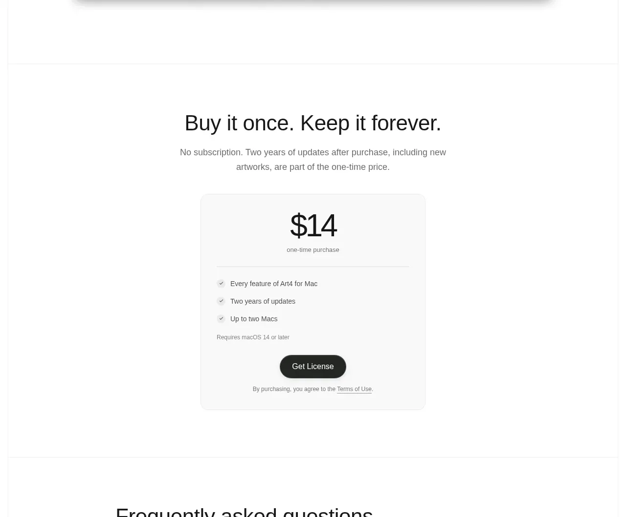
 Single purchase pricing card
Art4 · Pricing table
Single purchase pricing card
Art4 · Pricing table
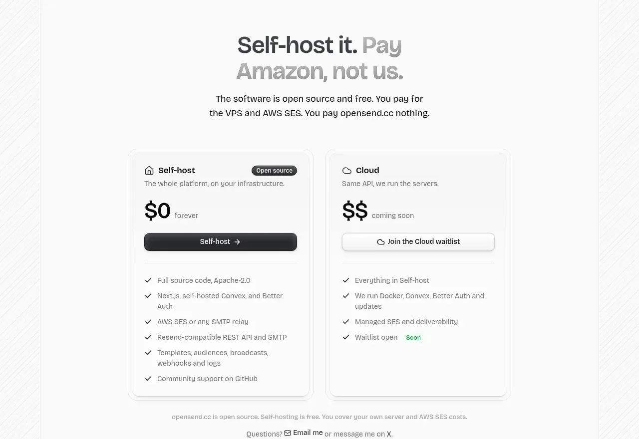
 Self-host versus cloud pricing
opensend.cc · Pricing table
Self-host versus cloud pricing
opensend.cc · Pricing table
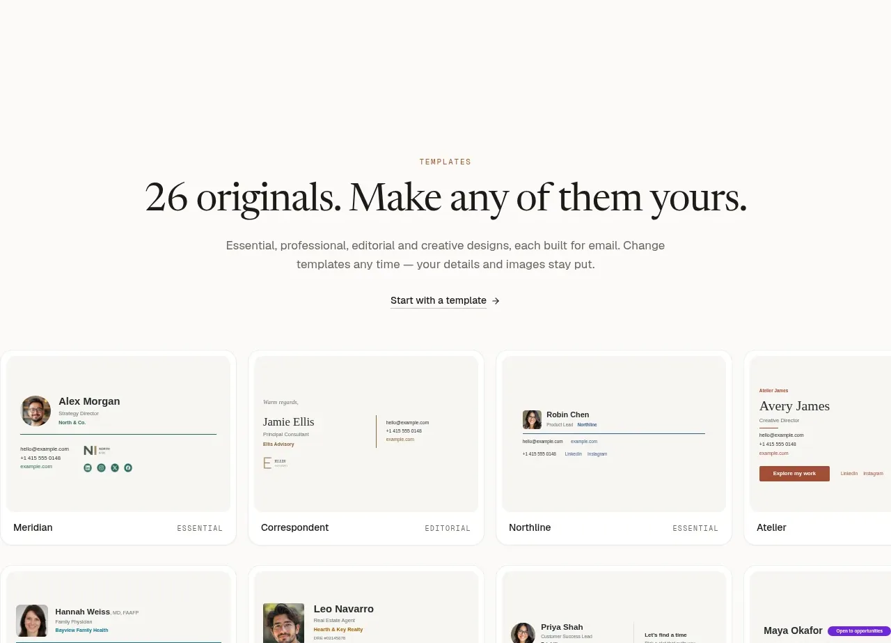
 Two-tier pricing table
esigna · Pricing table
Two-tier pricing table
esigna · Pricing table
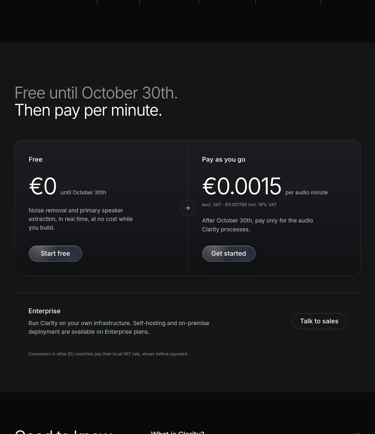
 Usage-based pricing
Clarity · Pricing table
Usage-based pricing
Clarity · Pricing table
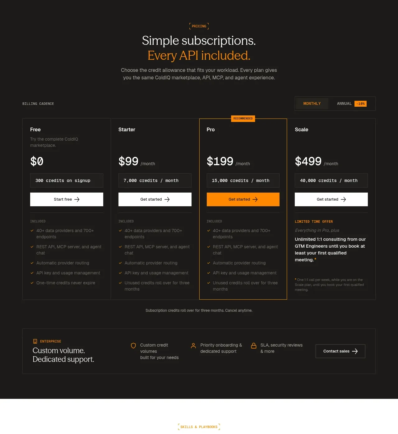
 Four-tier subscription pricing
ColdIQ x Slack · Pricing table
Four-tier subscription pricing
ColdIQ x Slack · Pricing table
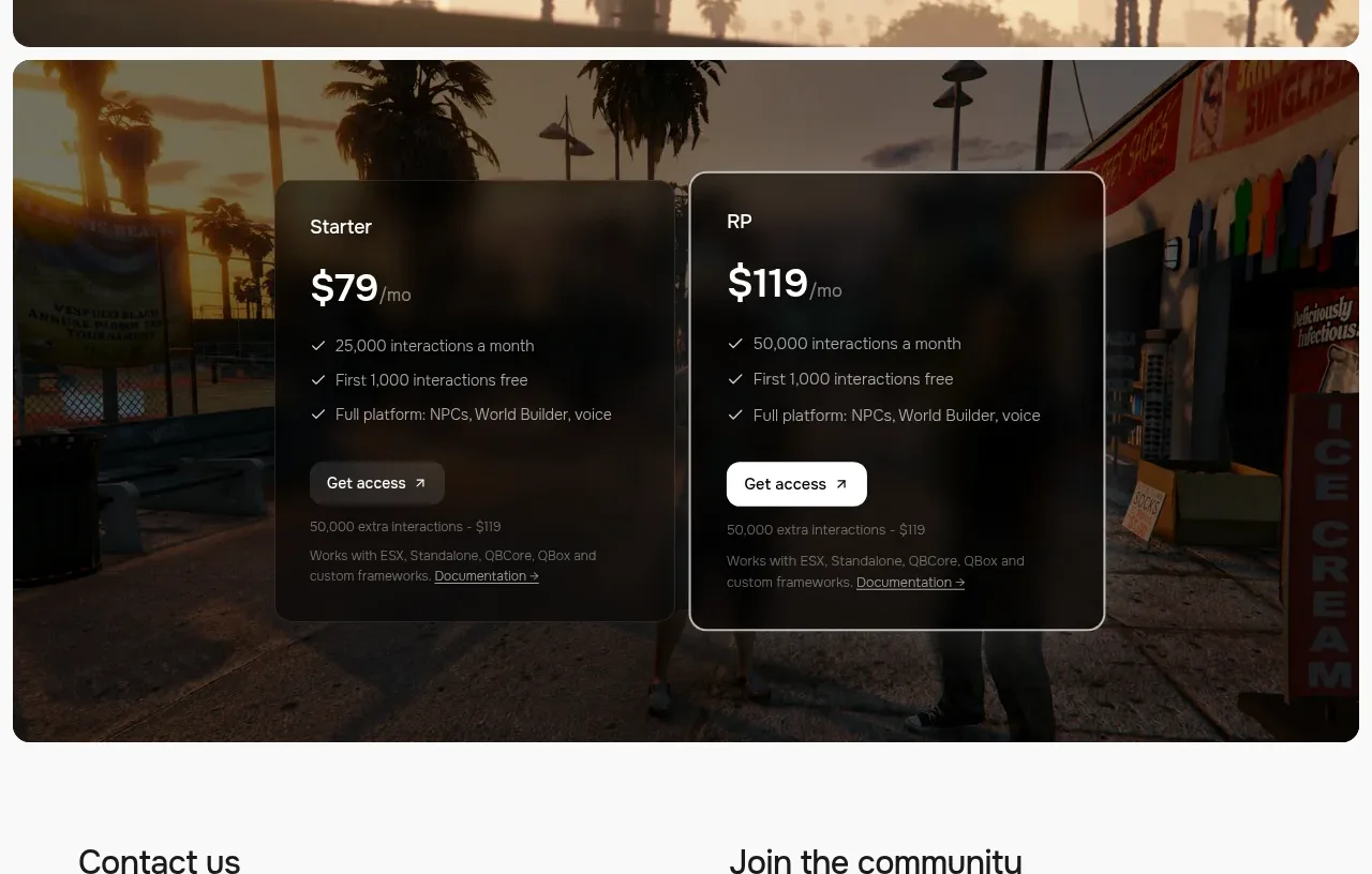
 Two-plan access pricing
Humalike x GTA RP · Pricing table
Two-plan access pricing
Humalike x GTA RP · Pricing table