 kage
usefastlane.ai
Design analysis
A centered section heading sits above a loose grid of small quote cards, creating breadth of opinion while keeping each testimonial easy to scan.
Prompt preview
## Reference images

Study these alongside the description below: hierarchy, rhythm, spacing, colour. Build for the product you are asked about, using this design language.

- Component: https://kage-design-assets.t3.tigrisfiles.io/components/fastlane-2-0/959a4273-adb0-42a9-9dfc-df0ea320e78d-1792735311-6.webp
- Full page it was cut from: https://kage-design-assets.t3.tigrisfiles.io/screenshots/fastlane-2-0/959a4273-adb0-42a9-9dfc-df0ea320e78d-1792735248580-full.webp
- Component on Kage: https://kage.design/component/fastlane-2-0-testimonials

## Before you start
Ask who the user's most credible customers are, what outcomes they can substantiate, and what permission exists to show names or avatars. Then build the proof system from those inputs.

Design a testimonials section with a centered heading around 34–46px and a responsive masonry-like grid of 5–8 quote cards. Cards should be white or near-white #ffffff on a very light background #fafafa, with 1px #eeeeee borders, 14–18px radius, and restrained shadows. Vary card heights slightly but keep text readable: 14–16px quote text, 12–13px attribution, small circular avatar, and optional company/context label. Use a balanced 3-column desktop grid, 2 columns tablet, and one column mobile. Keep 24–40px gaps and generous section padding. Add subtle hover elevation only; do not auto-rotate testimonials unless there is a clear mobile carousel affordance. Prioritize specific results and believable attribution over excessive praise.

Never: copy logos, product names, copy, illustrations, or imagery from the reference.
More components
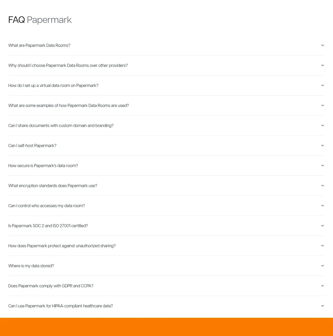
 Employee and community testimonials
Papermark Data Rooms · Testimonials
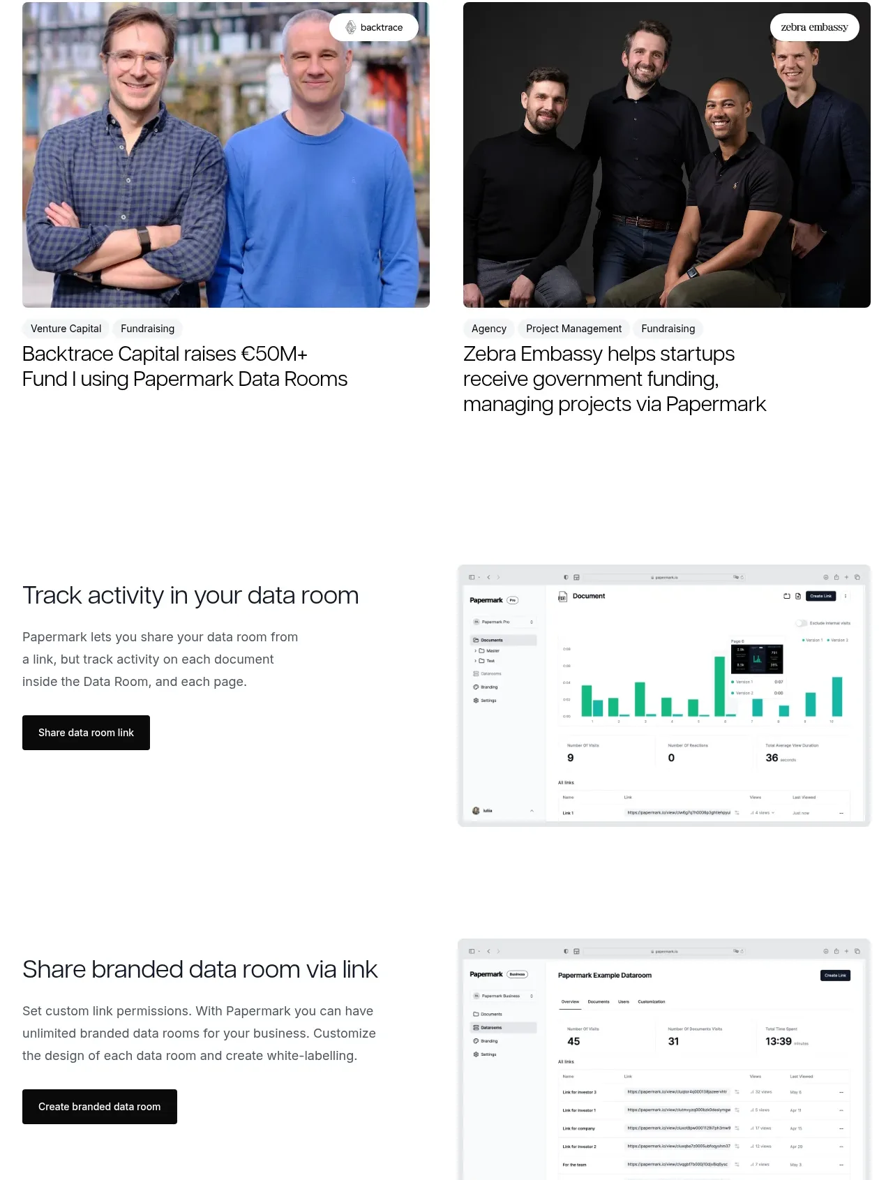 Customer success stories
Papermark Data Rooms · Testimonials
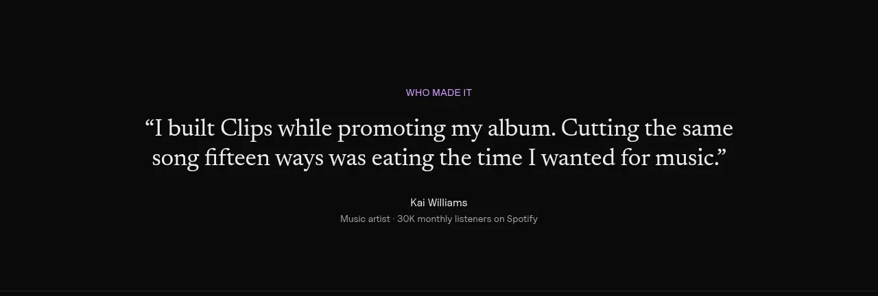
 Customer quote
Clips by Plastic · Testimonials
M
Creator testimonials
MOVO AI · Testimonials
 Customer proof carousel
Koi · Testimonials
 First customer quote
Inflight · Testimonials