 kage
koiscribe.com
Design analysis
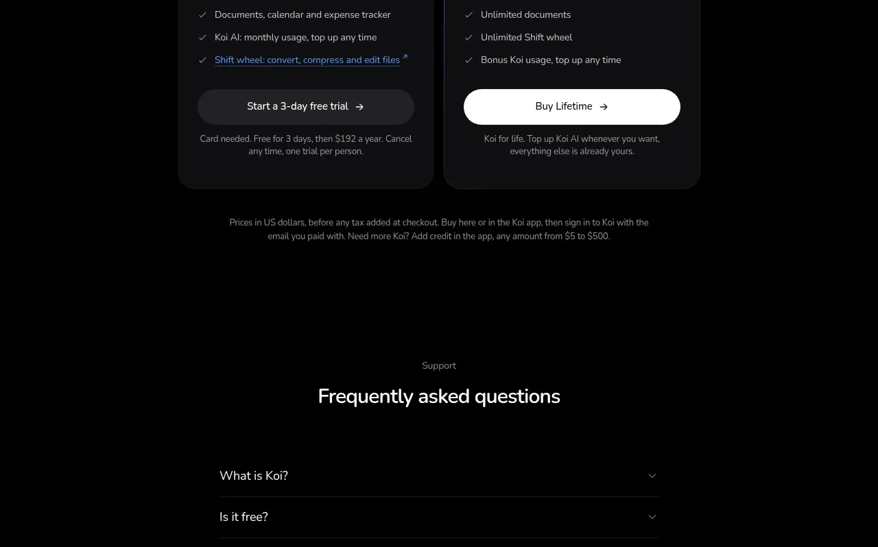
A compact testimonial band uses a centered heading and a row of dark quote cards to provide social proof without breaking the page's visual rhythm.
Prompt preview
## Reference images

Study these alongside the description below: hierarchy, rhythm, spacing, colour. Build for the product you are asked about, using this design language.

- Component: https://kage-design-assets.t3.tigrisfiles.io/components/koi/1f2fb87d-9243-4e92-a42a-66c20077da12-1792649022-10.webp
- Full page it was cut from: https://kage-design-assets.t3.tigrisfiles.io/screenshots/koi/1f2fb87d-9243-4e92-a42a-66c20077da12-1792648920300-full.webp
- Component on Kage: https://kage.design/component/koi-testimonials

## Before you start
Ask who the user's credible customers are, what outcomes they can honestly describe, and what tone the brand should use. Apply these rules without borrowing reference content.

Create a dark testimonial section with a centered eyebrow, 28–34px headline, and one muted sentence. Beneath it, show three or four quote cards in a horizontally scrollable row on small screens. Cards should have near-black surfaces, 1px borders, 14–18px radii, compact avatar placeholders or initials, author metadata, and readable 13–15px quote text. Keep card widths consistent and let the row gently overflow rather than shrinking text too far. Include accessible carousel controls or a simple horizontal scroll treatment, visible focus states, and enough contrast between card and page backgrounds.

Never: copy logos, product names, copy, illustrations, or imagery from the reference.
More components
 Customer success stories
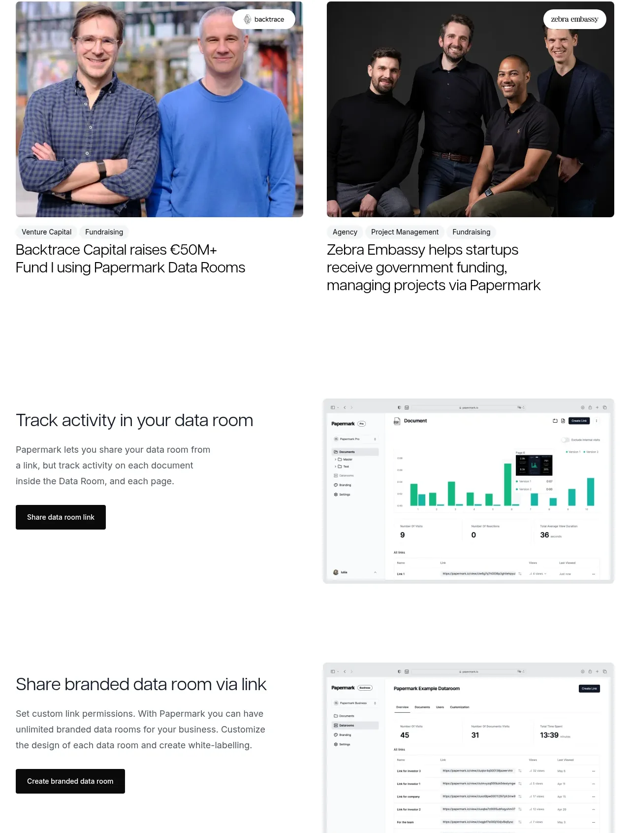
Papermark Data Rooms · Testimonials
 Employee and community testimonials
Papermark Data Rooms · Testimonials
 Customer quote
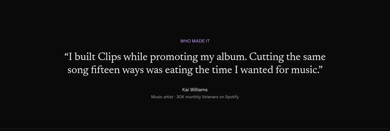
Clips by Plastic · Testimonials
M
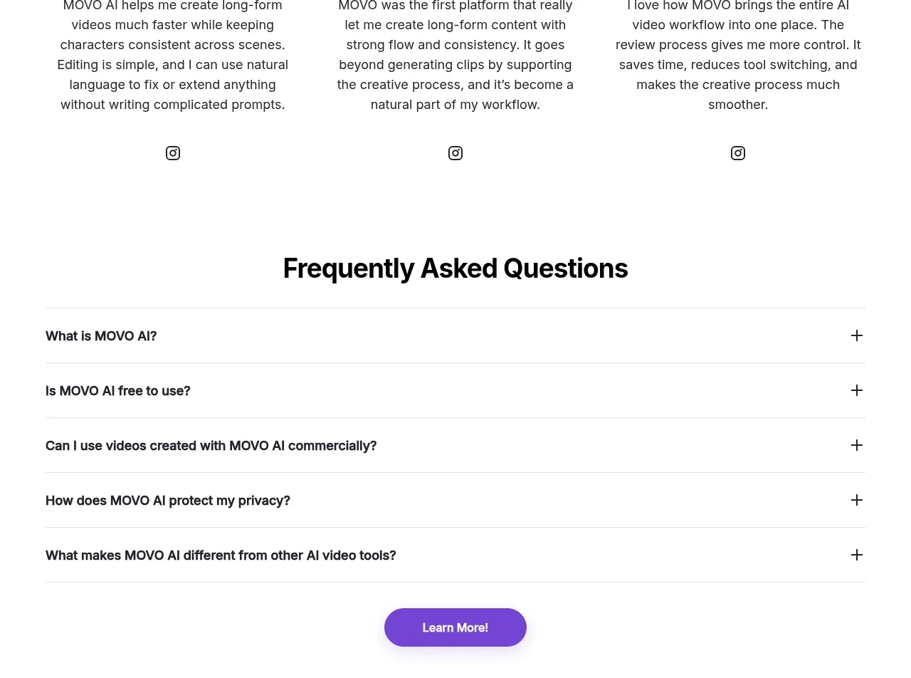
Creator testimonials
MOVO AI · Testimonials
 Founder and team testimonials
Fastlane 2.0 · Testimonials
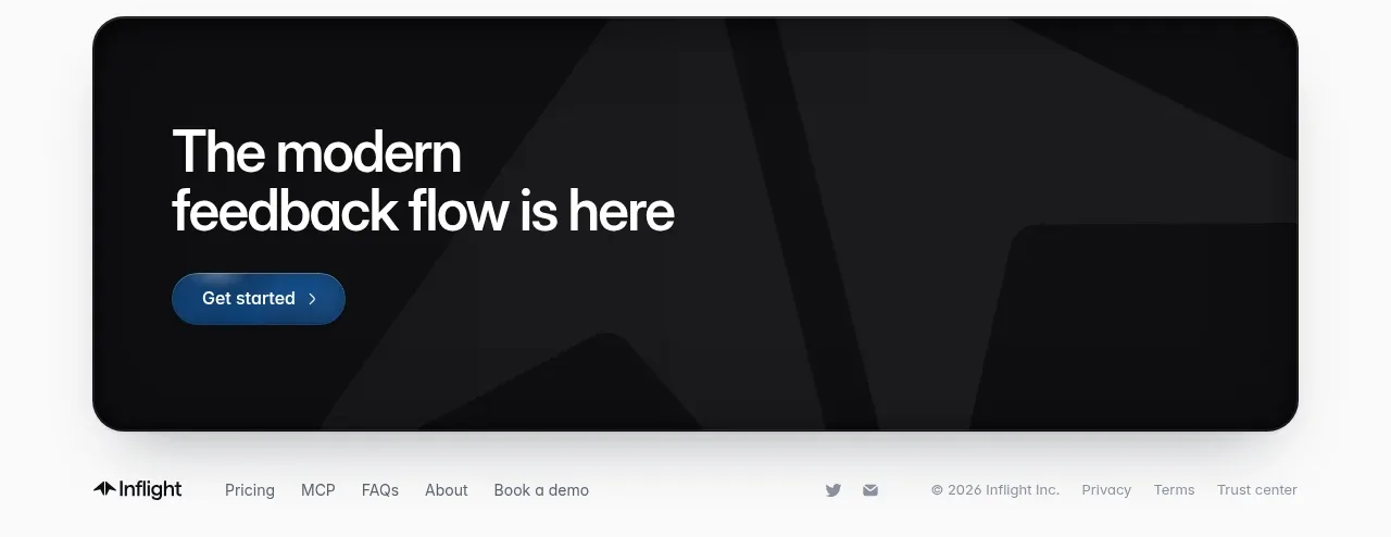
 Third customer quote
Inflight · Testimonials