kage
papermark.com
Design analysis
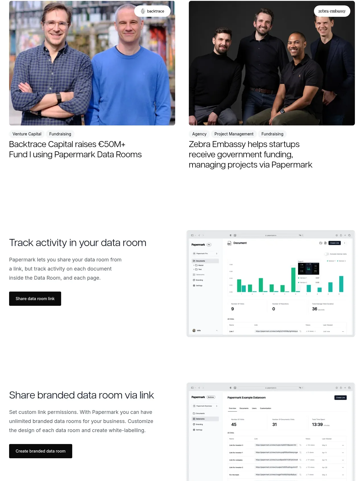
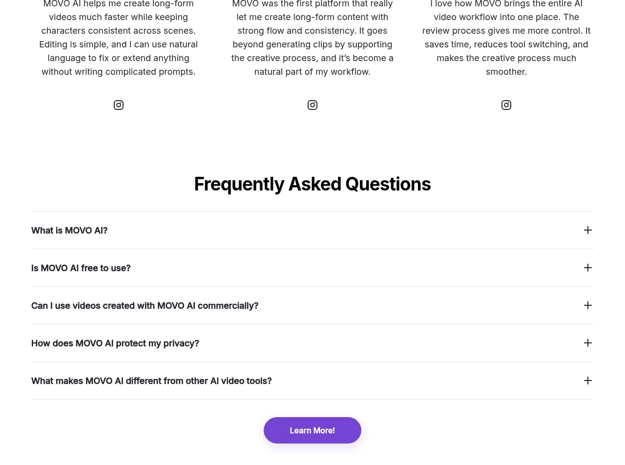
A three-column testimonial row combines portrait media with short first-person statements and attribution. It gives the page a warmer, more human proof layer after the product-heavy sections.
Prompt preview
## Reference images

Study these alongside the description below: hierarchy, rhythm, spacing, colour. Build for the product you are asked about, using this design language.

- Component: https://kage-design-assets.t3.tigrisfiles.io/components/papermark-data-rooms/d90c2ffc-2788-45c6-a044-36fe7b171e0c-1792994581-10.webp
- Full page it was cut from: https://kage-design-assets.t3.tigrisfiles.io/screenshots/papermark-data-rooms/d90c2ffc-2788-45c6-a044-36fe7b171e0c-1792994482140-full.webp
- Component on Kage: https://kage.design/component/papermark-data-rooms-testimonials-2

## Before you start
Ask whose perspective will build trust for the user's product and what consented portraits or avatars are available. Apply the principles below to that product.

Build a testimonial section with a heading, a brief supporting line, and three equal cards. Each card should place a portrait or avatar above a short, specific statement and a compact attribution line with role or context. Use consistent image crops, 8px media radii, white cards, subtle #E6E6E6 borders, and a soft shadow only on hover. Keep testimonial text at 14–16px with comfortable line-height and attribution at 11–12px muted gray. On smaller screens, use a one-column stack or horizontal carousel with accessible previous/next controls.

Never: use logos, product names, copy, illustrations, or imagery from the reference.