 kage
papermark.com
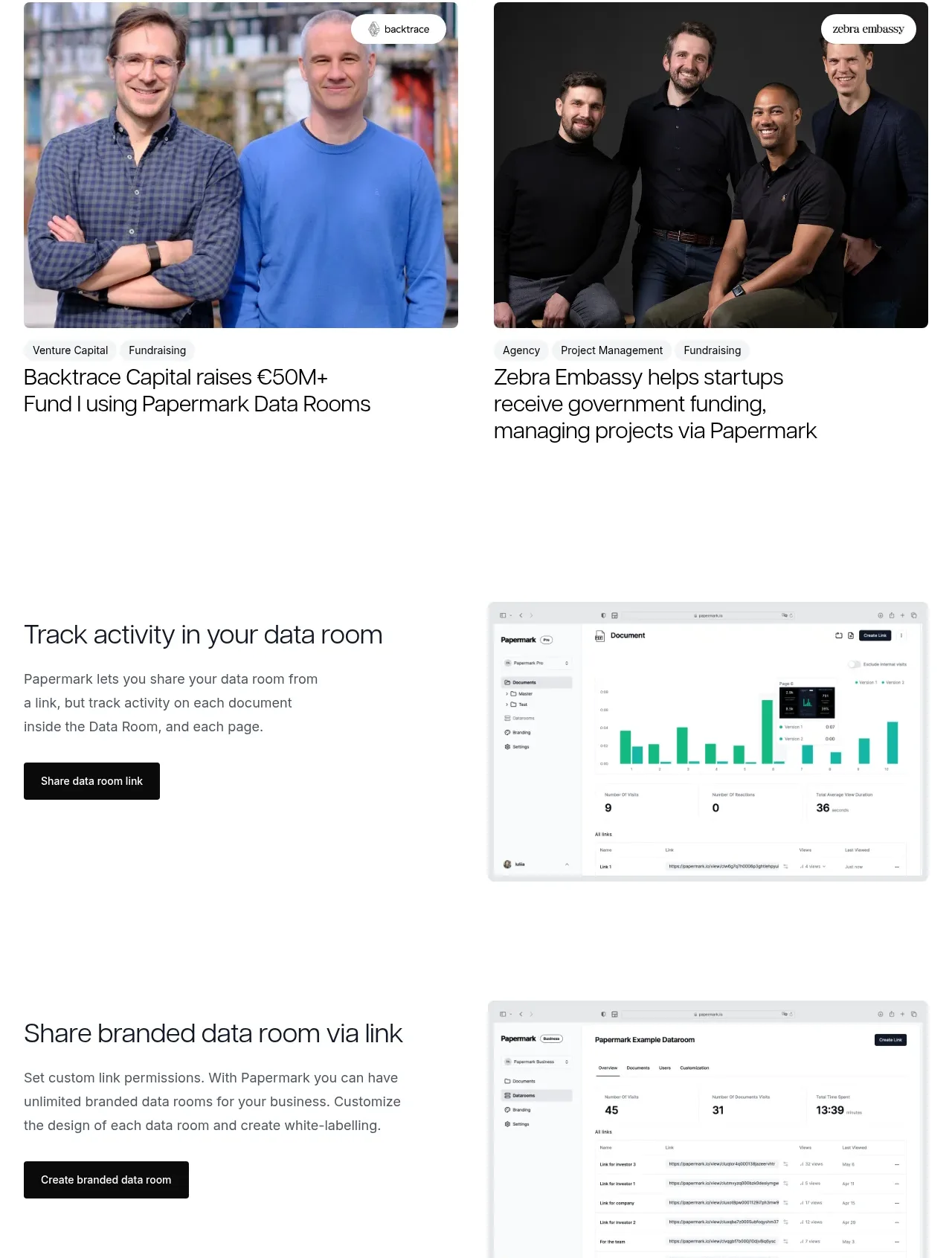
Design analysis
A customer-outcome heading introduces two large story cards with photography, category metadata, and measurable or concrete results. The cards make the product feel credible through specific workflows rather than generic praise.
Prompt preview
## Reference images

Study these alongside the description below: hierarchy, rhythm, spacing, colour. Build for the product you are asked about, using this design language.

- Component: https://kage-design-assets.t3.tigrisfiles.io/components/papermark-data-rooms/d90c2ffc-2788-45c6-a044-36fe7b171e0c-1792994580-7.webp
- Full page it was cut from: https://kage-design-assets.t3.tigrisfiles.io/screenshots/papermark-data-rooms/d90c2ffc-2788-45c6-a044-36fe7b171e0c-1792994482140-full.webp
- Component on Kage: https://kage.design/component/papermark-data-rooms-testimonials

## Before you start
Ask which customer outcomes and proof points are strongest for the user's product, and whether customer permissions exist for names and imagery. Apply the principles below to that product.

Create a customer story section with a heading, a subdued subtitle, and two prominent case-study cards in a two-column grid. Each card should have a large media area, small category tags, a customer or organization label, and a concise outcome-led headline. Add optional hover elevation and a clear click target for the full story. Use 16–20px card titles, 11–12px metadata, 14–16px section headings, 8–10px image radius, and white cards with minimal borders or soft shadows. Keep image aspect ratios consistent and make the cards stack cleanly on mobile. Favor specific evidence and a calm editorial tone over oversized testimonial quotes.

Never: use logos, product names, copy, illustrations, or imagery from the reference.
More components
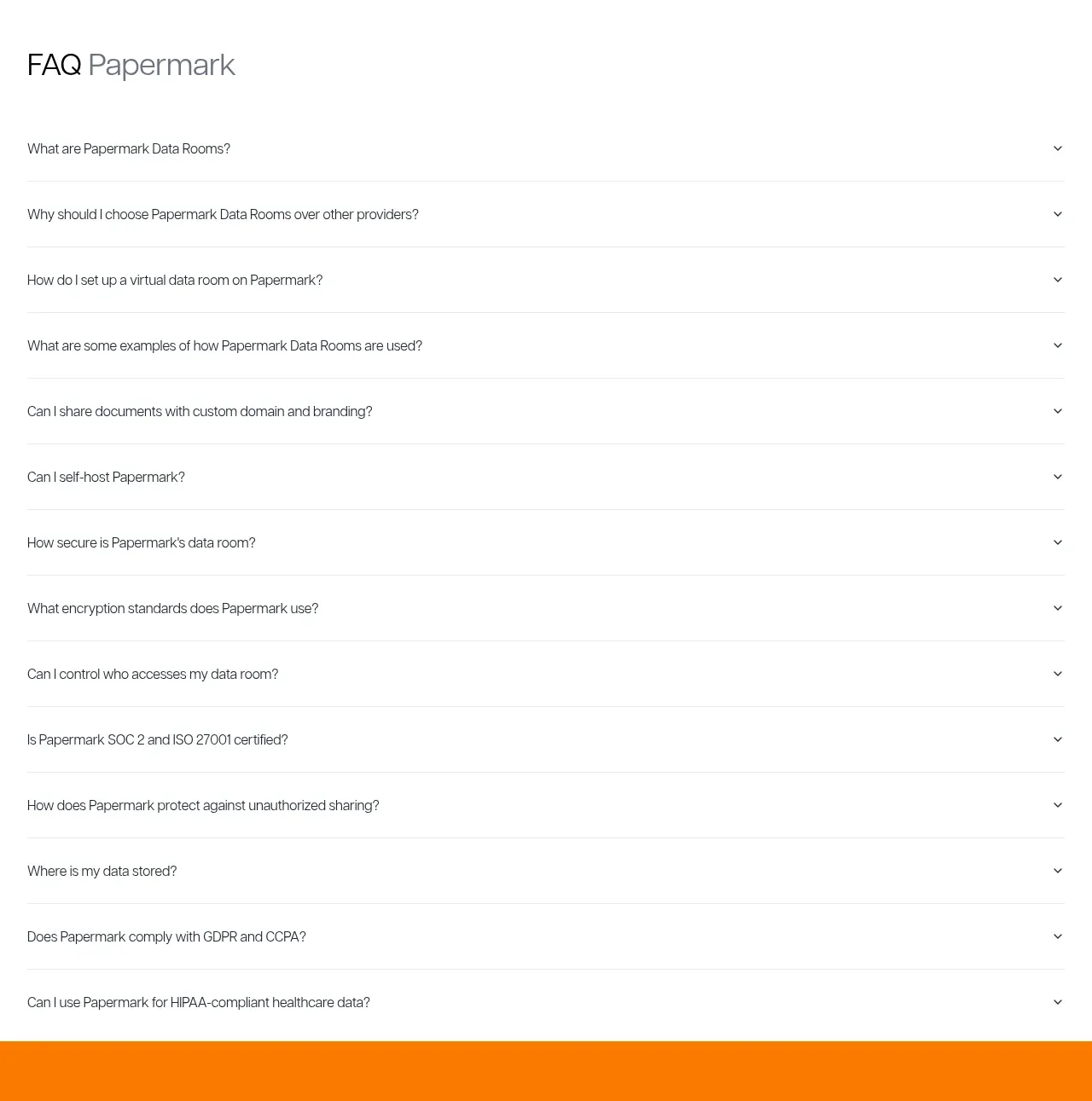
 Employee and community testimonials
Papermark Data Rooms · Testimonials
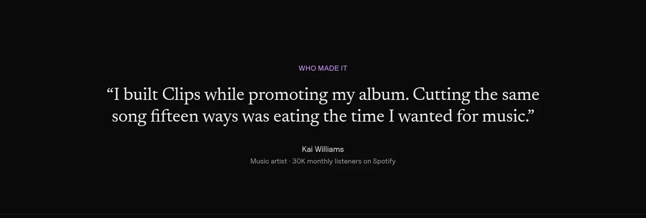
 Customer quote
Clips by Plastic · Testimonials
M
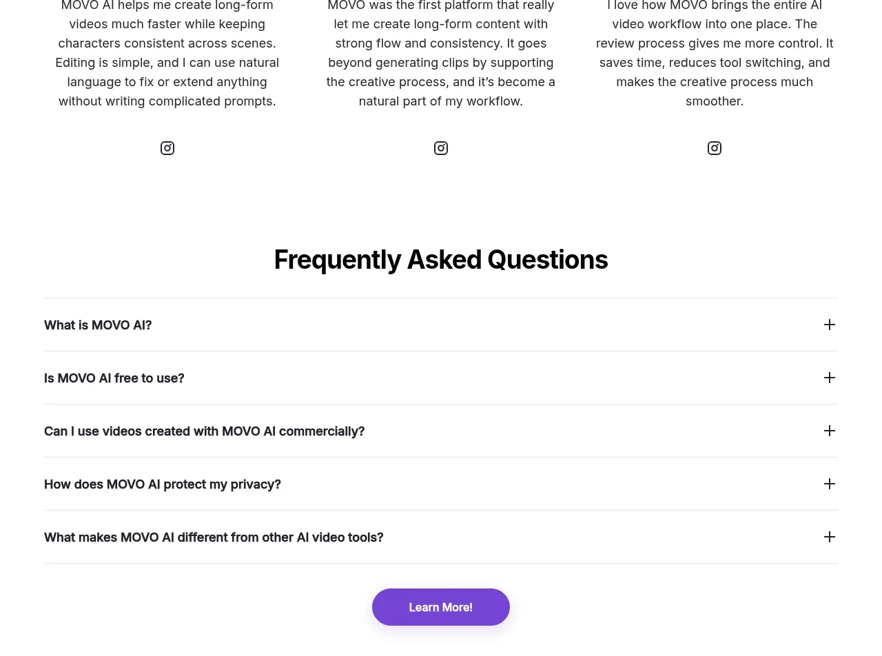
Creator testimonials
MOVO AI · Testimonials
 Founder and team testimonials
Fastlane 2.0 · Testimonials
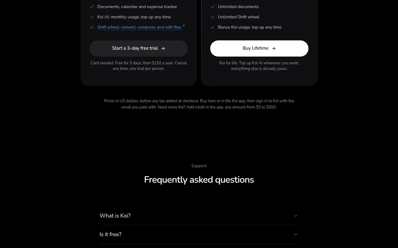
 Customer proof carousel
Koi · Testimonials
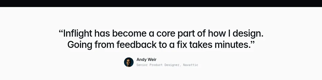
 First customer quote
Inflight · Testimonials