 kage
kage
fastrouter.ai

Design analysis
This section first surfaces a concrete operational pain point with metrics, then shifts into a dark enterprise-oriented capability panel. The contrast and dashboard preview make the abstract value feel tangible.
Prompt preview
## Reference images

Study these alongside the description below: hierarchy, rhythm, spacing, colour. Build for the product you are asked about, using this design language.

- Component: https://kage-design-assets.t3.tigrisfiles.io/components/fastrouter-ai/218f3f00-5cca-4309-9765-d0ad1151c96f-1791266479-3.webp
- Full page it was cut from: https://kage-design-assets.t3.tigrisfiles.io/screenshots/fastrouter-ai/218f3f00-5cca-4309-9765-d0ad1151c96f-1791266439499-full.webp
- Component on Kage: https://kage.design/component/fastrouter-feature-grid

## Before you start
Ask what measurable pain the user's product solves and which enterprise capability deserves emphasis. Use the answers to create an original two-part feature section.

Build a vertically composed feature section. Part one should use a pale, spacious background with a small green or blue eyebrow, a strong left-aligned heading, short explanatory copy, two actions, and a lightweight metrics/dashboard preview on the right. Part two should switch to a near-black panel around `#080909`, with a large light heading, concise description, an accordion-like list of 4–5 capabilities on the left, and a dark product interface preview on the right. Use a 12-column or two-column grid, 48–64px inner padding, and generous separation between the two parts. Typography should use 40–48px headings, 15–16px body copy, and 13–14px feature labels. Use white, `#f5f6f8`, muted gray `#a2a5ab`, electric blue `#3157d8`, and restrained green for positive metrics. Cards and previews can use 1px borders around `#2b2d30`, 12px radius, and soft shadows only on the light portion. Make capability rows keyboard-accessible, with clear active and hover states.

Never use logos, product names, copy, illustrations, or imagery from the reference.
More components

 Three-step process cards
godaylight.com · Feature grid
Three-step process cards
godaylight.com · Feature grid

 Use-case selector with vertical video preview
Spira Maxima · Feature grid
Use-case selector with vertical video preview
Spira Maxima · Feature grid

 Routing reliability and model collaboration
FastRouter.ai · Feature grid
Routing reliability and model collaboration
FastRouter.ai · Feature grid
 Goal-oriented product capabilities
FastRouter.ai · Feature grid
Goal-oriented product capabilities
FastRouter.ai · Feature grid
 Solutions by organizational role
FastRouter.ai · Feature grid
Solutions by organizational role
FastRouter.ai · Feature grid
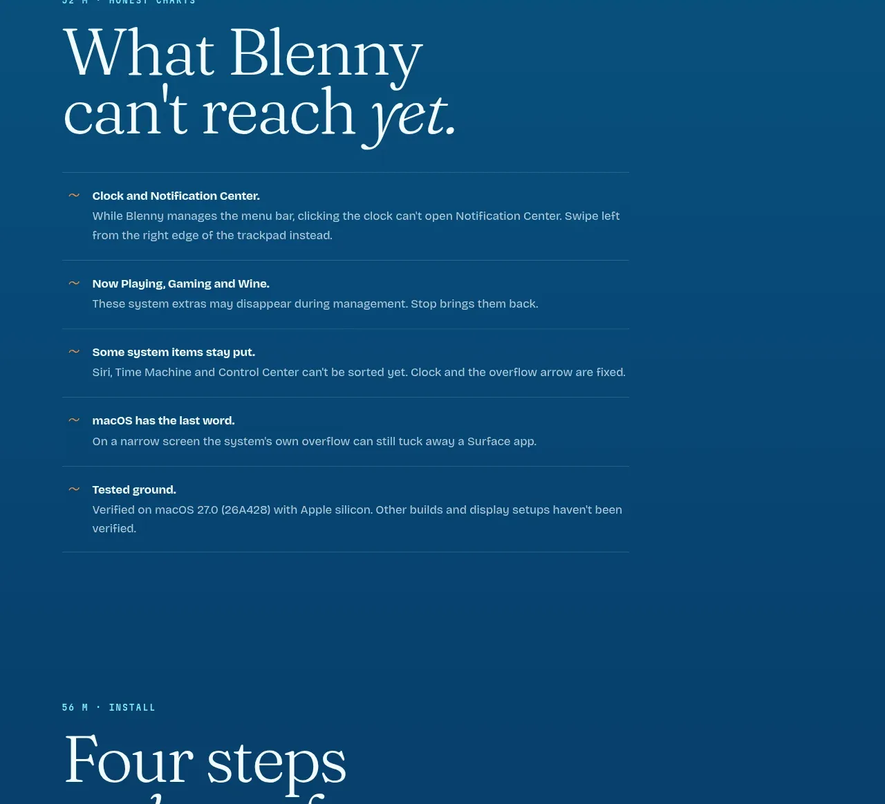
 Installation steps
Blenny · Feature grid
Installation steps
Blenny · Feature grid