 kage
kage
fastrouter.ai

Design analysis
A sequence of alternating product-led feature bands explains smart routing, failover, model collaboration, and visibility. Repeated layout logic makes the long story scannable while diagrams provide visual proof.
Prompt preview
## Reference images

Study these alongside the description below: hierarchy, rhythm, spacing, colour. Build for the product you are asked about, using this design language.

- Component: https://kage-design-assets.t3.tigrisfiles.io/components/fastrouter-ai/218f3f00-5cca-4309-9765-d0ad1151c96f-1791266479-4.webp
- Full page it was cut from: https://kage-design-assets.t3.tigrisfiles.io/screenshots/fastrouter-ai/218f3f00-5cca-4309-9765-d0ad1151c96f-1791266439499-full.webp
- Component on Kage: https://kage.design/component/fastrouter-feature-grid-2

## Before you start
Ask what the user's core product capabilities are, which order best explains their value, and what visual evidence can represent each one. Build an original feature narrative from that information.

Create a long, modular feature suite composed of four alternating two-column bands. Each band has a small uppercase eyebrow, a 40–48px heading, a concise description, three short benefit rows with small icons, and a contextual diagram or interface preview in the opposite column. Alternate image-left and image-right alignment to create rhythm, while preserving a consistent max-width and baseline grid. Use white background, charcoal `#17191c`, body gray `#747981`, faint blue-lavender diagram surfaces around `#eef2ff`, and blue accents near `#3157d8` with occasional green status accents. Use 96–140px vertical spacing between bands, 24px between feature rows, 12px radius on diagram cards, and very light borders `#e9ebef`. On mobile, collapse to one column with text before the visual and keep diagrams compact. If any rows behave like tabs or accordions, provide visible active states and keyboard support.

Never use logos, product names, copy, illustrations, or imagery from the reference.
More components

 Three-step process cards
godaylight.com · Feature grid
Three-step process cards
godaylight.com · Feature grid

 Use-case selector with vertical video preview
Spira Maxima · Feature grid
Use-case selector with vertical video preview
Spira Maxima · Feature grid

 Insights and enterprise model access
FastRouter.ai · Feature grid
Insights and enterprise model access
FastRouter.ai · Feature grid
 Goal-oriented product capabilities
FastRouter.ai · Feature grid
Goal-oriented product capabilities
FastRouter.ai · Feature grid
 Solutions by organizational role
FastRouter.ai · Feature grid
Solutions by organizational role
FastRouter.ai · Feature grid
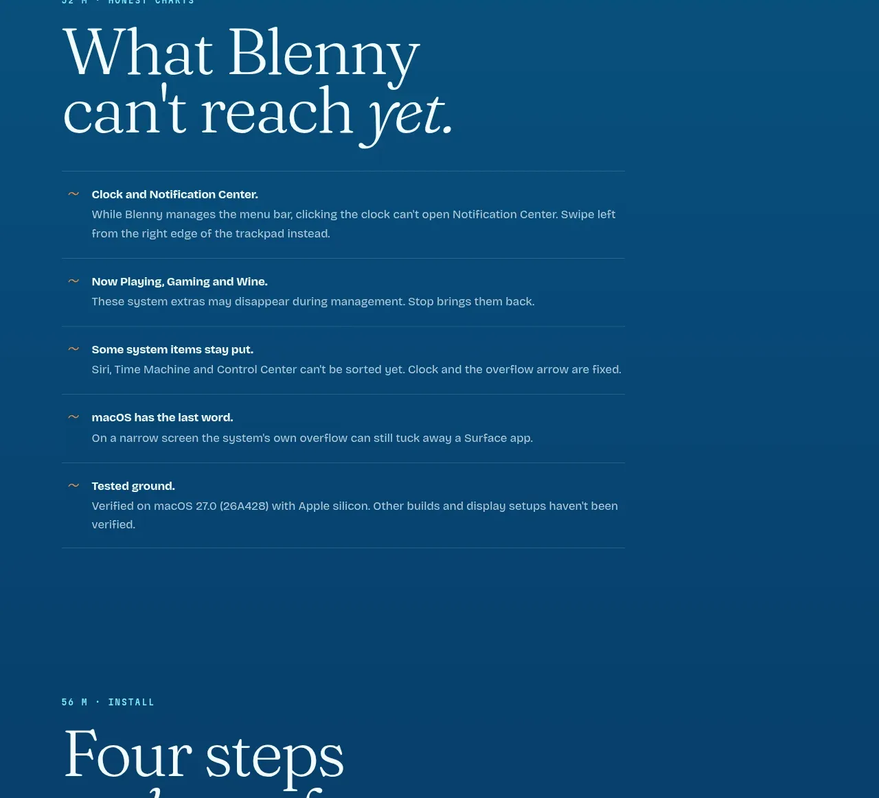
 Installation steps
Blenny · Feature grid
Installation steps
Blenny · Feature grid