 kage
kage
fastrouter.ai

Design analysis
A light section reframes the product around user goals, using a simple two-by-two grid of bordered cards. Each card combines a plain-language title, short explanation, and an illustrative workflow diagram.
Prompt preview
## Reference images

Study these alongside the description below: hierarchy, rhythm, spacing, colour. Build for the product you are asked about, using this design language.

- Component: https://kage-design-assets.t3.tigrisfiles.io/components/fastrouter-ai/218f3f00-5cca-4309-9765-d0ad1151c96f-1791266482-6.webp
- Full page it was cut from: https://kage-design-assets.t3.tigrisfiles.io/screenshots/fastrouter-ai/218f3f00-5cca-4309-9765-d0ad1151c96f-1791266439499-full.webp
- Component on Kage: https://kage.design/component/fastrouter-feature-grid-4

## Before you start
Ask what goals users have when they arrive at the product and which four use cases are most valuable. Apply this structure to those goals and the user's visual identity.

Build a light goal-oriented feature grid. Start with a large left-aligned heading and a short supporting sentence aligned to its right on desktop. Below, create four bordered cards in a 2×2 layout. Each card contains a title, 2–3 lines of explanatory copy, and a compact bottom illustration or workflow diagram made from UI primitives rather than stock imagery. Use white cards on a white or `#fbfcfd` background, text `#17191c`, body gray `#737981`, 1px border `#e4e7eb`, 10–12px radius, and 32px internal padding. Use a restrained blue accent and one or two semantic colors for diagram states. Keep equal card heights and 24px gaps; collapse to one column on mobile. Add subtle hover elevation only if it communicates clickability.

Never use logos, product names, copy, illustrations, or imagery from the reference.
More components

 Three-step process cards
godaylight.com · Feature grid
Three-step process cards
godaylight.com · Feature grid

 Use-case selector with vertical video preview
Spira Maxima · Feature grid
Use-case selector with vertical video preview
Spira Maxima · Feature grid

 Insights and enterprise model access
FastRouter.ai · Feature grid
Insights and enterprise model access
FastRouter.ai · Feature grid
 Solutions by organizational role
FastRouter.ai · Feature grid
Solutions by organizational role
FastRouter.ai · Feature grid
 Routing reliability and model collaboration
FastRouter.ai · Feature grid
Routing reliability and model collaboration
FastRouter.ai · Feature grid
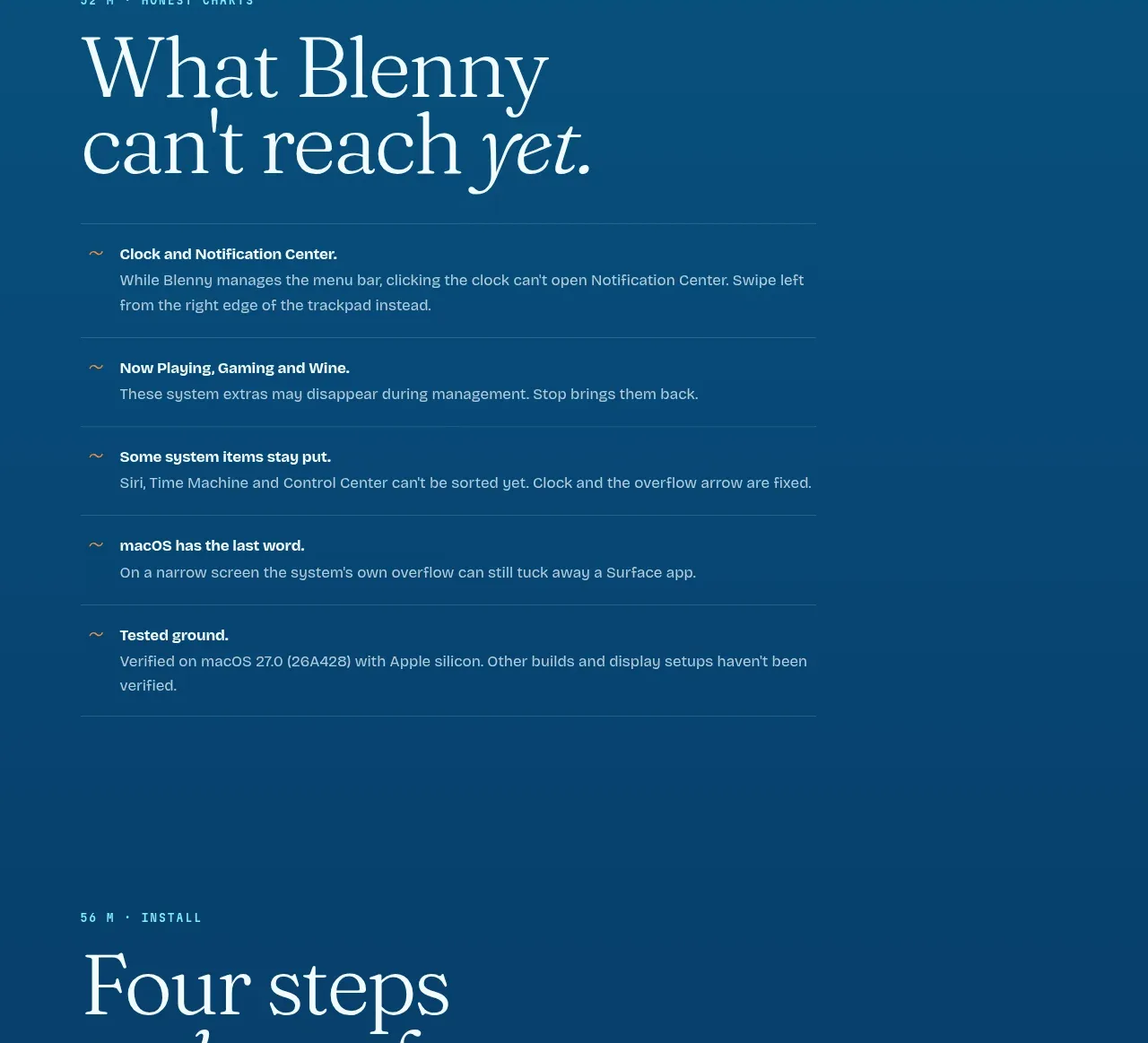
 Installation steps
Blenny · Feature grid
Installation steps
Blenny · Feature grid