 kage
kage
fastrouter.ai
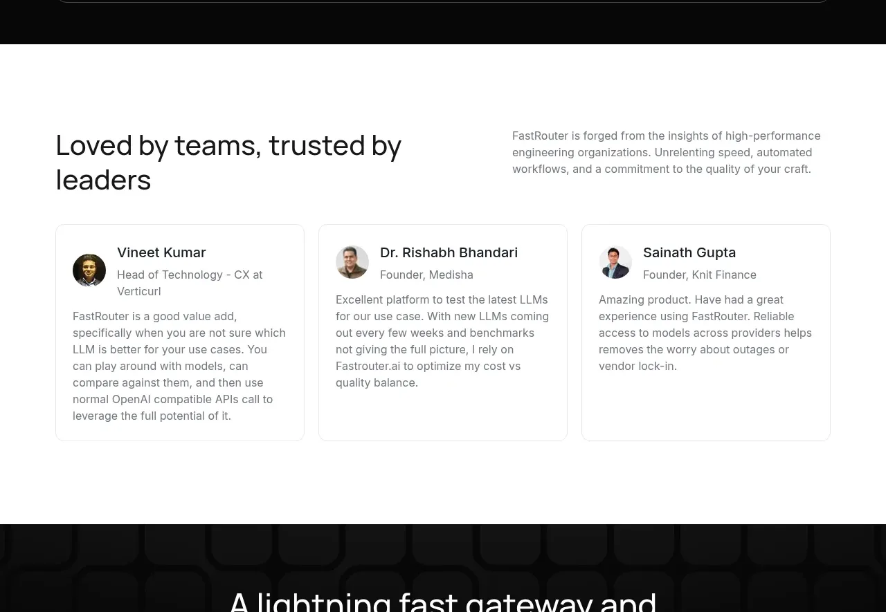
Design analysis
The testimonial section combines a clear social-proof heading with three compact quote cards. Consistent identity rows and restrained borders keep the focus on credibility and readability.
Prompt preview
## Reference images

Study these alongside the description below: hierarchy, rhythm, spacing, colour. Build for the product you are asked about, using this design language.

- Component: https://kage-design-assets.t3.tigrisfiles.io/components/fastrouter-ai/218f3f00-5cca-4309-9765-d0ad1151c96f-1791266482-8.webp
- Full page it was cut from: https://kage-design-assets.t3.tigrisfiles.io/screenshots/fastrouter-ai/218f3f00-5cca-4309-9765-d0ad1151c96f-1791266439499-full.webp
- Component on Kage: https://kage.design/component/fastrouter-testimonials

## Before you start
Ask who the user's real customers are, what outcomes they can truthfully describe, and whether permission exists to show names or photos. Use only approved, authentic proof.

Build a testimonial section on white or near-white background. Use a two-column intro with a large heading on the left and a short credibility statement on the right. Below, place three equal quote cards with a small avatar or neutral identity marker, person name, role/company, and a concise quote. Use 32px card padding, 20–24px gaps, 1px border `#e6e8eb`, 10px radius, charcoal text `#202226`, and muted gray metadata `#767b83`. Keep quote text around 14–15px with 1.5 line-height. On mobile use a vertical stack or accessible carousel with visible controls. Do not overuse decorative quotation marks; let the content provide proof.

Never use logos, product names, copy, illustrations, or imagery from the reference.
More components
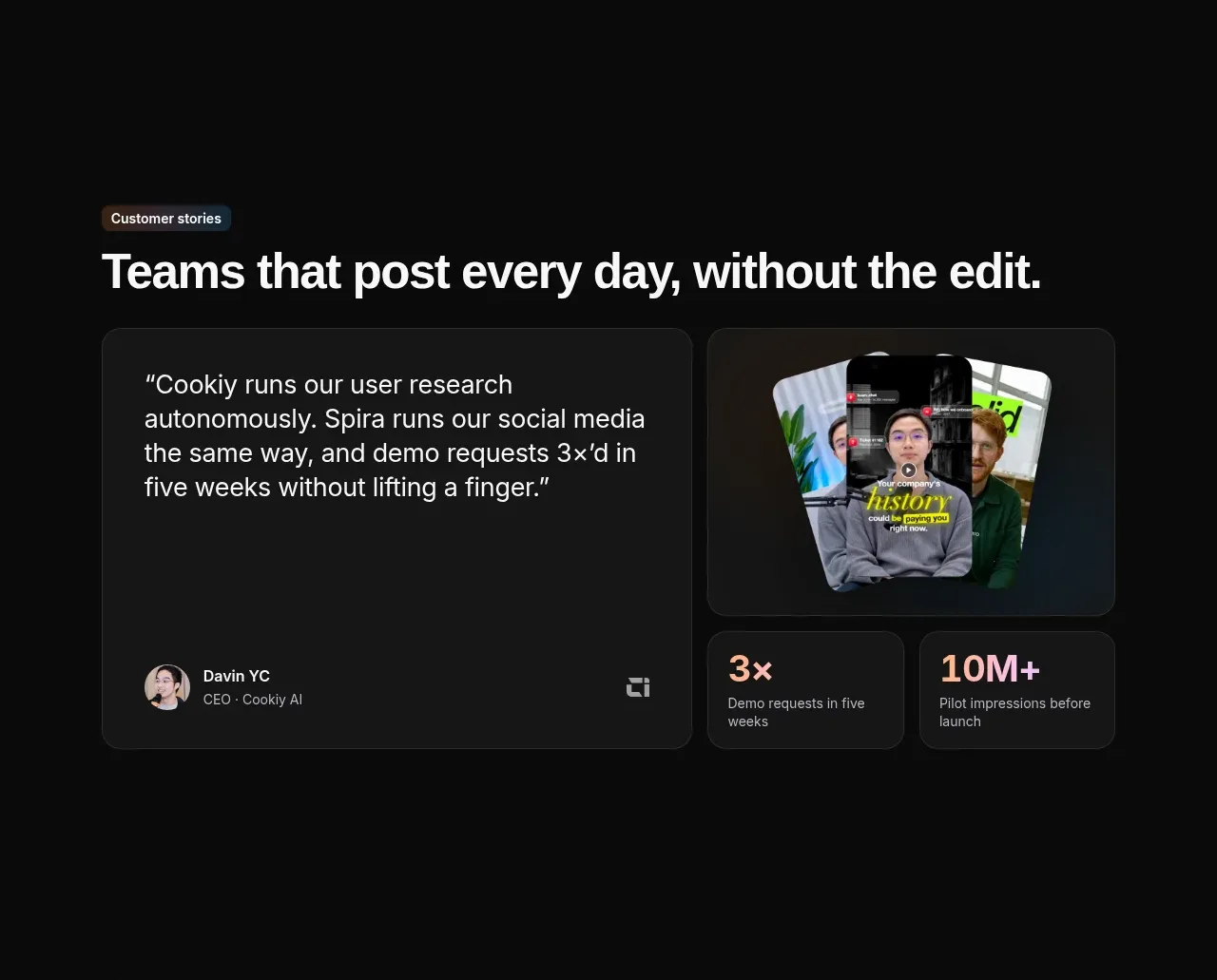
 Customer story and proof points
Spira Maxima · Testimonials
Customer story and proof points
Spira Maxima · Testimonials
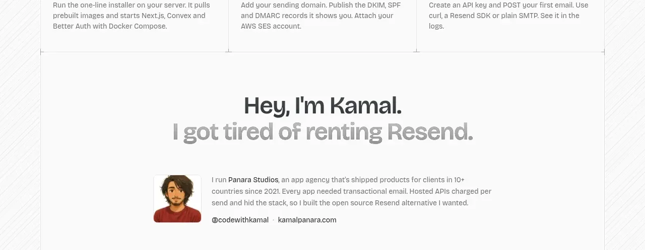
 Founder story
opensend.cc · Testimonials
Founder story
opensend.cc · Testimonials
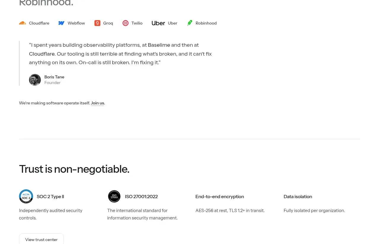
P
Founder testimonial
Polylane · Testimonials
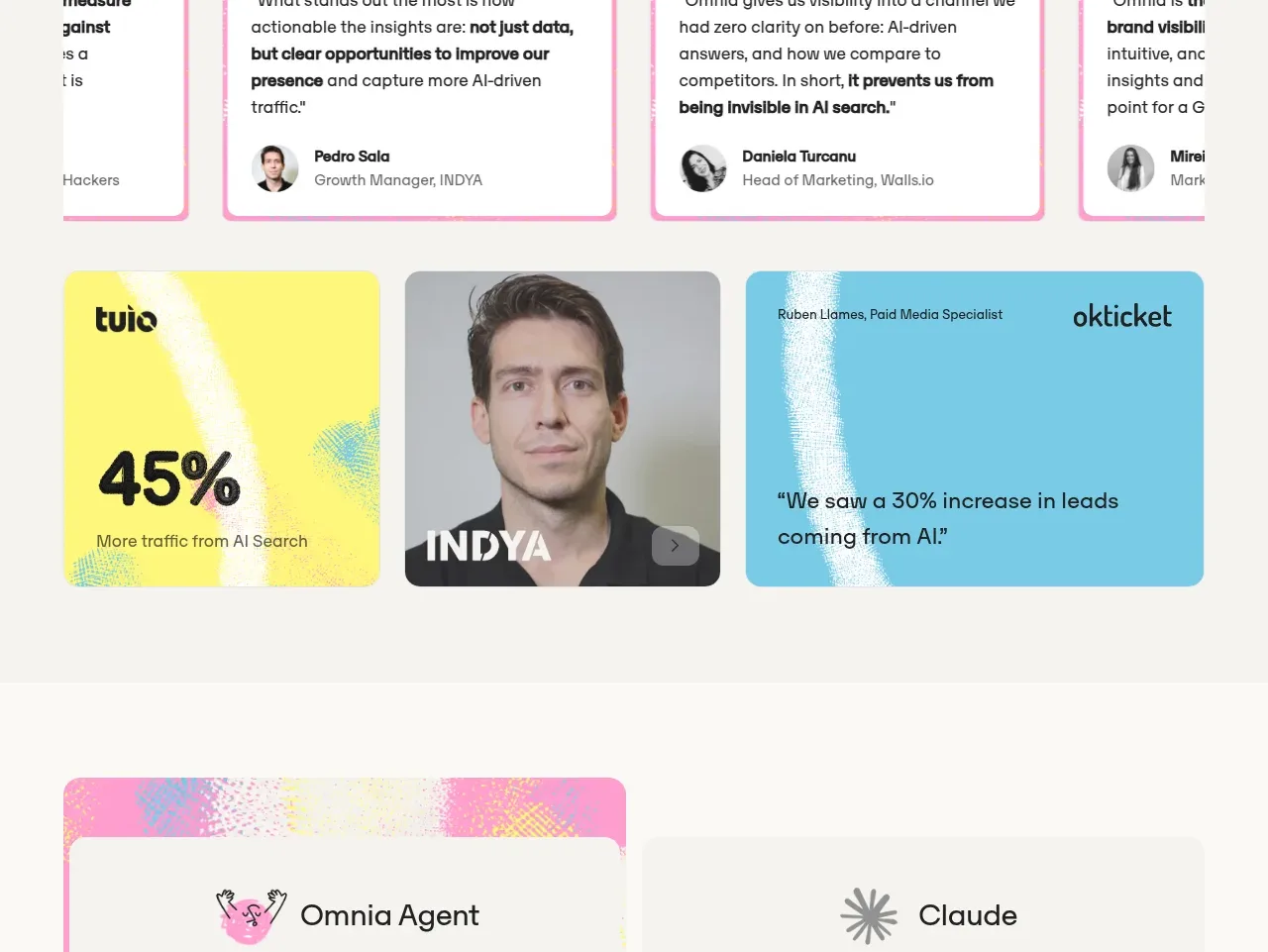
 Customer proof and outcomes
Omnia Agent · Testimonials
Customer proof and outcomes
Omnia Agent · Testimonials
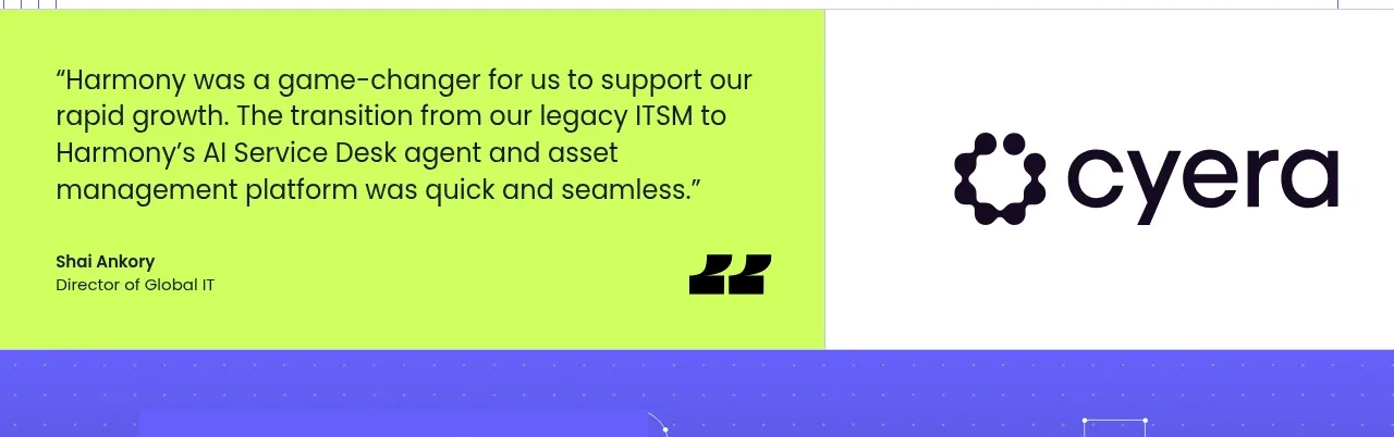
 Customer proof statement
Harmony · Testimonials
Customer proof statement
Harmony · Testimonials
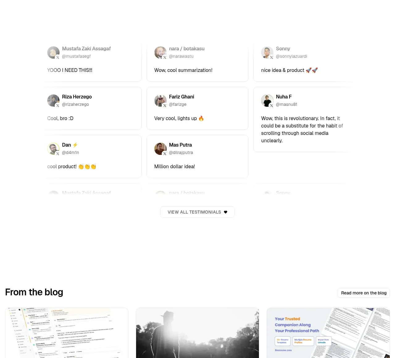
 Community testimonials
LaterOn v2: The agentic email plaftform · Testimonials
Community testimonials
LaterOn v2: The agentic email plaftform · Testimonials