 kage
kage
coastcreative.studio
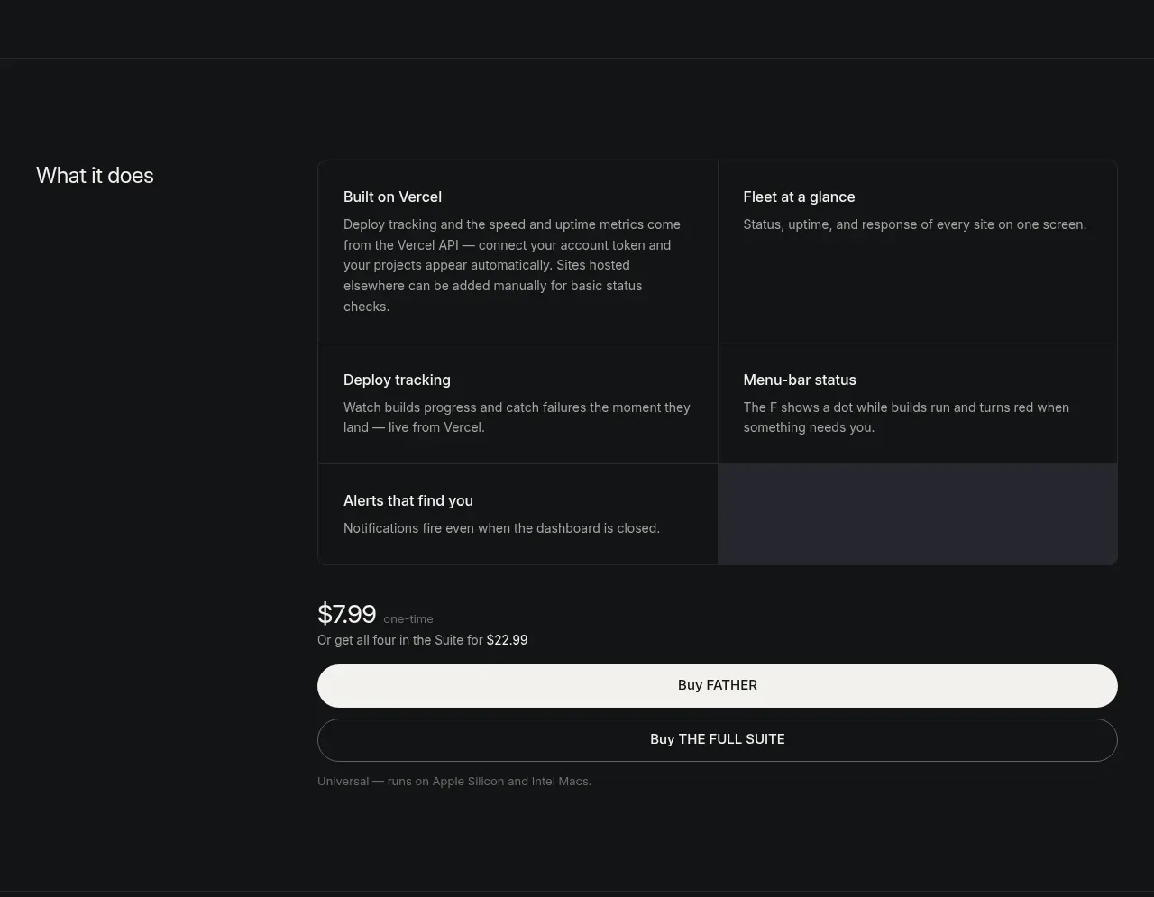
Design analysis
A left-side section label anchors a bordered grid of concise product capabilities, while the lower portion resolves into a wide purchase module. The grid uses subtle cell borders and short descriptions to make a complex tool feel scannable.
Prompt preview
## Reference images

Study these alongside the description below: hierarchy, rhythm, spacing, colour. Build for the product you are asked about, using this design language.

- Component: https://kage-design-assets.t3.tigrisfiles.io/components/father/e7444c2f-2da8-491a-acc7-45230a85c8b9-1789538599-4.webp
- Full page it was cut from: https://kage-design-assets.t3.tigrisfiles.io/screenshots/father/e7444c2f-2da8-491a-acc7-45230a85c8b9-1789538499004-full.webp
- Component on Kage: https://kage.design/component/father-feature-grid

## Before you start
Ask what the user's product does, which capabilities deserve emphasis, and what purchase or signup action should follow. Build an original section around those answers.

Build a dark feature overview with a two-column outer layout: a narrow label column and a wider content column. In the content column, use a 2x3 or similarly compact grid of feature cells with 1px borders in #292b2f, no heavy cards, and 24–32px internal padding. Each cell has a short title in #ededeb and one or two lines of muted description in #929499. Keep the grid dense but breathable, with consistent cell heights and a single optional highlighted cell using a very subtle cool-gray surface (#24262d). Under the grid, add a full-width pricing/action area with a price line, supporting note, a filled light pill CTA, and an outlined secondary CTA. Use a 15–17px body size, 20–24px section heading, and strong alignment between the grid and buttons. On mobile, collapse the label column and stack feature cells.

Never: copy logos, product names, exact copy, illustrations, or imagery from the reference.
More components

 Authentication product capabilities
tiun. · Feature grid
Authentication product capabilities
tiun. · Feature grid
 Customer data and user management
tiun. · Feature grid
Customer data and user management
tiun. · Feature grid
 Problem and unified solution narrative
tiun. · Feature grid
Problem and unified solution narrative
tiun. · Feature grid
 Integration and agent workflow
tiun. · Feature grid
Integration and agent workflow
tiun. · Feature grid
 Billing and checkout capabilities
tiun. · Feature grid
Billing and checkout capabilities
tiun. · Feature grid

 Receiving money channels
Payflip · Feature grid
Receiving money channels
Payflip · Feature grid