 kage
kage
ffffinder.repponen.com
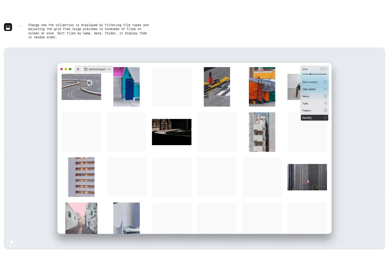
Design analysis
The second feature section demonstrates a different content state with the same copy-then-preview rhythm, creating a coherent narrative while showing that the product adapts to varied collections.
Prompt preview
## Reference images

Study these alongside the description below: hierarchy, rhythm, spacing, colour. Build for the product you are asked about, using this design language.

- Component: https://kage-design-assets.t3.tigrisfiles.io/components/ffffinder/236e01a7-b902-40d9-8cf2-9e70faeb5362-1790748892-2.webp
- Full page it was cut from: https://kage-design-assets.t3.tigrisfiles.io/screenshots/ffffinder/236e01a7-b902-40d9-8cf2-9e70faeb5362-1790748796754-full.webp
- Component on Kage: https://kage.design/component/ffffinder-feature-grid-2

## Before you start
Ask what kinds of content the user's product organizes and what the most valuable before-and-after state is. Ask for the user's brand colours and typography, then apply these rules to create an original section.

Build a second feature band that explains how users organize, filter, or switch between content collections. Keep the same visual rhythm as adjacent feature bands so the page feels systematic, but vary the product state shown in the preview to demonstrate a distinct capability.

Design rules:
- Use a short descriptive block followed by a large centered product preview.
- Align all feature copy and preview containers to a shared page grid.
- Keep text small and precise, using a technical sans or monospace for utility-oriented products.
- Use a light cool-gray outer surface around the preview, approximately `#E8ECF2`; let the inner product surface use the brand's strongest contrast.
- Maintain 56–80px section padding and 16px-ish radius, with no heavy decorative treatment.
- Ensure filters, menus, or sorting controls visible in the preview have clear hover, focus, and keyboard states.

Never:
- Never copy the reference's product name, labels, menu structure, screenshot, artwork, or imagery.
- Never add controls merely for decoration; every visible control should communicate a plausible user action.
More components

 Three-step process cards
godaylight.com · Feature grid
Three-step process cards
godaylight.com · Feature grid

 Use-case selector with vertical video preview
Spira Maxima · Feature grid
Use-case selector with vertical video preview
Spira Maxima · Feature grid

 Insights and enterprise model access
FastRouter.ai · Feature grid
Insights and enterprise model access
FastRouter.ai · Feature grid
 Solutions by organizational role
FastRouter.ai · Feature grid
Solutions by organizational role
FastRouter.ai · Feature grid
 Routing reliability and model collaboration
FastRouter.ai · Feature grid
Routing reliability and model collaboration
FastRouter.ai · Feature grid
 Goal-oriented product capabilities
FastRouter.ai · Feature grid
Goal-oriented product capabilities
FastRouter.ai · Feature grid