kage
kage
Design analysis
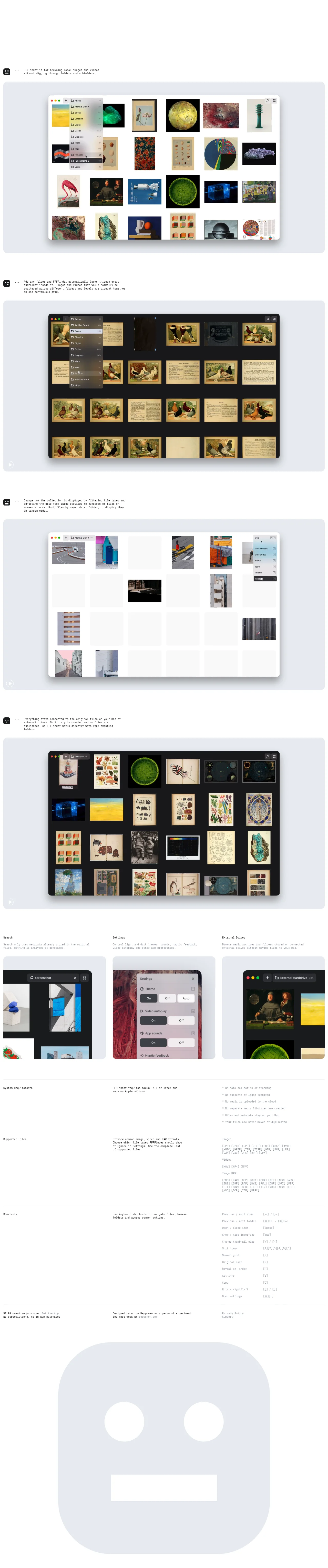
A documentation-flavoured product page set entirely in small monospace type on near-white, where hierarchy comes from size and gray value rather than display headlines. The rhythm alternates narrow two-line intro paragraphs — each marked by a tiny mascot icon and an ellipsis — with full-width app screenshots on soft gray rounded cards, switching between light and dark app themes panel by panel to demonstrate both modes. Below the hero the page shifts into a spec-sheet register: a three-up feature strip (Search / Settings / External Drives), then hairline-ruled three-column rows pairing labels, prose, and dense data like bracketed file-format tokens and keyboard keycaps, closing with a plain mono footer and a giant abstract mascot filling the page end.
Prompt preview
## Reference images

Study these alongside the description below: hierarchy, rhythm, spacing, colour. Build for the product you are asked about, using this design language.

- Full page: https://kage-design-assets.t3.tigrisfiles.io/screenshots/ffffinder/236e01a7-b902-40d9-8cf2-9e70faeb5362-1790748796754-full.webp
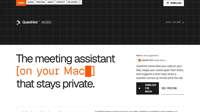
- Above the fold: https://kage-design-assets.t3.tigrisfiles.io/screenshots/ffffinder/236e01a7-b902-40d9-8cf2-9e70faeb5362-1790748787861.webp
- Design on Kage: https://kage.design/designs/ffffinder-landing-page

# FFFFinder-style landing page

A single-page product site in the style of a technical spec sheet: monospace type, near-white canvas, proof-through-screenshots storytelling, and a documentation-style data section at the bottom.

## Before you start
Ask the user:
- What product are they building, and is it a desktop app, web app, or something else?
- Who is it for, and what do they need to prove on the page (features, price, privacy, requirements)?
- What brand assets do they have: name, wordmark, colours, typeface, mascot/icon, and real product screenshots?

Wait for the answers. Everything below is applied to *their* product, not to the reference. If they have no real screenshots, design neutral placeholder frames rather than inventing product imagery.

## Page structure
Top to bottom, one continuous page:

1. **Intro block** — no navbar, no hero headline. A tiny mascot mark (rounded square with a simple face), an ellipsis, and one or two sentences in small monospace type describing what the product does. Left-anchored, narrow measure (~40ch), lots of white above and below.
2. **Proof panel 1** — a full-width rounded card in light gray containing a large product screenshot (light theme), centered with generous inner padding. Show a real UI moment: a dropdown menu or overlay open so the panel feels alive.
3. **Intro block 2** — same pattern: tiny mascot mark + ellipsis + one short monospace paragraph explaining a second capability (e.g. how the product aggregates or scans content).
4. **Proof panel 2** — same card format, but the screenshot in **dark theme**. Alternating light/dark panels is the page's core rhythm.
5. **Intro block 3** — mascot + ellipsis + short paragraph about display options (filtering, sorting, grid density).
6. **Proof panel 3** — light-theme screenshot showing a sort/filter menu open.
7. **Intro block 4** — mascot + ellipsis + paragraph about data ownership / no duplication / privacy.
8. **Proof panel 4** — dark-theme screenshot showing a dense, content-rich state.
9. **Feature triplet** — three equal columns. Each column: a small monospace heading, a one-to-two-line description, then a cropped mini screenshot card underneath. Text sits *above* the image, not on it.
10. **Spec rows** — three full-width rows separated by hairline rules, each a three-column grid:
    - Row 1 *Requirements*: label left; one short prose sentence in the middle; a bulleted list of factual claims on the right (privacy, accounts, data).
    - Row 2 *Supported formats*: label left; prose middle; on the right, grouped token lists — a group name (`Image:`, `Video:`, `RAW:`) followed by bracketed mono tags like `[JPG] [PNG] [MOV]`.
    - Row 3 *Shortcuts*: label left; prose middle; on the right, a list of action names with bracketed keycaps, keys aligned to the right (`Open / close item  [Space]`).
11. **Footer** — a single row of small monospace text: price and CTA link left, designer/company credit middle, Privacy Policy and Support links right. Plain text links, no buttons.
12. **Mascot outro** — a giant abstract mascot shape (the brand's own mark scaled up) in light gray on white, with simple geometric eyes and mouth, filling the bottom of the page as a full stop.

## Design language
- **Type is the design.** One monospace family throughout; body ~13–14px, data/spec text ~11–12px. No display headlines, no sans/serif pairing. Hierarchy is built from size steps, gray value, and whitespace only.
- **Colour treatment:** near-white background `#f5f5f6`, near-black text `#141414`, secondary gray `#87878c`, hairline rules `#e3e3e5`, panel gray `#e7e8ea`, dark panels `#101010`. Colour otherwise comes only from the product screenshots themselves.
- **Rhythm down the page:** airy intro paragraph → full-width proof panel → repeat, alternating light and dark screenshots. Roughly the first 60% of the page is this storytelling loop; the lower 40% switches register to dense documentation (triplet, spec rows), then releases tension with the big mascot.
- **Intro blocks:** always left-anchored, never centered; mascot mark ~16–20px, then `…`, then a narrow text column with generous margins (~96–128px vertical).
- **Proof panels:** rounded corners ~20px, ~5% inner padding, screenshot centered; a soft, small shadow only on the app window inside the panel — never a heavy drop shadow on the card.
- **Spec rows:** hairline top border per row; three-column grid ~25% / 35% / 40%; vertical padding ~40–48px; right-hand data columns are intentionally dense (bullet lists, bracketed tokens, keycap pairs) — density contrast is a feature, not a problem.
- **Keycap notation:** every shortcut or file format rendered as bracketed monospace tokens like `[Space]`, `[⌘][,]`, `[JPG]`, keys right-aligned in their column.
- **Controls and CTAs:** plain underlined or plain monospace text links; no filled buttons, no pills, no gradients, no glow.
- **Corners and shadow:** radius reserved for screenshot cards and the mascot; everything else is square hairlines. Shadows minimal and only inside panels.
- **Motion:** none required — no scroll animations, parallax, or carousels. Hover is limited to a subtle underline or opacity shift on links.
- **Imagery:** only real product screenshots and the abstract mascot; no stock photography, no illustration sets.

## Never
- Do not use the reference's name, wordmark, mascot face, copy, screenshots, file lists, shortcut tables, pricing ($7.99), or credits (Anton Repponen, repponen.com).
- Do not reproduce their supported-format lists or shortcut combos verbatim — derive the equivalent data from the user's own product.
- Never present the result as FFFFinder or any existing product; use the user's own brand name, mark, colours, and type.
Components from this page
All components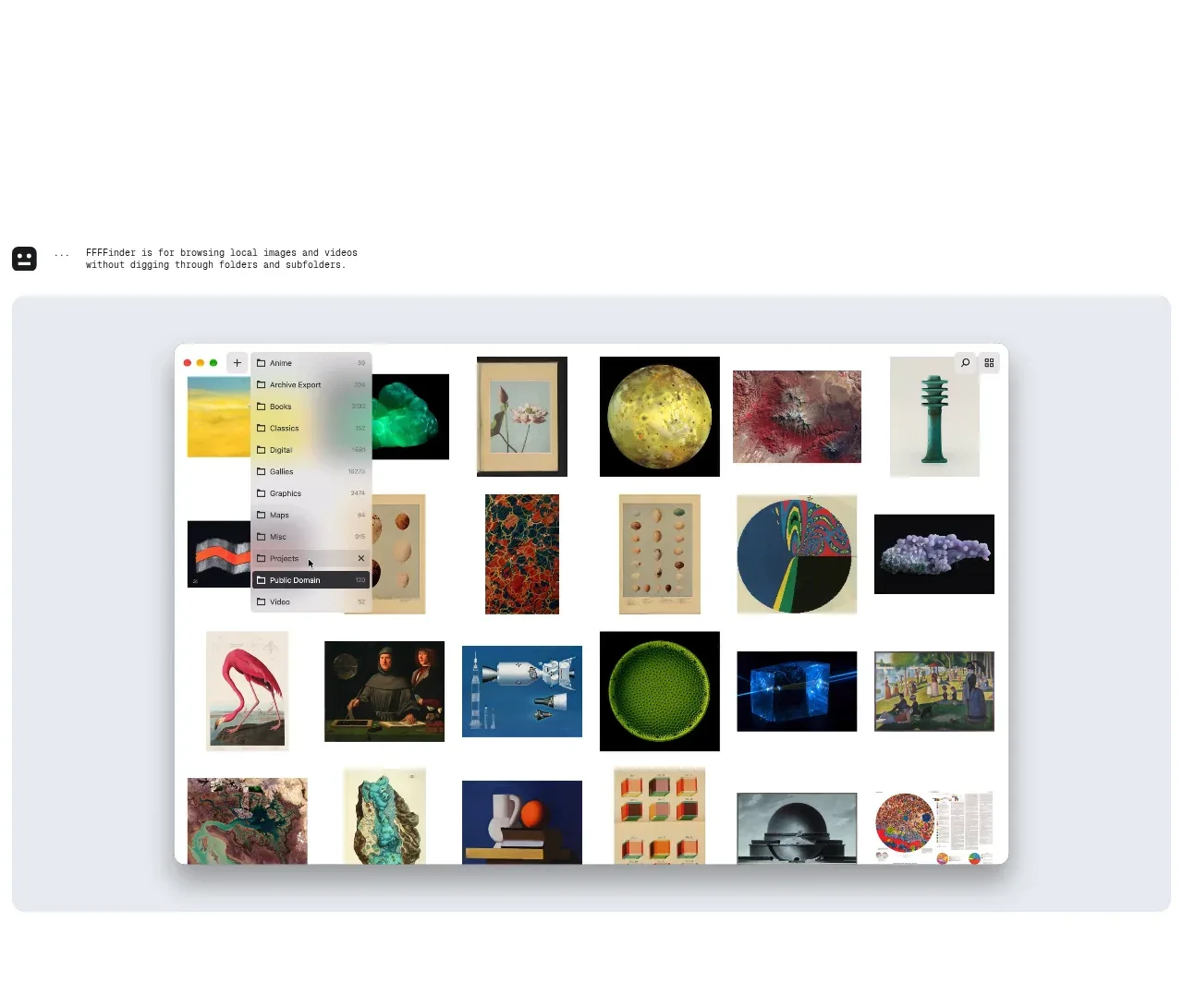
 Product introduction and visual preview
FFFFinder · Hero
Product introduction and visual preview
FFFFinder · Hero
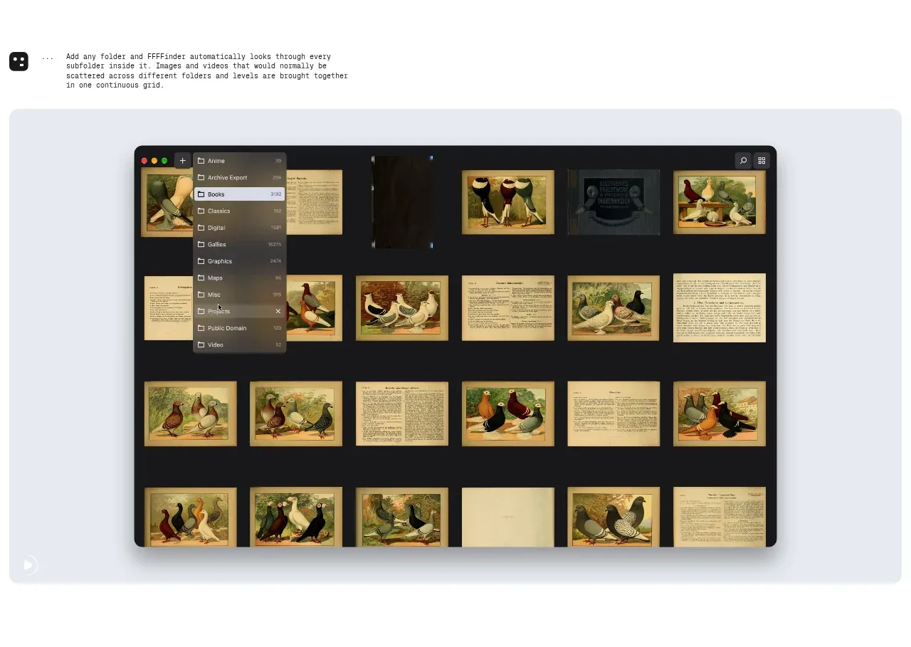 Visual browsing feature
FFFFinder · Feature grid
Visual browsing feature
FFFFinder · Feature grid
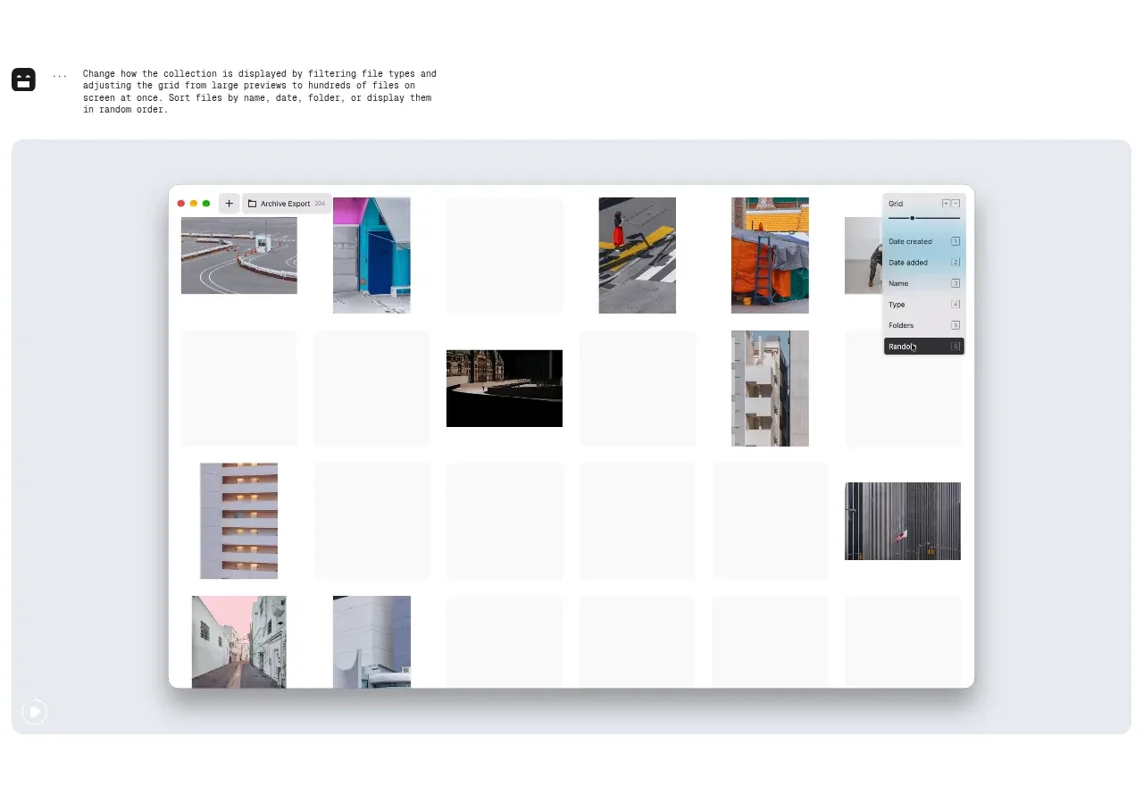 Collection organization feature
FFFFinder · Feature grid
Collection organization feature
FFFFinder · Feature grid
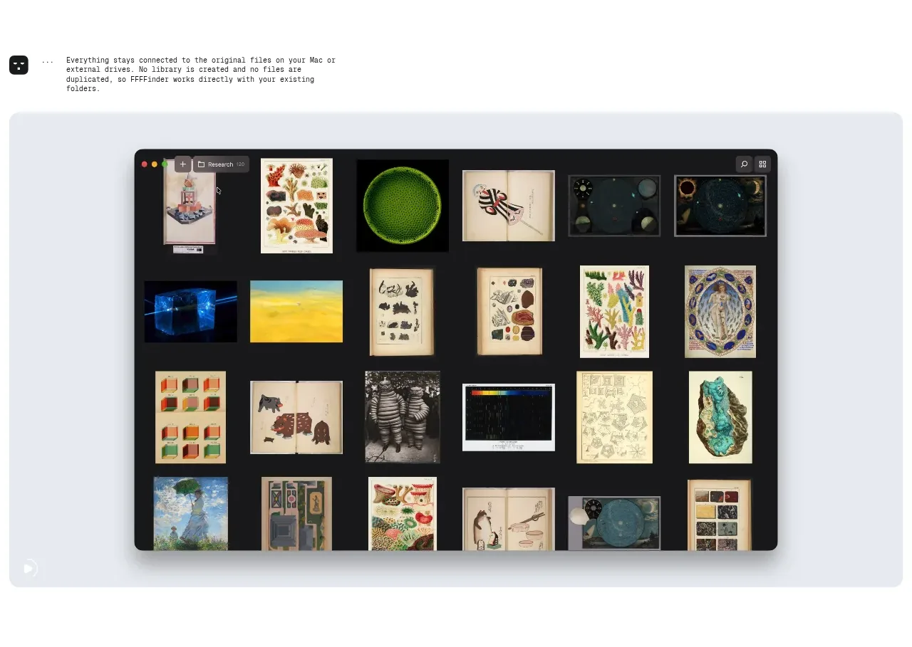 Filtering and display controls
FFFFinder · Feature grid
Filtering and display controls
FFFFinder · Feature grid
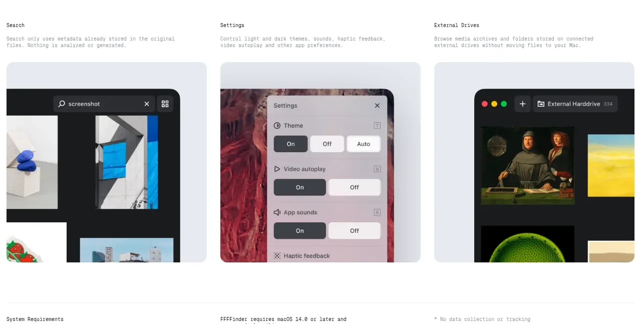 Supporting capabilities gallery
FFFFinder · Feature grid
Supporting capabilities gallery
FFFFinder · Feature grid
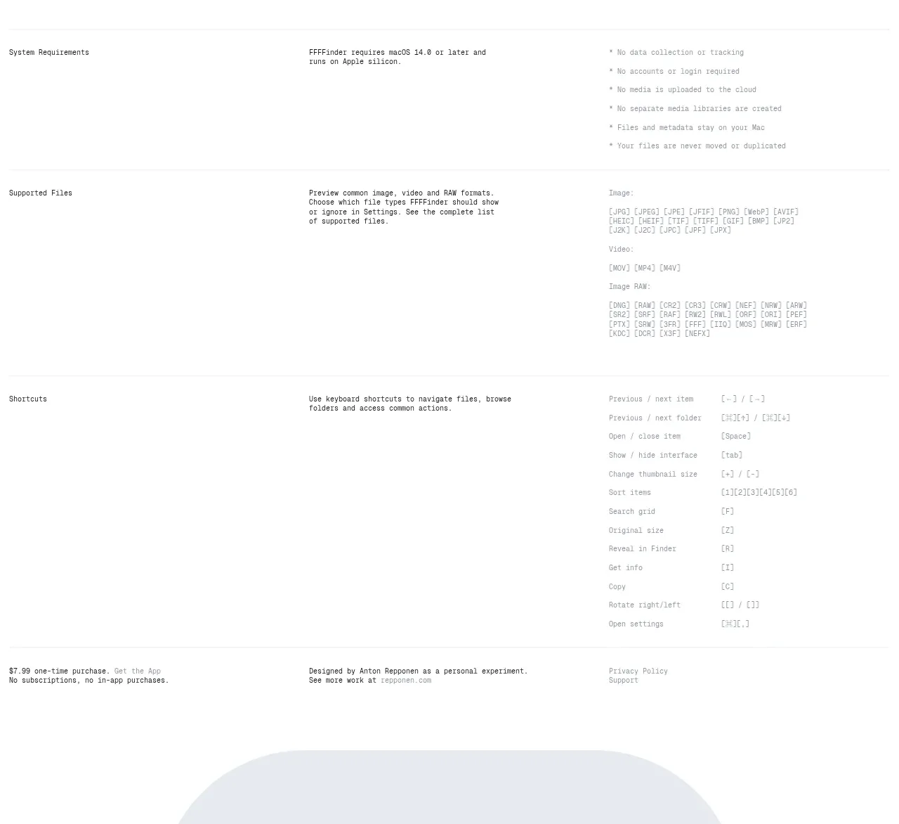 Requirements, file support, and shortcuts
FFFFinder · Table
Requirements, file support, and shortcuts
FFFFinder · Table
 Purchase links and closing mark
FFFFinder · Footer
Purchase links and closing mark
FFFFinder · Footer