 kage
kage
ffffinder.repponen.com
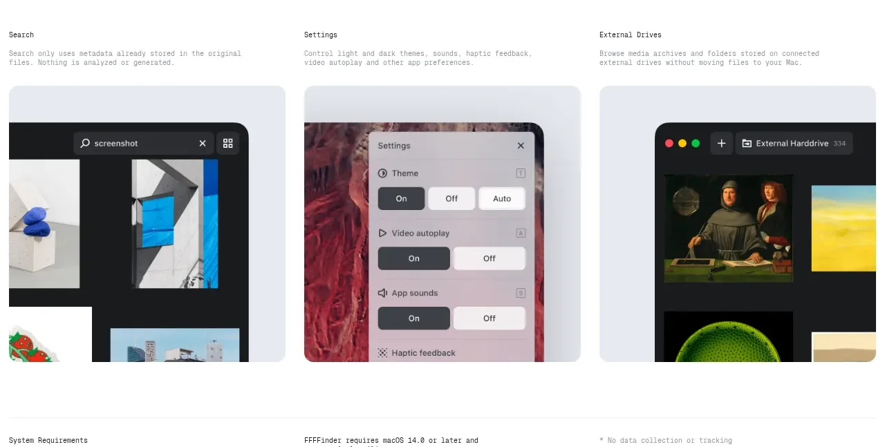
Design analysis
Three equal visual cards summarize supporting capabilities after the main demonstrations. Their repeated framing creates a compact scan-friendly overview without overpowering the primary feature story.
Prompt preview
## Reference images

Study these alongside the description below: hierarchy, rhythm, spacing, colour. Build for the product you are asked about, using this design language.

- Component: https://kage-design-assets.t3.tigrisfiles.io/components/ffffinder/236e01a7-b902-40d9-8cf2-9e70faeb5362-1790748893-4.webp
- Full page it was cut from: https://kage-design-assets.t3.tigrisfiles.io/screenshots/ffffinder/236e01a7-b902-40d9-8cf2-9e70faeb5362-1790748796754-full.webp
- Component on Kage: https://kage.design/component/ffffinder-feature-grid-4

## Before you start
Ask which three supporting capabilities matter most for the user's product and what brand assets are available. Then create an original supporting-feature gallery following these rules.

Build a three-column supporting feature grid with a small heading and one concise description per card, followed by a rounded visual tile. Keep each tile visually consistent while showing a different workflow or setting. This is a summary layer, so use shorter copy and smaller imagery than the main feature demonstrations.

Design rules:
- Use equal-width columns with consistent gutters and aligned card bottoms.
- Give each card a small, clear title, terse supporting copy, and a large image/mockup area.
- Use a white page with pale cool-gray tiles around `#E9EDF3`, dark text `#171717`, and muted copy `#777B80`.
- Use 14–18px radius, minimal borders, and no excessive card shadows.
- Add keyboard-visible focus states if cards link to deeper documentation or settings.
- Collapse to one column on small screens, preserving the order of importance.

Never:
- Never copy the reference's three titles, imagery, screenshots, logos, or wording.
- Never use decorative cards that do not map to a real product capability.
More components

 Three-step process cards
godaylight.com · Feature grid
Three-step process cards
godaylight.com · Feature grid

 Use-case selector with vertical video preview
Spira Maxima · Feature grid
Use-case selector with vertical video preview
Spira Maxima · Feature grid

 Insights and enterprise model access
FastRouter.ai · Feature grid
Insights and enterprise model access
FastRouter.ai · Feature grid
 Solutions by organizational role
FastRouter.ai · Feature grid
Solutions by organizational role
FastRouter.ai · Feature grid
 Routing reliability and model collaboration
FastRouter.ai · Feature grid
Routing reliability and model collaboration
FastRouter.ai · Feature grid
 Goal-oriented product capabilities
FastRouter.ai · Feature grid
Goal-oriented product capabilities
FastRouter.ai · Feature grid