kage
kage
fideisland.it.com
Design analysis
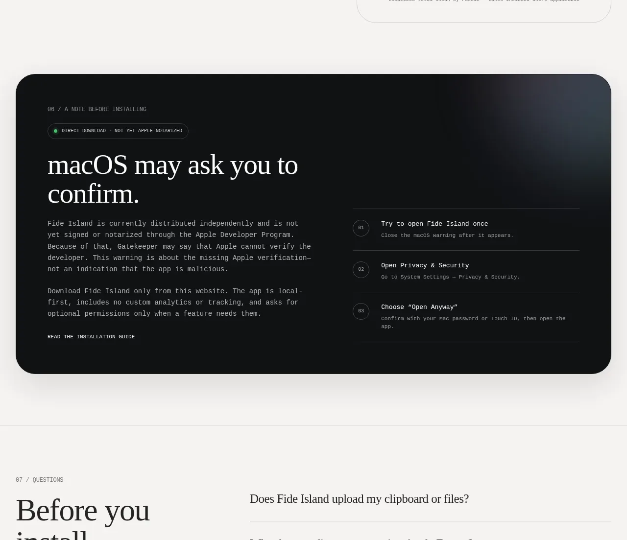
A dark, rounded panel explains a system warning in an editorial column and provides three numbered installation steps in a structured column.
Prompt preview
## Reference images

Study these alongside the description below: hierarchy, rhythm, spacing, colour. Build for the product you are asked about, using this design language.

- Component: https://kage-design-assets.t3.tigrisfiles.io/components/fide-island/e90b7c78-4279-44cf-a252-bbd8cdefeb5b-1789711573-7.webp
- Full page it was cut from: https://kage-design-assets.t3.tigrisfiles.io/screenshots/fide-island/e90b7c78-4279-44cf-a252-bbd8cdefeb5b-1789711455018-full.webp
- Component on Kage: https://kage.design/component/fide-island-card

## Before you start
Ask what installation, verification, or security friction users may encounter with the product. Explain the real process without minimizing important warnings.

Build a dark rounded information panel with a tiny status eyebrow, a large light serif heading, and explanatory paragraphs on the left. On the right, show three numbered steps separated by horizontal rules; each step has a short title and a smaller instruction. Include a quiet text link to a longer guide. Use #101113 or near-black as the panel background, #f2f2ee text, muted gray secondary text, thin #343639 rules, and a 28–32px radius. Keep the two columns balanced, use a small outlined status chip, and make the numbered steps easy to scan. Stack the columns on mobile while preserving the process order.

Never: use the reference's logos, product names, copy, illustrations, imagery, or exact branding.