 kage
kage
fideisland.it.com
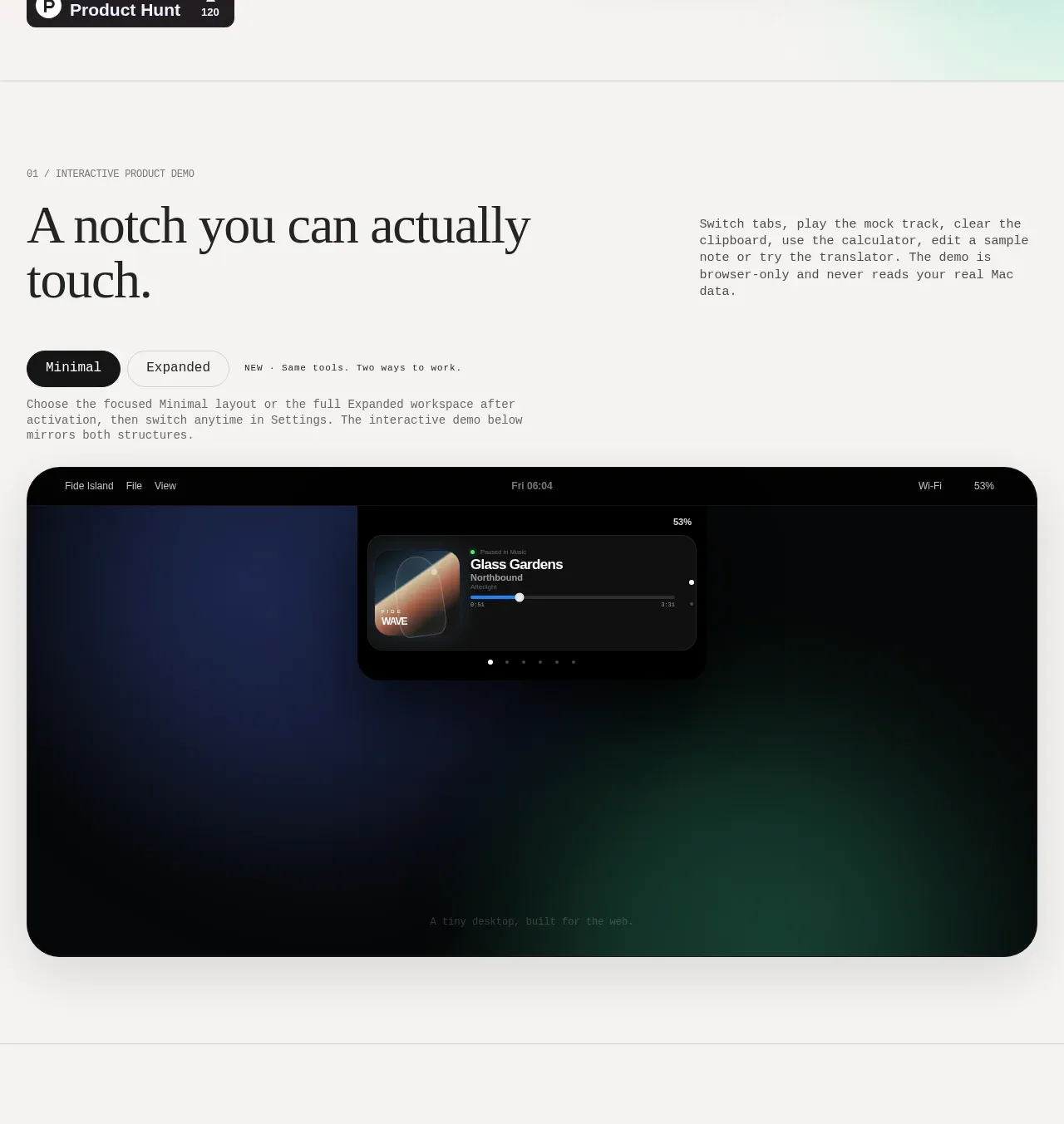
Design analysis
An introductory section leads into a Minimal/Expanded tab control and a large browser-like interactive product preview.
Prompt preview
## Reference images

Study these alongside the description below: hierarchy, rhythm, spacing, colour. Build for the product you are asked about, using this design language.

- Component: https://kage-design-assets.t3.tigrisfiles.io/components/fide-island/e90b7c78-4279-44cf-a252-bbd8cdefeb5b-1789711572-2.webp
- Full page it was cut from: https://kage-design-assets.t3.tigrisfiles.io/screenshots/fide-island/e90b7c78-4279-44cf-a252-bbd8cdefeb5b-1789711455018-full.webp
- Component on Kage: https://kage.design/component/fide-island-feature-grid

## Before you start
Ask what the user's product does and which interaction is most important to demonstrate. Use the answers to shape the demo.

Build a product-demo section with a small numbered eyebrow, a large left-aligned serif heading, and a short explanatory paragraph aligned to the right. Below, add a compact segmented tab switcher with a dark active pill, a secondary tab, and a tiny contextual note. Follow it with a large rounded preview surface that resembles the product itself: dark chrome, restrained metadata, a focused central module, and subtle depth rather than decorative clutter. Keep the preview centered with broad whitespace around it. Use #f5f4f1 for the page, #07090b for the demo, low-contrast gray borders, 28px radius, serif headings, and mono utility labels. Make tabs keyboard-accessible, update the preview state visibly, and respect reduced motion.

Never: use the reference's logos, product names, copy, illustrations, imagery, or exact branding.
More components

 AI-powered helpdesk feature section
intercom.com · Feature grid
AI-powered helpdesk feature section
intercom.com · Feature grid
 Integrations and ecosystem section
intercom.com · Feature grid
Integrations and ecosystem section
intercom.com · Feature grid
 AI agent capabilities section
intercom.com · Feature grid
AI agent capabilities section
intercom.com · Feature grid
 Unified support experience overview
intercom.com · Feature grid
Unified support experience overview
intercom.com · Feature grid

 Core invoicing capabilities
sendinvo.com · Feature grid
Core invoicing capabilities
sendinvo.com · Feature grid
 Audience and trade types
sendinvo.com · Feature grid
Audience and trade types
sendinvo.com · Feature grid