 kage
kage
fideisland.it.com
Design analysis
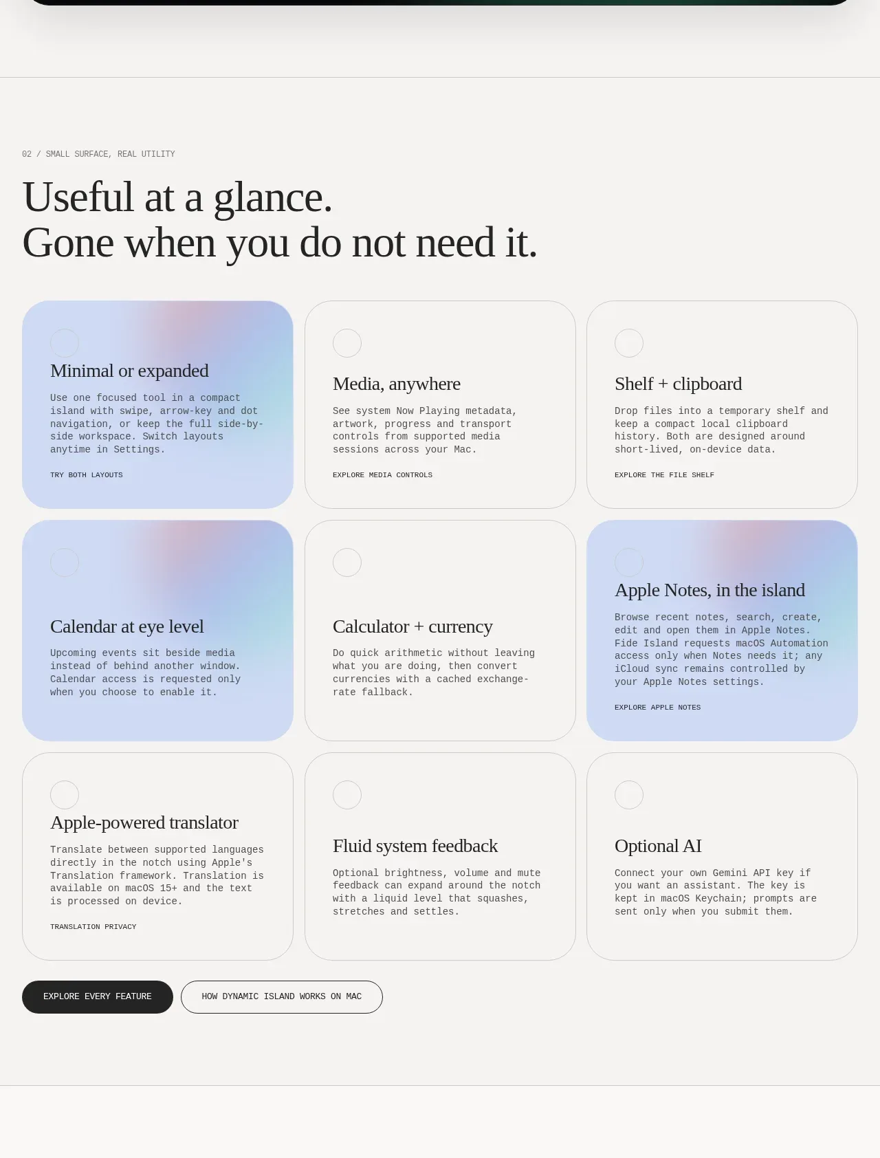
A strong editorial heading introduces a three-column grid of rounded feature cards, with selected cards receiving a pale blue/pink gradient highlight and closing CTAs below.
Prompt preview
## Reference images

Study these alongside the description below: hierarchy, rhythm, spacing, colour. Build for the product you are asked about, using this design language.

- Component: https://kage-design-assets.t3.tigrisfiles.io/components/fide-island/e90b7c78-4279-44cf-a252-bbd8cdefeb5b-1789711572-3.webp
- Full page it was cut from: https://kage-design-assets.t3.tigrisfiles.io/screenshots/fide-island/e90b7c78-4279-44cf-a252-bbd8cdefeb5b-1789711455018-full.webp
- Component on Kage: https://kage.design/component/fide-island-feature-grid-2

## Before you start
Ask what the user's product's key capabilities are and which ones deserve emphasis. Then create a hierarchy that fits that product.

Create a feature overview section with a numbered eyebrow and a large two-line serif heading. Under it, use a responsive three-column grid of equal-height rounded cards. Each card should have a small circular marker, a short serif feature title, compact explanatory text, and a tiny uppercase utility link. Alternate quiet white cards with one or two softly emphasized cards using a pale periwinkle-to-blush gradient (#c9d7f5 to #f2dce1). Use generous internal padding, 1px #d9d9d5 borders, 20–24px radius, dark text, and a restrained mono/grotesk body style. End with a filled and outlined action pair. On mobile, collapse to one column while preserving card order.

Never: use the reference's logos, product names, copy, illustrations, imagery, or exact branding.
More components

 AI-powered helpdesk feature section
intercom.com · Feature grid
AI-powered helpdesk feature section
intercom.com · Feature grid
 Integrations and ecosystem section
intercom.com · Feature grid
Integrations and ecosystem section
intercom.com · Feature grid
 AI agent capabilities section
intercom.com · Feature grid
AI agent capabilities section
intercom.com · Feature grid
 Unified support experience overview
intercom.com · Feature grid
Unified support experience overview
intercom.com · Feature grid

 Core invoicing capabilities
sendinvo.com · Feature grid
Core invoicing capabilities
sendinvo.com · Feature grid
 Audience and trade types
sendinvo.com · Feature grid
Audience and trade types
sendinvo.com · Feature grid