 kage
kage
fideisland.it.com
Design analysis
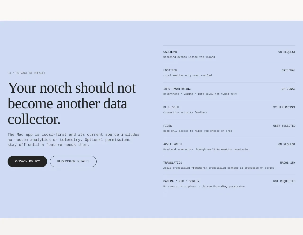
A pale blue trust section combines a large privacy promise and CTA on the left with a structured list of permission states on the right.
Prompt preview
## Reference images

Study these alongside the description below: hierarchy, rhythm, spacing, colour. Build for the product you are asked about, using this design language.

- Component: https://kage-design-assets.t3.tigrisfiles.io/components/fide-island/e90b7c78-4279-44cf-a252-bbd8cdefeb5b-1789711573-5.webp
- Full page it was cut from: https://kage-design-assets.t3.tigrisfiles.io/screenshots/fide-island/e90b7c78-4279-44cf-a252-bbd8cdefeb5b-1789711455018-full.webp
- Component on Kage: https://kage.design/component/fide-island-feature-grid-3

## Before you start
Ask what data the user's product handles, what trust concerns users have, and which permissions need explicit explanation. Use that to write an honest, product-specific layout.

Build a full-width trust section on a pale periwinkle background (#cbd9f6). Use a two-column layout: a large serif privacy promise, supporting text, and two pill actions on the left; a tidy permission matrix on the right. Each row should show a permission name, a plain-language explanation, and a clear state such as optional, on request, user-selected, or not requested. Separate rows with subtle horizontal rules and align state labels to the far edge. Keep the tone transparent rather than promotional, use dark text, compact mono labels, 1px translucent borders, and generous vertical padding. Ensure the table reflows into stacked rows on mobile and that permission language is understandable.

Never: use the reference's logos, product names, copy, illustrations, imagery, or exact branding.
More components

 AI-powered helpdesk feature section
intercom.com · Feature grid
AI-powered helpdesk feature section
intercom.com · Feature grid
 Integrations and ecosystem section
intercom.com · Feature grid
Integrations and ecosystem section
intercom.com · Feature grid
 AI agent capabilities section
intercom.com · Feature grid
AI agent capabilities section
intercom.com · Feature grid
 Unified support experience overview
intercom.com · Feature grid
Unified support experience overview
intercom.com · Feature grid

 Core invoicing capabilities
sendinvo.com · Feature grid
Core invoicing capabilities
sendinvo.com · Feature grid
 Audience and trade types
sendinvo.com · Feature grid
Audience and trade types
sendinvo.com · Feature grid