 kage
kage
fideisland.it.com
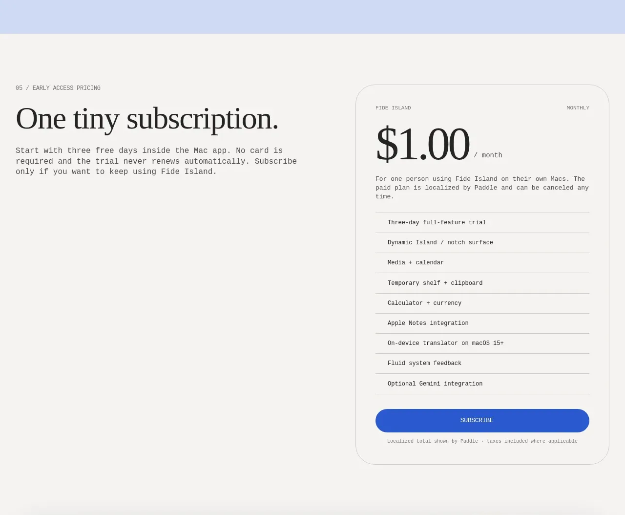
Design analysis
The pricing section pairs a concise trial explanation with one prominent rounded plan card showing price, inclusions, and a full-width subscribe button.
Prompt preview
## Reference images

Study these alongside the description below: hierarchy, rhythm, spacing, colour. Build for the product you are asked about, using this design language.

- Component: https://kage-design-assets.t3.tigrisfiles.io/components/fide-island/e90b7c78-4279-44cf-a252-bbd8cdefeb5b-1789711573-6.webp
- Full page it was cut from: https://kage-design-assets.t3.tigrisfiles.io/screenshots/fide-island/e90b7c78-4279-44cf-a252-bbd8cdefeb5b-1789711455018-full.webp
- Component on Kage: https://kage.design/component/fide-island-pricing-table

## Before you start
Ask what the user's pricing model, trial rules, billing cadence, and cancellation policy are. Make those facts explicit in the component.

Create a focused single-plan pricing section with an editorial heading and explanatory paragraph on the left and a large bordered pricing card on the right. The card should show a tiny plan label, billing cadence, oversized price with a smaller unit, a short qualification line, a vertically separated list of included capabilities, and a strong full-width primary button. Include a small localized-tax or billing note below the button. Use a warm off-white background, #171717 text, white or slightly lighter card fill, 1px #d5d5d0 border, 28px radius, generous 28–32px padding, serif display type, and compact mono details. Make the price and trial terms unambiguous and ensure the button has loading, focus, and error states.

Never: use the reference's logos, product names, copy, illustrations, imagery, or exact branding.
More components
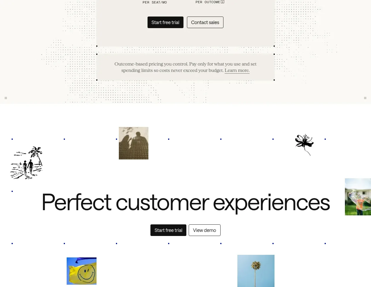
 Transparent pricing card
intercom.com · Pricing table
Transparent pricing card
intercom.com · Pricing table
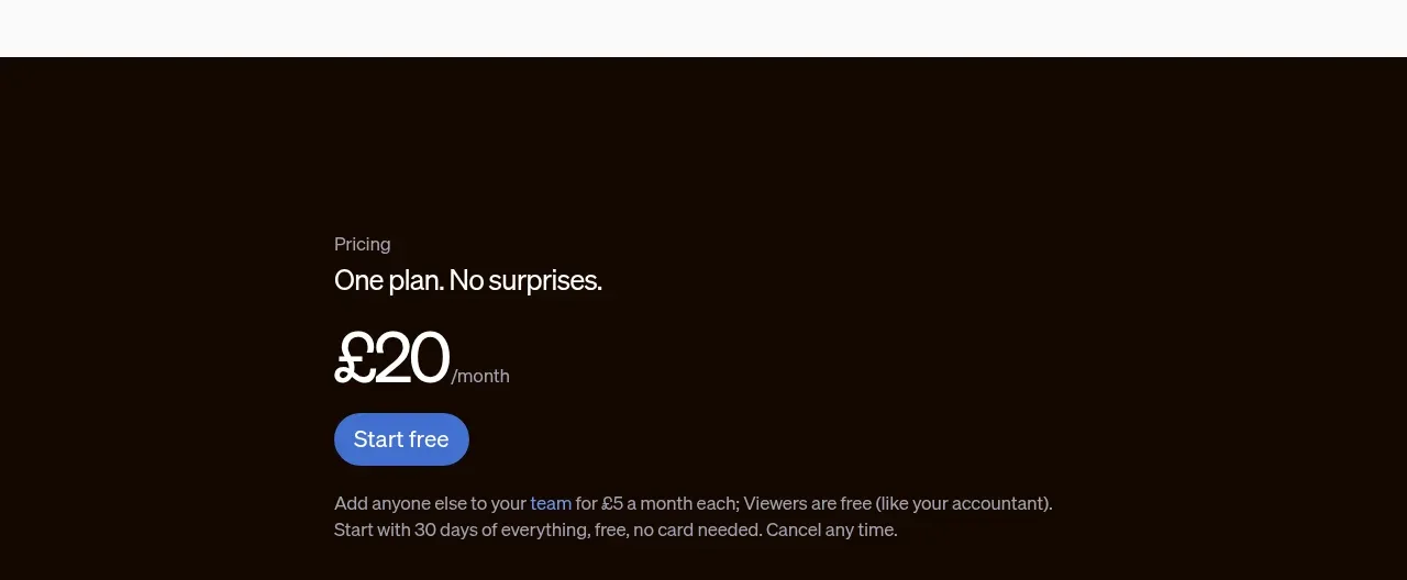
 Single-plan pricing offer
sendinvo.com · Pricing table
Single-plan pricing offer
sendinvo.com · Pricing table
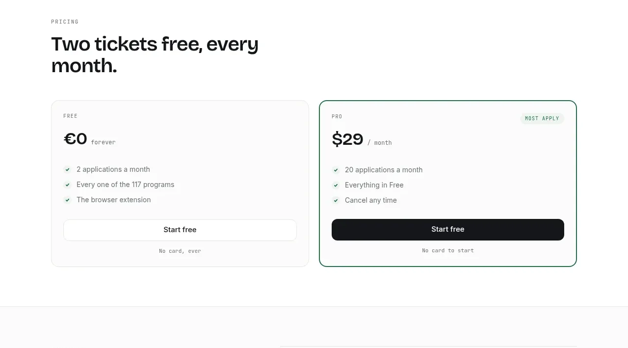
 Two-tier pricing table
ApplySeed · Pricing table
Two-tier pricing table
ApplySeed · Pricing table
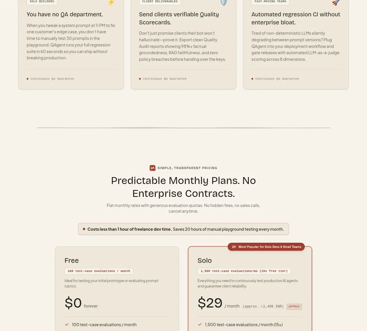
 Two-tier pricing table
QAgent · Pricing table
Two-tier pricing table
QAgent · Pricing table
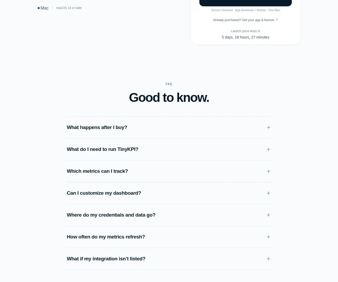
 Single launch price offer
TinyKPI · Pricing table
Single launch price offer
TinyKPI · Pricing table
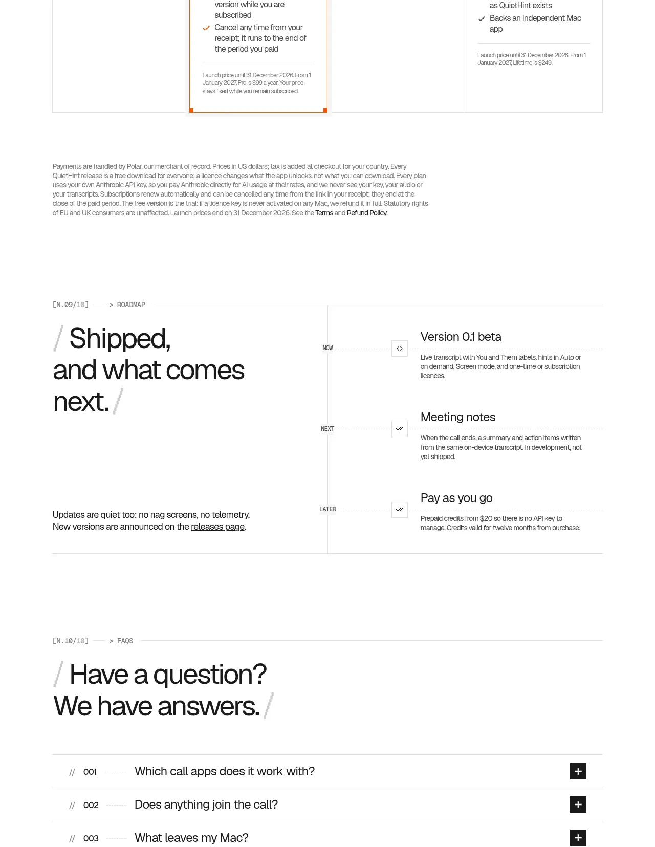
 Flexible four-plan pricing
QuietHint® · Pricing table
Flexible four-plan pricing
QuietHint® · Pricing table