kage
kage
fideisland.it.com
Design analysis
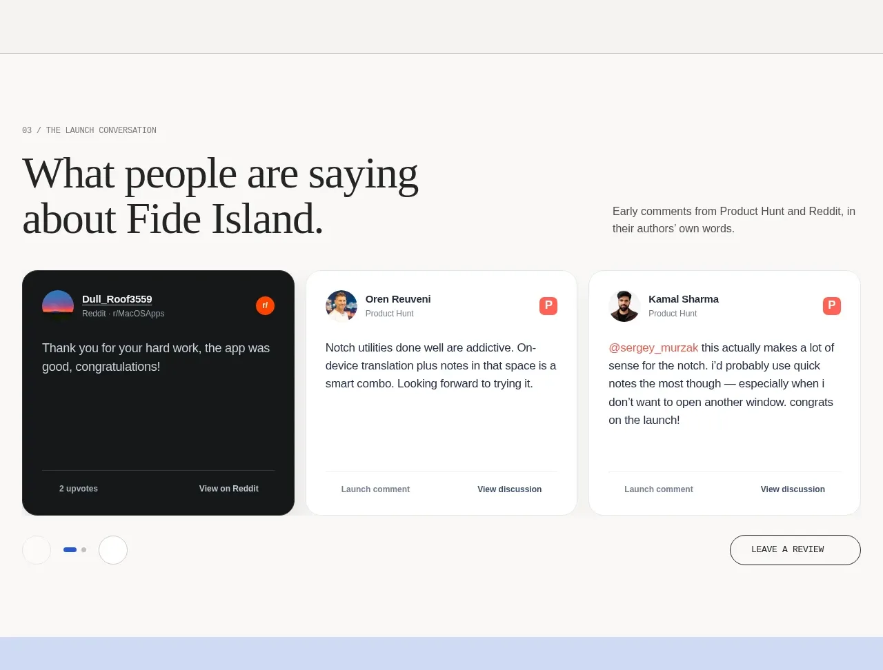
A large question-style heading introduces three testimonial cards from different communities, with one dark featured card, carousel indicators, and a review CTA.
Prompt preview
## Reference images

Study these alongside the description below: hierarchy, rhythm, spacing, colour. Build for the product you are asked about, using this design language.

- Component: https://kage-design-assets.t3.tigrisfiles.io/components/fide-island/e90b7c78-4279-44cf-a252-bbd8cdefeb5b-1789711572-4.webp
- Full page it was cut from: https://kage-design-assets.t3.tigrisfiles.io/screenshots/fide-island/e90b7c78-4279-44cf-a252-bbd8cdefeb5b-1789711455018-full.webp
- Component on Kage: https://kage.design/component/fide-island-testimonials

## Before you start
Ask who the user's real customers are, what proof is credible, and whether testimonials require attribution or moderation. Build the section around those answers.

Design a testimonial section with a numbered eyebrow, a large editorial serif heading on the left, and a short contextual sentence on the right. Below, place three horizontally aligned review cards: one visually featured dark card and two light cards. Each card needs an avatar placeholder, source label, author name, quote, and a small footer action such as viewing the discussion. Add unobtrusive pagination dots and an outlined “leave a review” style action aligned to the lower right. Use #f5f4f1, white cards, #171719 for the featured card, thin borders, 20px radius, and restrained red/orange source accents only where useful. Make the row swipeable on mobile and provide accessible carousel controls.

Never: use the reference's logos, product names, copy, illustrations, imagery, or exact branding.