kage
kage
callfifi.app
Design analysis
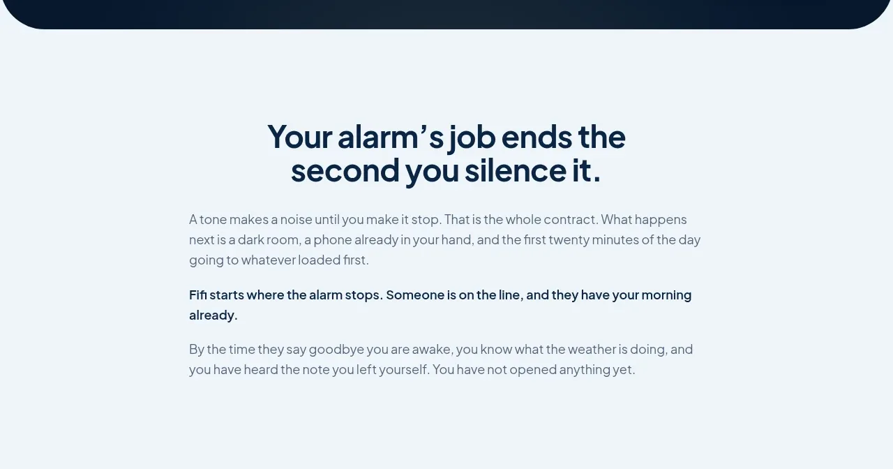
A quiet pale section uses a centered narrow text column to explain the problem and establish the product contract before showing features.
Prompt preview
## Reference images

Study these alongside the description below: hierarchy, rhythm, spacing, colour. Build for the product you are asked about, using this design language.

- Component: https://kage-design-assets.t3.tigrisfiles.io/components/fifi/65f510a7-1d11-431a-a427-6e570df25f2f-1789538467-2.webp
- Full page it was cut from: https://kage-design-assets.t3.tigrisfiles.io/screenshots/fifi/65f510a7-1d11-431a-a427-6e570df25f2f-1789538432367-full.webp
- Component on Kage: https://kage.design/component/fifi-card

## Before you start
Ask what the user's product is, who it serves, and what their brand personality and palette are. Apply the following principles to that product rather than reproducing the reference.

Build an editorial problem-framing section on a very pale cool background around #eef5f9. Center a narrow content column about 520–580px wide with substantial vertical breathing room. Use a dark navy heading around #08213b at 32–38px with a compact two-line treatment, followed by readable 16px body copy in muted slate #647483. Separate the key product promise with a slightly bolder paragraph. Keep the alignment centered for the heading but allow body paragraphs to remain comfortably readable. Use large top and bottom padding, approximately 80–110px, and avoid decorative cards or unnecessary borders.

Never: use logos, product names, copy, illustrations, or imagery from the reference.